


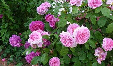
Is this the dreaded "Dusty Rose"??
cheryleb
10 years ago

Related Stories
GARDENING GUIDESWhat Kind of Roses Should You Grow?
Want to add the beauty of roses to your garden? Find out which ones, from old-fashioned to modern, are right for you
Full Story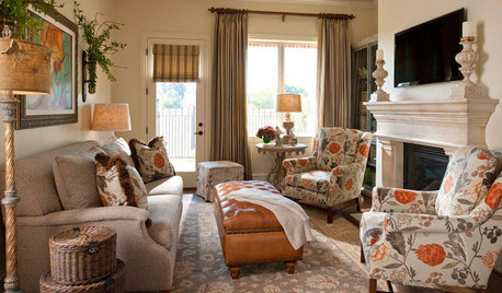
DECORATING GUIDESWhat Goes With Floral Upholstery?
How to decorate around floral-print furniture so that everything comes up roses
Full Story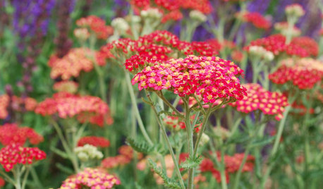
GARDENING GUIDESTexas Gardener's February Checklist
Show roses some love around Valentine's Day and set the stage for future garden growth with seeds and starts
Full Story
HOUZZ TOURSMy Houzz: Hard Work Pays Off in a DIY Cottage Renovation
First-time homeowners roll up their sleeves and give their midcentury Montreal home an infusion of style and personality
Full Story
REMODELING GUIDESOriginal Home Details: What to Keep, What to Cast Off
Renovate an older home without regrets with this insight on the details worth preserving
Full Story
GARDENING GUIDESSummer Gardens Sing With Blues
When hot weather hits, bursts of blue keep the garden palette cool and calm
Full Story
DECORATING GUIDESRoom of the Day: Serene Glamour Suits a Master Bedroom
This sleeping spot feels like a luxury hotel — one where kids and dogs are welcomed with open arms
Full Story
HOUSEPLANTSOutsmart Winter — Make Houseplants of Your Garden Growers
No need to watch Jack Frost play Wreck the Rosemary. Bring your garden inside for the winter, using containers and these guidelines
Full Story
LIFE6 Ways to Beat the Winter Blahs
Snow and dark days dampening your spirits? These ideas will have you looking on the bright side
Full StoryMore Discussions


gsciencechick
debrak2008
Related Professionals
Glenbrook Interior Designers & Decorators · Struthers Interior Designers & Decorators · Fayetteville Furniture & Accessories · Greer Furniture & Accessories · Savannah Furniture & Accessories · Skokie Furniture & Accessories · Walnut Creek Furniture & Accessories · Carpinteria Furniture & Accessories · Central Falls Custom Artists · Bellwood Custom Artists · Arcadia Lighting · Batavia Lighting · South Bend Lighting · Warwick Lighting · Wells Branch Lightingjoaniepoanie
User
Tmnca
anele_gw
happy2b…gw
LuAnn_in_PA
lizzie_nh
lizzie_nh
mic111
Tmnca
cherylebOriginal Author
lascatx
lazy_gardens
cherylebOriginal Author
Holly- Kay
Suzi AKA DesertDance So CA Zone 9b
mrsmortarmixer
cherylebOriginal Author
Circus Peanut
mic111
rosie
patty_cakes
ghostlyvision