Shop Products
Houzz Logo Print
caligirl_cottage

Help with an 'aqua' color for bedroom?

caligirl_cottage
15 years ago

I want something "spa-like' for our bedroom. We have skylights, but not many windows, and we have green dressers from my mother in laws' home. I'd like something chipper and fresh, but my husband doesn't like "turquoise" so I don't know how to make us both happy. Any foolproof aqua blues out there?

TYIA

Comments (28)

  • denali2007
    15 years ago

    Ellen Kennon has one called Aqua. You might also try BM Quiet Moments, Gossemer blue and Aura's constellation.

  • princessgrandmommy
    15 years ago

    I believe the color of my guest room is SW Tidewater. It is a very relaxing color. I have really enjoyed it. It is showing up in the pic a little greener than it really is. However, it is a blue/green color - not as bright as an aqua.

  • willowdecor
    15 years ago

    Teresa's Green from Farrow and Ball

  • Meghane
    15 years ago

    This is Fountain Spout by Behr. I *love* it.

    {{!gwi}}

    {{!gwi}}

    It looks very different depending on the light. It's soft at night, but very crisp and tropical with lots of sun.

  • caligirl_cottage
    Original Author
    15 years ago

    Thanks, I'll have to check these colors out! I think I'm liking the Fountain Spout, but it's so hard to tell in pictures or even in the store. I have to go get some samples and see them in our light.

    Thanks again!

  • Sueb20
    15 years ago

    Take a look at BM Palladian Blue. It's a great color without screaming "Aqua!" I've seen it used successfully in quite a few different rooms.

  • mcps
    15 years ago

    I wanted a spa-like aqua for my guest bath. I called a designer to help me pick colors and she pointed out that the one I picked would be too "cartoonish." She pointed me towards a beautiful color, Sherwin Williams "Rainwashed." SW6211. Maybe by this time tomorrow I'll be able to post a photo of the painted room!

  • caligirl_cottage
    Original Author
    15 years ago

    Thanks, I'd love to see your guest bath color. I want to avoid "cartoonish" but I'm also not loving the more muted and mellow colors as I'm more of a "cartoonish" person!

  • Rudebekia
    15 years ago

    SW Breezy is a fabulous "spa" color--sounds just like what you are looking for.

  • caminnc
    15 years ago

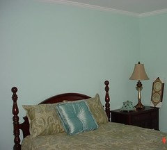
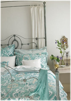
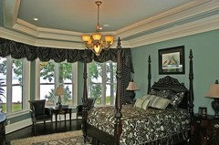
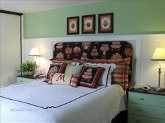
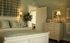
    Here are a few insp. pics


  • kailleanm
    15 years ago

    I love blues and greens but my husband doesn't like "cutesy" colours. I have managed to please him by choosing blues and greens that have a bit of gray undertone to them so they do not come across as pastel. Greens are the trickiest to get right. Here are some favourites of ours (all Benjamin Moore).

    - Smoky Green
    - Green Tint
    - Wedgewood Gray
    - Titanium
    - Natural cream (not a green/blue but is a neutral that links cool/warm colours together nicely and reads very calming)
    - Silver Satin - another soothing gray toned colour that looks very spa like and melds nicely with the colours above.

  • mcps
    15 years ago

    Hi Caligirl!
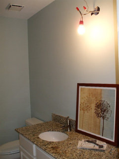
    As promised, here is a picture of my guest bath - just painted today with SW Rainwashed. I love it! Aqua without looking like a cartoon.


  • randita
    15 years ago

    mcps - I love how that color turned out in your bathroom. It looks so relaxing and fresh. I love the SW colors in the Rainwashed strip. I also love the Rain strip and the Sea Salt strip. For colors in the aqua family tending from more green to more blue, there are really great options on those three strips.

  • caligirl_cottage
    Original Author
    15 years ago

    mcps - thanks for the photos they look beautiful. I love that color, that's somewhat similar to the one we've chosen for our bathroom, though I think ours might be more blue, it's hard to tell. I picked up a color chip of Behr's Fountain Spout, and I like that one a lot. We're going to Benjamin Moore again tomorrow to try and figure out this bedroom and a few other rooms once and for all!

  • caligirl_cottage
    Original Author
    15 years ago

    Thanks for all the help and pics, this is really hard. So I went and got Fountain Spout and put it up in the room (just the chip) and I really like it. So then I went to BM to try and find something similar (to keep things simple for my painter who's getting everything else in BM). Anyway, I brought some bigger chips that were similar back and put them up. I left the room and came back a while later and they kind of scare me!

    I really want something quite saturated, not muted in color, but not garish or scary.

    At this point, I'm thinking maybe I just buy the Behr Fountain Spout for this one room. I can't take it anymore!!!!

  • caligirl_cottage
    Original Author
    15 years ago

    I took the plunge and bought 2 gallons of Behr "Fountain Spout"! Holding my breath now until I go and see it all done!

    I have to admit, when I saw the mixed gallon of paint, my heart nearly stopped, it looked so wimpy and baby cloud blue, but I know it gets darker when it goes on the walls and dries.

    Breathe!

  • ttodd
    15 years ago

    Caminnc & anyone else,

    I don't want to highjack the thread but may I pick your brain re: the 1st & 2nd pic's that Caminnc in her response?

    Do you think that the walls in the 1st inspiration pic are white or the palest shade of blue just hinting at blue?

    2nd pic: Would it be entirely too overwhelming if I had aqua colored walls AND summer bedding in the same shade (it has a tiny cream pattern all over) if everything else in the rm. is black and black & white in the inspiration pic? What BM or SW paint color would you choose to re-create that color? I am soooooo in love w/ that rm.!

    Caligirl,

    Will be looking forward to seeing the finished wall color.

  • bestyears
    15 years ago

    Hi ttodd,
    I'm not caminnc, but thought I'd chime in...

    In the first pic, I don't think the walls are white, because the curtains that are attached to the bedframe are white, and you can see a contrast.

    I think your idea of aqua walls and summer bedding in the same shade would be incredibly beautiful! That room looks a lot like BM Palladian Blue, which is a popular well-loved color.

  • patricianat
    15 years ago

    Mica, Pratt & Lambert; Rainwashed, Sherwin-Williams.

  • caligirl_cottage
    Original Author
    15 years ago

    Oh-KAY, so when I said I was taking the plunge, little did I know the result would be a swimmingpool color on my walls! I literally said "EEEK" when I walked in the room.

    Starting over now.

    Next time will use the sample pots!

  • terezosa / terriks
    15 years ago

    I love Devine Paints "Almond", which a bluish, greenish, grayish color and very spa like.

  • patricianat
    15 years ago

    LOL, Caligirl, I did the same thing with a bathroom and it looked like a swimming pool or a spa-wide room. I had to get wallpaper with texture to stabilize the room. LOLOLOL.

  • decor64
    15 years ago

    SW Rain is very nice.

  • ttodd
    15 years ago

    That's how I felt when I tested the SW Glimmer (1 up from Tidewater) on my walls mixed at only 50% (& I'm a color kind of girl)! Your description of a swimming pool is right on. I couldn't put my finger on the feeling but that's what it is! I got Tidewater to put on the ceiling - glad I didn't go all the way w/ both colors! I will say that the Tidewater looks great on the ceiling w/ an off-white but my hallway is painted the same way so I knew that I'd like that.

  • jaymielo
    15 years ago

    You know, now that you mention it, my Master might be a swimming pool. Egads! I hope that image passes before we move in.

  • caligirl_cottage
    Original Author
    15 years ago

    I wish I could take a pic and download it for you all to see. It's quite shocking and this was in low light. I can't imagine what it looks like in the bright of day!

    I'll check into some of the other colors. I think when I said "spa-like" that was misleading, I really do want something quite saturated with color, not muted. I just can't put my finger on the right combo of blue and green for a beautiful aqua (read NOT swimming pool) color.

    Thanks for the suggestions though, I'm off to check them out.

  • ttodd
    15 years ago

    It really stinks when those bright crisp blues look so good in pictures, ad's & mag's & then are so shocking on the walls. That's happened to me quite a few times w/ blue - especially the MS blues when SW used to carry her line. So beautiful in the brochures - so shocking on my walls (they look good on my ceilings though)!

    I think someone else mentioned Farrow and Ball & I would def. check them out for blues. Since they still manufacture their paint in an old-fashioned traditional way (w/ natural earth pigments) the colors come out so soft & beautiful. One of my favorites is Folly Green. All of their colors are so very livable.

    In other lines of paint I'd suggest looking only at those colors that fall w/in historical colors but that's just my opinion.

    I on the other hand traipsed back to SW today & picked up samples of Requisite Gray and Backdrop. I am so pleased! Despite being grayish browns, my new aqua bedding looks sooooo good against it (as will my gray flannel bedding & brown faux fur). At least I think it will - I still have 1 more King sham to get before being completed. It does not however look good w/ my aqua striped bureau that I just got done painting!!!!! Can you say re-do?!