


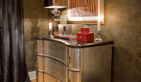
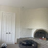
RH Silver Sage in a low-light room
redbazel
13 years ago
Featured Answer
Sort by:Oldest
Comments (16)

ttodd
13 years ago
graywings123
13 years agoRelated Professionals
Mount Vernon Interior Designers & Decorators · Belle Glade Interior Designers & Decorators · Rosaryville Interior Designers & Decorators · Woodbury Furniture & Accessories · Chaska Furniture & Accessories · Hawthorne Furniture & Accessories · Port Chester Furniture & Accessories · Temple Terrace Furniture & Accessories · Folsom Custom Artists · Berkeley Window Treatments · Fraser Window Treatments · New Baltimore Window Treatments · Rochester Hills Window Treatments · South Yarmouth Window Treatments · Walnut Creek Window Treatmentsdilly_dally
13 years agobellaflora
13 years agorpal3
13 years agoscanmike
13 years agodash3108
13 years agottodd
13 years ago
Kathleen McGuire
13 years ago
jane__ny
13 years ago PRO
PROLori A. Sawaya
13 years agomaddie260
13 years ago
golddust
13 years ago
redbazel
13 years agobellaflora
13 years ago
Related Stories

KITCHEN CABINETSKeeping Cabinet Color on the Down Low
Give just base cabinets a colorful coat for a kitchen sporting character and a spacious look
Full Story
METAL10 Ways to Add a Silver Lining to Your Interiors
Let your home shine this summer with a host of shimmery treasures
Full Story
SELLING YOUR HOUSE10 Low-Cost Tweaks to Help Your Home Sell
Put these inexpensive but invaluable fixes on your to-do list before you put your home on the market
Full Story
ACCESSORIES8 Low-Cost Luxuries With a Big Payoff
Consider the small stuff — like switch plates and throw pillows — to give your home a touch of class
Full Story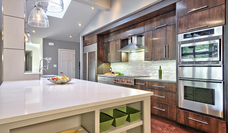
KITCHEN COUNTERTOPS7 Low-Maintenance Countertops for Your Dream Kitchen
Fingerprints, stains, resealing requirements ... who needs ’em? These countertop materials look great with little effort
Full Story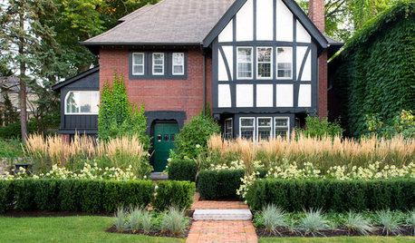
LANDSCAPE DESIGNHow Low Can Hedges Go? Discover Unusual Garden Borders
Short enough to step over, high enough to be a stretch ... check out these radically different hedge styles and tell us your opinion
Full Story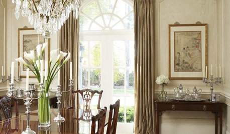
DINING ROOMSAlluring Lighting for a Traditional Dining Room
Show dishes in their best light and set a beautiful mood with classically elegant chandeliers, sconces and pin lights
Full Story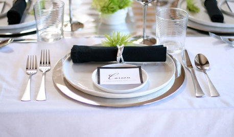
ENTERTAININGA Place for Everything: Beautiful Ways to Style Your Table
Polish your silver and pull out your china as we look at how tables were laid out traditionally and how they shine now
Full Story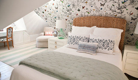
ATTICSRoom of the Day: Awkward Attic Becomes a Happy Nest
In this master bedroom, odd angles and low ceilings go from challenge to advantage
Full Story
ttodd