


Can someone explain about lightening a paint color by percentages
sis2two
9 years ago
Featured Answer
Comments (29)

yayagal
9 years ago
lazy_gardens
9 years agoRelated Professionals
Glenbrook Interior Designers & Decorators · Queens Interior Designers & Decorators · Struthers Interior Designers & Decorators · Charlotte Furniture & Accessories · Medford Furniture & Accessories · Springdale Furniture & Accessories · Alpharetta Furniture & Accessories · San Diego Furniture & Accessories · Westport Furniture & Accessories · Fort Washington Lighting · Red Bank Lighting · Suitland Lighting · Ferndale Window Treatments · Huntington Beach Window Treatments · New Baltimore Window Treatmentstheclose
9 years agolazy_gardens
9 years ago PRO
PROLori A. Sawaya
9 years agosis2two
9 years agoCEFreeman
9 years ago- PRO
Lori A. Sawaya
9 years ago lazy_gardens
9 years ago- PRO
Lori A. Sawaya
9 years ago CEFreeman
9 years ago- PRO
Lori A. Sawaya
9 years ago CEFreeman
9 years ago
williamsem
9 years agotomatofreak
9 years ago- PRO
Lori A. Sawaya
9 years ago - PRO
Lori A. Sawaya
9 years ago tomatofreak
9 years agolazy_gardens
9 years ago
Bunny
9 years agowilliamsem
9 years ago- PRO
Lori A. Sawaya
9 years ago tomatofreak
9 years ago
Jessica V
6 years agosis2two
6 years agoBunny
6 years agolast modified: 6 years agoBunny
6 years agolast modified: 6 years agosis2two
3 years ago
Related Stories
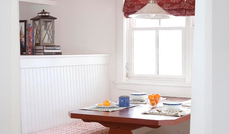
KITCHEN DESIGNKitchen Banquettes: Explaining the Buffet of Options
We dish up info on all your choices — shapes, materials, storage types — so you can choose the banquette that suits your kitchen best
Full Story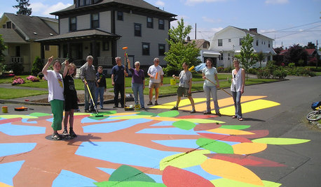
COMMUNITYCommunity Building Just About Anyone Can Do
Strengthen neighborhoods and pride of place by setting up more public spaces — even small, temporary ones can make a big difference
Full Story
PETSWhat Chihuahuas Can Teach Us About Interior Design
Who knew these tiny dogs could be such a huge fount of design tips? Houzzers did
Full Story
WORKING WITH PROS10 Things Decorators Want You to Know About What They Do
They do more than pick pretty colors. Here's what decorators can do for you — and how you can help them
Full Story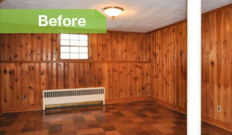
PAINTINGKnotty to Nice: Painted Wood Paneling Lightens a Room's Look
Children ran from the scary dark walls in this spare room, but white paint and new flooring put fears and style travesties to rest
Full Story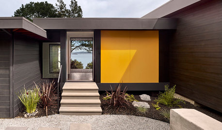
BUDGETING YOUR PROJECTConstruction Contracts: What to Know About Estimates vs. Bids
Understanding how contractors bill for services can help you keep costs down and your project on track
Full Story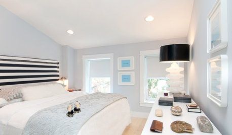
BEDROOMSGuessing Game: What Might Our Bedrooms Say About Us?
For entertainment only; actual accuracy may vary. Always don fun goggles and engage your imagination before playing!
Full Story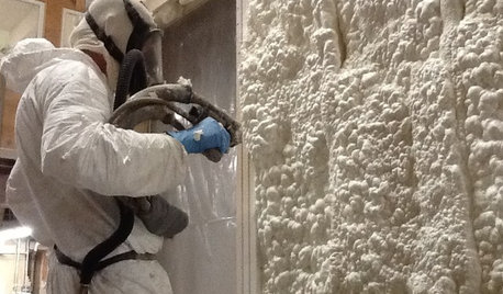
MATERIALSInsulation Basics: What to Know About Spray Foam
Learn what exactly spray foam is, the pros and cons of using it and why you shouldn’t mess around with installation
Full Story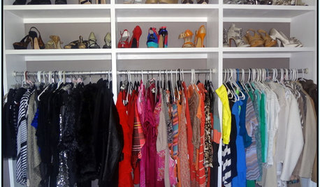
STORAGE5 Tips for Lightening Your Closet’s Load
Create more space for clothes that make you look and feel good by learning to let go
Full Story
CONTRACTOR TIPSBuilding Permits: What to Know About Green Building and Energy Codes
In Part 4 of our series examining the residential permit process, we review typical green building and energy code requirements
Full Story

Lori A. Sawaya