


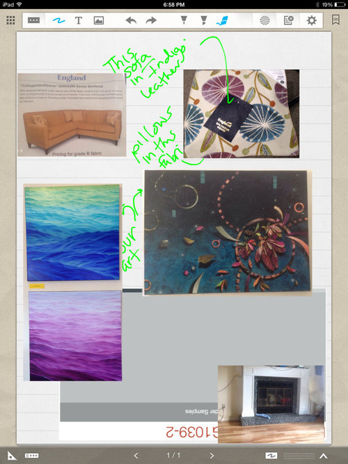
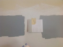
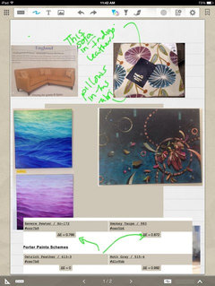
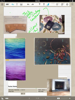
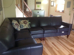
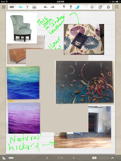
Not sure paint works, help with color? Pics!
williamsem
9 years ago
Featured Answer
Comments (32)

Annie Deighnaugh
9 years ago
gr8daygw
9 years agoRelated Professionals
Evanston Furniture & Accessories · Fort Wayne Furniture & Accessories · Jacksonville Furniture & Accessories · Kearny Furniture & Accessories · Peachtree City Furniture & Accessories · San Diego Furniture & Accessories · Topeka Furniture & Accessories · Murray Furniture & Accessories · Ashburn Custom Artists · Aurora Window Treatments · Edmond Window Treatments · Greensboro Window Treatments · Ridgewood Window Treatments · Stanton Window Treatments · Woodridge Window Treatments
yayagal
9 years ago
williamsem
9 years agoSparklingWater
9 years agochesters_house_gw
9 years agowilliamsem
9 years ago
justgotabme
9 years agooaktonmom
9 years agojakefield
9 years agosumac
9 years agowilliamsem
9 years agooaktonmom
9 years agowilliamsem
9 years agoSparklingWater
9 years agonosoccermom
9 years ago
raee_gw zone 5b-6a Ohio
9 years agoAnnie Deighnaugh
9 years agoAnnie Deighnaugh
9 years agowilliamsem
9 years agoAnnie Deighnaugh
9 years agooaktonmom
9 years agowilliamsem
9 years agonosoccermom
9 years ago
Bunny
9 years agobrightm
9 years agowilliamsem
9 years agowilliamsem
9 years agoyayagal
9 years agowilliamsem
9 years agoraee_gw zone 5b-6a Ohio
9 years ago


Related Stories

COLORPaint-Picking Help and Secrets From a Color Expert
Advice for wall and trim colors, what to always do before committing and the one paint feature you should completely ignore
Full Story
STUDIOS AND WORKSHOPSYour Space Can Help You Get Down to Work. Here's How
Feed your creativity and reduce distractions with the right work surfaces, the right chair, and a good balance of sights and sounds
Full Story
EXTERIORSHelp! What Color Should I Paint My House Exterior?
Real homeowners get real help in choosing paint palettes. Bonus: 3 tips for everyone on picking exterior colors
Full Story
COLORPick-a-Paint Help: How to Create a Whole-House Color Palette
Don't be daunted. With these strategies, building a cohesive palette for your entire home is less difficult than it seems
Full Story
DECORATING GUIDESCould a Mission Statement Help Your House?
Identify your home’s purpose and style to make everything from choosing paint colors to buying a new home easier
Full Story
KITCHEN DESIGNDesign Dilemma: My Kitchen Needs Help!
See how you can update a kitchen with new countertops, light fixtures, paint and hardware
Full Story
HOUZZ TOURSMy Houzz: Saturated Colors Help a 1920s Fixer-Upper Flourish
Bright paint and cheerful patterns give this Spanish-style Los Angeles home a thriving new personality
Full Story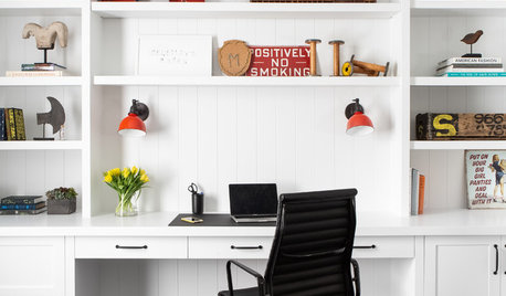
REMODELING GUIDESKey Measurements to Help You Design the Perfect Home Office
Fit all your work surfaces, equipment and storage with comfortable clearances by keeping these dimensions in mind
Full Story
MOST POPULAR7 Ways to Design Your Kitchen to Help You Lose Weight
In his new book, Slim by Design, eating-behavior expert Brian Wansink shows us how to get our kitchens working better
Full Story
UNIVERSAL DESIGNMy Houzz: Universal Design Helps an 8-Year-Old Feel at Home
An innovative sensory room, wide doors and hallways, and other thoughtful design moves make this Canadian home work for the whole family
Full StorySponsored
Your Custom Bath Designers & Remodelers in Columbus I 10X Best Houzz
More Discussions


lascatx