


Palimpsest-- color vs. contents-based rooms.
In an earlier thread you referenced color vs. contents based rooms. This was interesting, and I was wondering if you would elaborate more on this. I seem to lean toward deeper colors in my rooms. However I love antique furniture which I don't want to detract from. I could not even imagine my rooms in white although it sure would be easier for me than picking colors. Sometimes I feel I have too many colors. I would really like to hear more about this subject. Thanks so much.
Comments (41)

palimpsest
12 years agoLet's see. This is kind of hard to explain but this is what it means to me. I will show some pictures then.
Paint based means the paint color of the room takes precedence over the actual furniture and other contents. To me, almost any room that has accent walls or more than one real "color" on the walls is paint based unless the contents of the room are Very Strong. Also, almost any room that has neutral furniture and rugs of the brown taupe beige variety, which is an awful lot of people's rooms--this room becomes paint based when there is any other non-neutral color on the walls.
Contents based means that the wall color takes a back seat to the actual contents of the room. This means that the furniture may be more interesting, more colorful etc., and the walls are more of a background to highlight it. The walls can still be a strong color if the contents are particularly strong.
Contents based, almost monochromatic. This is Mariette Himes-Gomez who almost always does white rooms.

Jamie Drake. Uses a lot of color but this room is still contents based:

Jamie Drake. Paint based to the extent that the "room" is the color of everything.

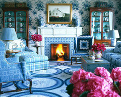
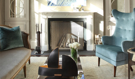
Miles Redd: contents based with an intense wall color:very significant contents in this room.

Paint based with a similar wallcolor. Furniture could be practically anything. The difference between this one and the Miles Redd is very subtle but even though there is some interesting stuff in *this room, it is the wall color that sets the tone, with the exception, perhaps of that little group of contents to the right of the fireplace.
{{!gwi}}Paint based:
{{!gwi}}Perfect example of a typical paint based scheme: You could photoshop any color on these walls and it would change the room. The furniture is neutral (to the point of blandness imo--nothing wrong with it, but it doesn't make any kind of particular statement).
{{!gwi}}Related Professionals
Hercules Interior Designers & Decorators · Mount Laurel Interior Designers & Decorators · Ridgefield Park Interior Designers & Decorators · Whitman Interior Designers & Decorators · Franklin Furniture & Accessories · Huntersville Furniture & Accessories · Owensboro Furniture & Accessories · Toledo Furniture & Accessories · Alpharetta Furniture & Accessories · Sudbury Furniture & Accessories · Wellesley Furniture & Accessories · Central Falls Custom Artists · Fairview Shores Custom Artists · Maywood Custom Artists · Boston Window Treatmentssis2two
Original Author12 years agoPalimpsest--Thank you so much for taking the time to explain this to me. It makes more sense and the pictures really help me to understand the concept.
nancybee_2010
12 years agoI'd like to thank you too. I've learned so much from your posts and threads- thanks for sharing your knowledge.
User
12 years agoThis is interesting and your visuals are fantastic. I'm just wondering...like styles, do people (or designers) tend to naturally lean towards a specific base as a preference? Or when designers are creating a space, do they say, ok we're going to do a paint based room or we're going to do a contents based room? I would imagine if it's not, it could be something that makes the room look out of balance, right? (does that makes sense?)
sis2two
Original Author12 years agoThat is a good question, lukkiirish. I would be interested in knowing that myself.
amysrq
12 years agoIt's all about the budget. If you have the dough for Mariette Himes Gomez, you can do the contents-based room...and white walls.
palimpsest
12 years agoPaint is the less expensive way to add personality to a room. My friends in the commercial interiors biz used to say "There's no budget, so the project is all paint."
If you think of your first apartment where you did not have much in the way of furniture, let alone interesting furniture, and you were limited to white walls, it was pretty dull right? The cheapest way to add something to this was to paint and repaint white before you moved out, rather than wait for your contents to come together.
A room with interesting contents can go either way--the Mariette Himes Gomez way, where everything stands out against the white backdrop--or the Miles Redd way, where the contents are strong enough to hold their own against a rich color.
By the way I have heard that Mariette Himes Gomez *achieves* that super monolithic "white" backdrop by using a different white on all four walls and ceiling, if necessary.
On the other hand, paint-based in the hands of Jamie Drake could get very expensive, the way he goes about it. So the generalities don't always hold true.
The generality about budget does not always hold true, but it generally does. If you don't have budget, you can do it if you have a *lot of patience and a good eye. I have gotten some real bargains over the years, by sometimes *waiting years to make a pair of something or to reupholster something--or foregoing a vacation or the like to get something done for the house.
sis2two
Original Author12 years agoThanks guys. I guess that's why pottery barn uses white backgrounds in their catalogs since they are actually trying to sell their " contents " so to speak.
User
12 years agoAgain, very interesting. It's something I'm going to think about now, every time I see a room.
htnspz
12 years agolukkirish, I think that's a very good observation. As a designer, I do not think about doing a color vs content room. For me, they are just two parts of a very large puzzle. The most well balanced room such as the Miles Redd rom is one that has both and is such that if you took away one part such as the wall color, the room would feel unbalanced.
And balance is still only one of the principles of design.htnspz
12 years agolukkirirsh, The way I was taught is that the very first start of a room is a concept. Some of you are more familiar with the idea of a theme. It's sort of like that. Then, we start thinking about floor plans and so on. If we are trying to do a serene space, then even the floor plan will likely lack in diagonal (active) type lines. This concept lies in every part of the design. Then, there is usually an order of operations that is followed such as the furniture selection, color palette and art and accessories (not necessarily in that order).
This is where there can be a hierarchy because a room that is serene, may have less saturated colors with an emphasis on texture to give it life.
Still, it is the collective whole that is important and that lies within the concept.palimpsest
12 years agoI agree that there is much more to the whole process but to me there seems to be two basic ways that wall color selection can have an impact on the whole by being either predominant in the scheme or allowing the contents to take center stage. It is but one small part of the design process.
htnspz
12 years agoFor me, it's jarring when it's just about the wall color if there are not contents to balance it out.
I do see what you are saying if you are trying to make it really simple for others to grasp but I guess I felt like the whole picture was missing. I pick the color palette based on how I want a room to feel not because I want to show off the contents. That's why I explained the part about the concept.Lukkiirish, sorry about your name again! Geez, how hard is that?
palimpsest
12 years agoI think its very jarring if the contents are not there to balance it out, and I think it is one of the problems with people choosing a wall color.
I don't think most people choose a palette, I think they buy furniture and say "Okay, now what?" Or worse, paint, and then say "Okay now what?" Worse because there are thousands of paint colors, and then they may end up having a dozen or less choices when it comes to upholstery on something they like, and can afford. We see it all the time "I picked this paint color cos I loved it" "I bought this furniture, now how do I make it work?"
I should clarify that "Paint based" vs. "Contents based" is *not a design process concept--meaning it is *not a decision about how to go about a designing a room. Rather, it is *one of the ways of analyzing the Outcome.
Lets take a look at the last room in particular which is a very typical outcome. The furniture is all neutral, there is no pattern in the furniture itself, and it is either beige or dark brown/black.
The wall color starts out at whatever that is at the far right--it looks like it matches the carpet, and the room is pretty dull. So the homeowner picks a color, almost any color, and paints the walls. Same furniture, same carpet but bright red. Gets a couple pillows that are red, whole new look to the room --next year do it green and get some green pillows and a new look for the cost of some paint and accessories.
Do I think this *works*? No, generally not. I think it went from being a dull room with all beige walls to a dull room with a red wall. Why? Because there is no palette, there is no concept, there is no design process. It's picking a paint color completely independent of the contents, because you *can. There is no balance in the room and there is no collective whole.
So please don't interpret that I was putting this forward as any kind of process, but rather as a way of analyzing how whatever was done turned out.
edie_thiel
12 years agoI am learning SO much from all of you. This is such an interesting topic
Something that I've wondered about seems related design concept, but not necessarily in the way that has been discussed here. I live in a "small" home - 1200 sq. feet (which I think used to be "average" when I was growing up) - so I don't just want to fill the space; I want to keep items from my travels, include pieces of artwork that I really like, incorporate pieces of furniture that I find pleasurable to look at and touch. As the years go by, I'm becoming more picky and practical about what gets to "live with me," so that I don't have to rent storage space or spend my life cleaning things. I hate clutter, but I'm not a true minimalist. Everything does have a place, and if I don't have display space, I "rotate" accessories that have meaning to me.
So, I don't know if I could work with a designer that says, "THIS one item was our inspiration piece!" Or, "HERE is the concept for this space."
What kind of decorating mindset would this be? I think I once saw Nate Berkus on Oprah, and he was expressing this idea, also.
So, how do the rest of you decorate your own space? Overall concept? Design style such as "Transitional"? Inspiration piece? Practical lifestyle - kids/pets?
htnspz
12 years agoKees_Lover- For clarification, as designers, we don't (and shouldn't) give you the concept unless you request it. In most ways, the concept is a collaboration between a client and a designer. The concept is useful to make sure there is harmony between all facets of the design process. In your case, an example of a concept would be to incorporate your worldly possessions into the design. It would be integral to the design.
Also, very rarely is one item is rarely the one inspiration piece. A favorite piece may become a focal point, or help with a color palette but a concept is much bigger than that.
Programming is also a huge part of what we do and that includes, style, pets, number of people etc.rosesstink
12 years agoThis is all very interesting!
In answer to Kees: I decorate with (around?) the things I like. Windows with good light get plants, whether it is "good design" or not, because I like plants. My rooms have a lot of natural wood and shades of green because they please me. I'm drawn to mission style furniture and that whole aesthetic but I don't limit my choices to only mission. I have never "furnished" a room from scratch. Unless you count my first apartment - furnished with whatever used furniture was available. I can't even imagine dumping all my stuff and trying for perfection. I buy things I like and then work new things into what I have.
jockewing
12 years agoPal,
This reminds me of the "are light colors (insert word that shall remain nameless)" thread that I started about a month ago. I think you are really explaining what I was trying to say in that thread.
I used to have more brightly colored walls because I didn't have the money to buy nice furnishings, and the wall color helped "disguise" that fact. Now that I can afford better stuff and I'm slowly accumulating some nicer furnishings, I find that I am craving ligher and cooler colors to create a soothing backdrop for my things.
Do you find that paint-based schemes tend to use warmer colors? I am also noticing the fact that my preferences have shifted over time from warm colors to almost exclusively cool colors.
palimpsest
12 years agoI think that paler colors tend to read cooler, generally.
With regards to designers and "schemes", "themes", and "inspiration pieces" are the brainchild of the design Media. It's really an over-simplification to give a good sound bite to a TV program.
Concept is a more all encompassing word, but real design programming may have a dozen "bubbles" or parameters that influence the outcome.
I think in a sense if the "contents" you are working with are good: fine furniture, or well upholstered furniture, artwork that was purchased because of content rather than for its color palette (there is nothing wrong with either) and accessories that are strong and unique, these may drive the wall color to a very tight group of possibilities (or white).
If the furniture is all very neutral and accessories and art will be purchased for color, it may leave a very open ended, large number of possibilities Paint driven scheme. (and the results still may not be very cohesive because of the neutrality of the furnishings).
Jamie Drake is really *color driven* and does exceptionally tight palettes that are very difficult and expensive to pull off.
lavender_lass
12 years agoIt seems to me that the best room (IMHO) is the Miles Redd. A similar look might be achieved, by taking a few risks and mixing in patterns with the colors. The pattern on the rug and pillows, along with the bold color for the walls and drapes, mixes well with the furnishings and the lamps and other accessories. It's a very collected look, while the first picture seems rather vanilla.
The first picture has a very monochromatic look, where only the art really seems to pop, which seems similar to the painted wall effect...but maybe a little more high dollar. The second room (the pale blue) seems more interesting, not just because of the wall color, but the furniture, lamps, and colors used give it a lot more personality.
What am I missing in the first room?
dianalo
12 years agoIt's funny, but I do not enjoy Miles Redd's room much at all. While it may have nice things in it and the colors are fine, I don't like how they are pulled together. I think it is the rug and pillows that ruin it for me. They don't seem to relate to the room well. I look at it and feel like it needs to stop shouting, if that makes any sense.
The orange couch ruins the orange room as well. A strong color like on the walls needs to be handled better (like in the other pic with an orange wall). There is too much orange on orange in there. It looks like a paint bomb went off.
The artwork in the top one looks like it does not belong in that space. It has entirely different vibe than the room.
I am not crazy about the wall color in the Jamie Drake room with the blues. The wall color and the blue accents are off when paired together. Either color is fine, but not as a combo.
I am trying to be more bold with color in our reno. I have gone with stronger colors than in our last house and it is fun. I don't want the contents to get overshadowed, but I guess I won't know that until everything is in its place and I can see it as a whole. I know our last house was contents driven and I think the wall color will mix it up a bit here. I did not want to recreate our last place as this was a chance to have a fresh look. I think I could have done white, light colors or bold colors and worked those with our contents. The colors would have changed the vibe more than changing the contents.
I'd be interested to know which pole, paint or contents, drove our design when it is all done... I'd guess both, but it could be paint this time....palimpsest
12 years agoThe Mariette Himes-Gomez room and the All orange Jamie Drake room are actually the most difficult to achieve, and they both have a limited audience.
The most expensive room in terms of design services is probably the first room, with the Miles Redd room being the most expensive in terms of overall budget. (Fine Art excluded, who knows what the Lichtenstein in the M H-G room cost).
Look at the white in the Mariette Himes-Gomez room: She experiments with white paint to get a super monochromatic white that doesn't appear different on different walls, like a typical single shade would. Look at the corners, and compare it to the interactions of the orange at the corners. There is a shadow, sure, but the distinction between planes is minimized. I heard she may use a different "white" on each wall and ceiling to achieve this.
The saturated near monochromatic of Jamie Drake's orange room is also very hard to do. If one of the oranges is just a bit off, you have a disaster. It would be much easier to put a purple sofa in there and call it a day than to get those subtle shifts of orange that are so closely linked.
The all out eclecticism of Miles Redd's room just takes some guts and lots of money. There is a program there in the "anything goes" and it takes a discerning eye to make it look so Unintentional.
The last two rooms are the easiest to do, but the least successful from an integrated design perspective. There is nothing that really ties the paint color to the contents at all, except a couple of accessories. You could photoshop any accent color on those walls and get a look that was different...but essentially the same thing. There isn't much design there. This might work out for people who like to change colors and can't commit to anything non-neutral for upholstery, but its not a look that is very integrated (or satisfying, to my eye)
kitchendetective
12 years agoInteresting, Diana. The Miles Redd room is my favorite of the examples because it is the one in which I could live the longest without becoming either bored or agitated. I love his mixes of colors and of styles. While I don't love every single item in that room, I do like most, and I think many are downright beautiful. The colors are rich and varied. His rooms almost always draw me in. I could see changing out the paint for another of the saturated colors in the furnishings, still having a dramatic and daring room, and yet managing a big change at the same time. It's an open design, that is, capable of accepting some big changes without losing the overall effect. It's a room where paint and content are both strong contributors, but I'd have to say content wins out.
OT: Kees_Lover, Is that short for âÂÂKeeshond LoverâÂÂ? If so, I love that breed, too. WeâÂÂve had six of them over the years. Would have made life easier if I had decorated in wolf gray, furry textures. LOL.
edie_thiel
12 years agoKitchen detective,
Yes, for the Keeshond breed. However, I am finding that my white, textured, "beachy" fabric couch has been great at "hiding" fur - since white/gray is the undercoat that sheds the most. LOL! :-)
The whole purpose of my leaving a condo and buying my twinhome 11 years ago was to get this dog. Lots of decorating decisions are currently made due to Beloved Aging Dog (BAD - new acronym - don't think I can use DD :-)). Thought I would keep the blue & mauve carpet selections from 1983 for "just a couple years" - until he outgrew eating grass and throwing it up indoors. Well - that hasn't stopped. Have now decided to put in wood floors, when I can afford it. More on this in a different thread.
User
12 years agohtnspz - thank you for taking the time to explain further, I didn't know you worked in that field too! Very cool. Anyways, the clarification helped to understand it better and no worries bout the name, usually, when it's mistyped, it's spelled "lurk" :c( so you did ok!
Pal-thank you too for expanding and for clarifying as well. Now after reading this thread, every interior picture I see I ask, is this contents based or color based design?
 PRO
PROLori A. Sawaya
12 years ago"With regards to designers and "schemes", "themes", and "inspiration pieces" are the brainchild of the design Media. It's really an over-simplification to give a good sound bite to a TV program."
amen.
petty
12 years agothanks for sharing your knowledge
Here is a link that might be useful: http://www.buysoilpainting.com/
palimpsest
12 years agoThese are color based, similar to Jamie Drake. Diamond Baratta. Not my favorite, they love tight palettes of unrelieved color. Take the live flowers out of this one, for example.
I like the "idea" of their work, but I could not live in it. Very intense, very custom, very expensive. Look at the rag rugs.

User
12 years agoThis thread is fascinating! Thank you Pal for the visuals. I totally see the difference with the visuals.
However, I also found it a little depressing. I love both the 1st MHG room and the Miles Redd room. But, those rooms will never be in my budget, and I fear I am the last room, which I am not attracted to at all. I have a red living room...I had the neutral furniture...none of it special in any way, but it wasn't getting replaced anytime soon...I needed a color I liked that played nicely with surrounding rooms...and ended up with red. I like it. Or I thought I did. Ugh. Now I need to go look at it or pictures of it and see if it's the last room. DH will not be happy about this :-)
palimpsest
12 years agoMaybe you just need to commit a little more to the read and bring in a red accent table or slipcovered chair, more accessories, just to commit more to the red in the contents themselves.

aprilneverends
6 years agoThank you! a great thread, indeed.
Pity pics are gone of course. I'll have to google some of the designers(the ones I don't know or either don't remember), won't be exact rooms but maybe I'll get a better idea.
leela4
6 years agoOh, yes. Thanks Jennifer for referring to this thread in the other one (how were you helped in gw.) I am always learning here.

Rita / Bring Back Sophie 4 Real
6 years agoI am so glad this thread popped up. A great new lens for thinking about interiors.
dragonflywings42
6 years agoA wonderful example of bringing back an older thread when doing so is useful and thought provoking. (And not to sell lawn fertilizer) Thank you Jennifer

Allison0704
6 years agolast modified: 6 years agoGood thread to read every now and then. Now to find new thread where it was linked.
*edited - Can someone link the other thread? No luck searching.


Saypoint zone 6 CT