


warm vs cool beige paint
lovetoshop
14 years ago
Sort by:Oldest
Comments (10)
Related Stories
BROWNBeige to Almost Black: How to Pick the Right Brown
Warm your home with paint the color of lattes, espresso and chocolate
Full Story
MORE ROOMSGreat Space: Unique Wood Wall Warms Up an Entryway
Designer Shari Misturak solves an interior design challenge with a walnut wall installation inspired by cityscapes
Full Story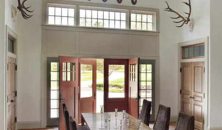
NEUTRAL COLORSColor Guide: How to Work With Beige
If you yawn and dismiss it, you're missing out on beige's infinite subtleties and the possibilities it brings to room designs
Full Story
EXTERIOR COLORExterior Color of the Week: 7 Ways With Warm Gray
See why this hue can be the perfect neutral for any house
Full Story
MOST POPULARMust-Try Color Combo: White With Warm Off-White
Avoid going too traditional and too clean by introducing an off-white palette that brings a touch of warmth and elegance
Full Story
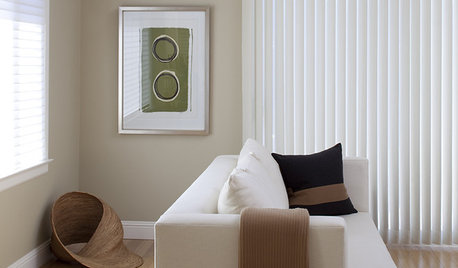
DECORATING GUIDESWarm Up Your Walls With Woven Wallcovering
Create a Rich Base of Texture With Grasscloth, Linen and More
Full Story
DECORATING GUIDESColor of the Week: Decorating With Warm Gray
Tired of tan? Getting gloomy from cool gray? Make warm gray your new go-to neutral
Full Story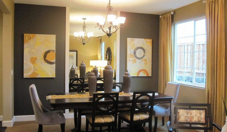
NEUTRAL COLORSColor Combos: Gray and Beige
See how to add colorful personality when pairing two neutral hues
Full Story
HOUZZ TOURSHouzz Tour: Builder's Beige Gets a Makeover
Home goes from boring to lively with color, furniture and textures to fit a family's personality
Full Story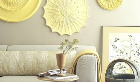


jovtfam4
lovetoshopOriginal Author
Related Professionals
Arkansas Interior Designers & Decorators · Wareham Interior Designers & Decorators · Augusta Furniture & Accessories · Portage Furniture & Accessories · San Elizario Furniture & Accessories · Eureka Furniture & Accessories · Mahwah Furniture & Accessories · Melbourne Custom Artists · Springville Custom Artists · Batavia Lighting · Palm Desert Lighting · Pearland Lighting · Tukwila Lighting · Clinton Window Treatments · Rockford Window Treatmentsjovtfam4
lovetoshopOriginal Author
trisha57_ny
Lori A. Sawaya
lovetoshopOriginal Author
juddgirl2
lovetoshopOriginal Author
bnaarrd_gmail_com