


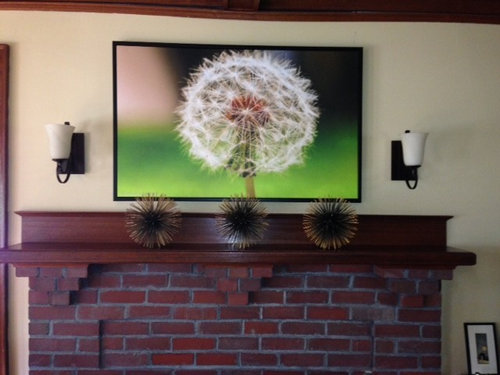
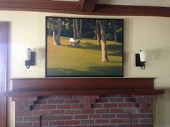
Messing with my mantel/art/arrangement
Sueb20
9 years ago
Featured Answer
Sort by:Oldest
Comments (50)

teacats
9 years ago
Olychick
9 years agoRelated Professionals
Middle Island Interior Designers & Decorators · Nashville Interior Designers & Decorators · Washington Interior Designers & Decorators · Augusta Furniture & Accessories · Reno Furniture & Accessories · Alpharetta Furniture & Accessories · Aventura Furniture & Accessories · Fountainebleau Furniture & Accessories · Mill Valley Furniture & Accessories · Wilmington Furniture & Accessories · Kendall Furniture & Accessories · Carson Furniture & Accessories · Dallas Window Treatments · Oklahoma City Window Treatments · Palm Beach Gardens Window Treatmentslazydaisynot
9 years agoannkh_nd
9 years ago
arlosmom
9 years agoFun2BHere
9 years ago
sas95
9 years ago
Errant_gw
9 years ago
tinam61
9 years ago
Sueb20
9 years ago
Annie Deighnaugh
9 years ago
Irish2
9 years agonosoccermom
9 years agoFun2BHere
9 years agoSueb20
9 years agoOlychick
9 years ago
mtnrdredux_gw
9 years agoSueb20
9 years ago
stolenidentity
9 years agomtnrdredux_gw
9 years agoSueb20
9 years agonanny2a
9 years ago
justgotabme
9 years agobeekeeperswife
9 years agoyayagal
9 years agomclarke
9 years agoSueb20
9 years agooaktonmom
9 years agomtnrdredux_gw
9 years agomclarke
9 years agoSueb20
9 years agojustgotabme
9 years agopeony4
9 years agojustgotabme
9 years ago
Bunny
9 years agomboston_gw
9 years agostolenidentity
9 years agoSueb20
9 years agoSueb20
9 years agoSueb20
9 years agoOlychick
9 years agooaktonmom
9 years agoSueb20
9 years agopugga
9 years agoUser
9 years agoSueb20
9 years agonosoccermom
9 years agoBunny
9 years agosis2two
9 years ago


Related Stories
DECORATING GUIDES11 Tips for Picture-Perfect Mantel Styling All Year
The garland is gone; the holly is history. But you can keep your mantel arrangements artful no matter which decorations you choose next
Full Story
LIFEAnatomy of a Family-Size Mess
Study your home’s dumping grounds to figure out what organizational systems will work — then let yourself experiment
Full Story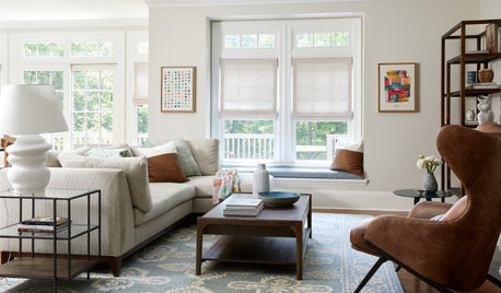
HOUSEKEEPINGHow to Relax and Put Housework in Its Place
If household disarray is making you stressed and unhappy, try approaching it with a different point of view
Full Story
MOST POPULARA Fine Mess: How to Have a Clean-Enough Home Over Summer Break
Don't have an 'I'd rather be cleaning' bumper sticker? To keep your home bearably tidy when the kids are around more, try these strategies
Full Story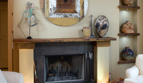
DECORATING GUIDESDecorating the Mantel: Create a Fireplace Focal Point
If the "haphazard disarray" school of style has your mantel as a student, consider these techniques for a more artfully balanced arrangement
Full Story
DECORATING GUIDESCasual Wall Art Arrangements Show Deliberate Style
No time or desire to carefully plot a wall-art arrangement? Grab a hammer and throw tradition to the wind
Full Story
ART8 Ways to Arrange Artwork
Find the best way to configure your pictures, on or off the wall
Full Story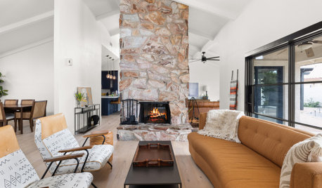
DECORATING GUIDESHow to Get Your Furniture Arrangement Right
Follow these 10 basic layout rules for a polished, pulled-together look in any room
Full Story
HOLIDAYS7 Quick and Easy Indoor Halloween Decorating Ideas
Make a pumpkin family portrait — no carving! — and other simple but eye-catching fall tabletop and mantel arrangements
Full Story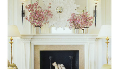
DECORATING GUIDES10 Inspired Ways to Refresh Your Mantel Now
Postholiday blahs don't stand a chance on your mantel when you incorporate these ways to accessorize and light it
Full StoryMore Discussions


Sueb20Original Author