


Is there a perfect silver blue gray paint color???
boystown
12 years ago
Featured Answer
Comments (26)

les917
12 years agoRelated Professionals
Barstow Interior Designers & Decorators · Portland Furniture & Accessories · Ventura Furniture & Accessories · Walnut Creek Furniture & Accessories · Beverly Hills Furniture & Accessories · Carlsbad Furniture & Accessories · Fountainebleau Furniture & Accessories · Northridge Furniture & Accessories · Central Falls Custom Artists · Seal Beach Custom Artists · Diamond Bar Lighting · Green Bay Lighting · Arden-Arcade Window Treatments · Berkley Window Treatments · La Jolla Window Treatmentsdecor64
12 years agosunshinedog
12 years ago
msrose
12 years agoaunttomichael
12 years agodakota01
12 years agosunshinedog
12 years agorandita
12 years agoboystown
12 years agocrescent50
12 years ago
Lyban zone 4
12 years agoalku05
12 years agoGrace_Nurse
10 years ago
mtnrdredux_gw
10 years agoineffablespace
10 years agoliriodendron
10 years ago
Pipdog
10 years agoms222
10 years agojacqueline5
10 years agoTxMarti
10 years agojacqueline5
10 years agogracie01 zone5 SW of Chicago
10 years agosuska6184
10 years agoPipdog
10 years agoMomMom M
3 years ago


Related Stories
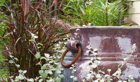
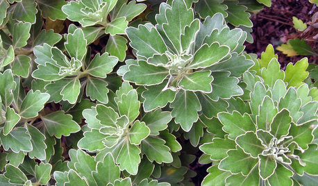
PLANTING IDEASGreat Garden Combo: Silver Sparkles Amid Purple and Blue Foliage
Get the look of this modern foundation planting by focusing on a restrained color palette with tasteful accents
Full Story
BLUE AND GRAY FOLIAGE6 Stunning Silver-Leaf Plants
Bring luster to your garden with these shining examples of silver plants for both sun and shade
Full Story
GRAYChoosing Paint: How To Pick the Right Gray
Which Version of Today's 'It' Neutral Is For You?
Full Story
MOST POPULAR50 Shades of Gray
Gray is hotter than ever, thanks to a hit novel full of risks and dark secrets. Tell us: Which paint shade possesses you?
Full Story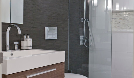
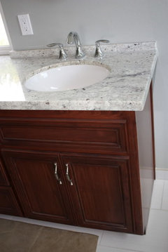
COLORBathed in Color: When to Use Gray in the Bath
Go for elegance and sophistication without going overboard on coolness, using these gray bathroom paint picks and inspirational photos
Full Story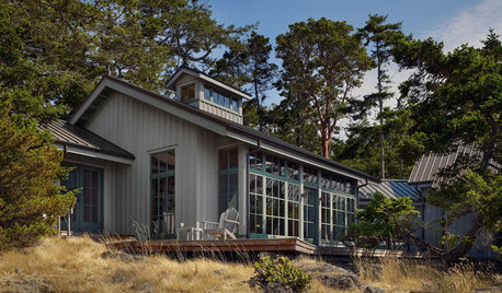
EXTERIOR COLORWhen to Paint Your Home Gray
This perfectly neutral and highly versatile color can create subtle distinctions among exterior architectural elements or stand on its own
Full Story
COLORColor of the Week: April Sky Blue
See how to use this soft neutral hue that’s neither gray nor pure blue
Full Story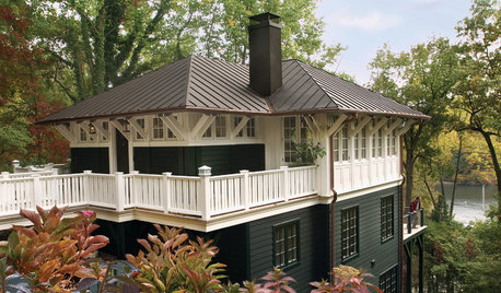
HOUZZ QUIZHouzz Quiz: What Color Should You Paint Your House?
Is white right? Maybe dark blue-gray? Take our quiz to find out which color is best for you and your home
Full Story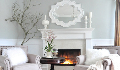
GRAYColor Guide: How to Work With Light Gray
The hottest new neutral can be cool or warm, formal or casual, and feminine or masculine. Talk about versatile
Full StoryMore Discussions


nini804