


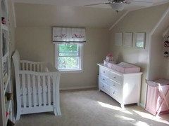
Help Picking Neutral Color
Rob F.
11 years ago
Featured Answer
Sort by:Oldest
Comments (25)

annzgw
11 years agoyayagal
11 years agoRelated Professionals
Nashville Interior Designers & Decorators · Ridgefield Interior Designers & Decorators · Duluth Furniture & Accessories · Jupiter Furniture & Accessories · Lake Zurich Furniture & Accessories · Ventura Furniture & Accessories · Wilmington Furniture & Accessories · Palmetto Bay Furniture & Accessories · Bethlehem Custom Artists · Camp Springs Lighting · Rockland Lighting · Arden-Arcade Window Treatments · Aurora Window Treatments · Riverhead Window Treatments · Baytown Window Treatments
Rob F.
11 years agoUser
11 years ago
susanlynn2012
11 years agosusanlynn2012
11 years agojessicaml
11 years agosusanlynn2012
11 years agojessicaml
11 years agosusanlynn2012
11 years agojuddgirl2
11 years agosusanlynn2012
11 years agojuddgirl2
11 years agoUser
11 years agosalonv
11 years ago
outsideplaying_gw
11 years agosuero
11 years agoRob F.
11 years agosusanlynn2012
11 years agojillthoner
9 years agoRob F.
9 years agobugbite
9 years agosusanlynn2012
9 years agobugbite
9 years ago

Related Stories
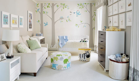
PRODUCT PICKSGuest Picks: How to Furnish a Gender-Neutral Nursery
These cribs, gliders, storage units, lamps and textiles would help create a light and airy nursery for a boy or a girl
Full Story
COLORPick-a-Paint Help: How to Create a Whole-House Color Palette
Don't be daunted. With these strategies, building a cohesive palette for your entire home is less difficult than it seems
Full Story
COLORPick-a-Paint Help: How to Quit Procrastinating on Color Choice
If you're up to your ears in paint chips but no further to pinning down a hue, our new 3-part series is for you
Full Story
COLORPaint-Picking Help and Secrets From a Color Expert
Advice for wall and trim colors, what to always do before committing and the one paint feature you should completely ignore
Full Story
COLORPick-a-Paint Help: 11 Ways to Mine Your World for Colors
Color, color everywhere. Discover the paint palettes that are there for the taking in nature, shops and anywhere else you roam
Full Story
PRODUCT PICKSGuest Picks: Help Your Home Blossom With Floral Decor
Sprinkle hints of spring around your rooms with fabrics, wall coverings and more that recall nature's charms
Full Story
Guest Picks: Give Your Home a Helping of Spring Greens
Celebrate garden growth with this collection of housewares and gardening gear in the shades of budding plants
Full Story
COLORColor Palette Extravaganza: Room-by-Room Help for Your Paint Picks
Take the guesswork out of choosing paint colors with these conveniently collected links to well-considered interior palettes
Full Story
PRODUCT PICKSGuest Picks: Neutral Tableware Eases Us Into Autumn
Work these pieces in with the flatware, glasses and placemats you already have for fall flair without a major overhaul
Full Story
Guest Picks: Neutral Essentials for a Small Space
With furniture that flatters, savvy storage and accessories that maximize space, small rooms can be long on style
Full Story


nini804