Shop Products
Houzz Logo Print
brightm

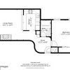
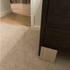
Help picking paint for an odd room

brightm
9 years ago

I tried the paint forum. No bites. So I'll re-package this and try here.

Our house is a 1947 masonry, semi-MCM-style ranch. I'm pretty sure it was custom made as everything is different from anything I've experienced, even in houses of similar vintage.

My two issues are:
--I'm not sure what elements to paint what color
--I'm not sure how much contrast to have between the walls and the trim if I do use different colors

The room is my dressing room/sewing room. (Hopefully...I haven't sewed much in about 25 years but am hoping to start again.) It just got new LVT flooring and I figured this would be a good time to paint it. It's all Swiss Coffee (or something similar, maybe yellower).

We got new white windows at the beginning of the year and all the swiss coffee-ish paint in the house is starting to look mighty yellow. So as we're working our way through rooms, we'll be switching the trim and ceilings at least. My main project for the summer is a kitchen reno, but that's prompting finishing up lots of other projects and starting others. I've chosen Lighthouse (at this point) as my trim color and maybe the only wall color. I thought that would be as good of a 'white' as any to use for trim throughout the house.

The room in question has two masonry walls with white windows (no floor trim). Two interior walls with tongue and groove wainscoting (did I use that right?)--one has a big bulletin board up above that I'll either do away with or cover in fabric, the other has the entry door and built in closets/cabinets that have the same tongue and groove finish. The ceiling is vaulted and has open beams (do you still call them that when they're just small?). The interior and exterior walls both 'stop' at 8 ft and then there's shiplap horizontally (I think) above that to the tallest point.

Needless to say, there are a lot of textures going on. Like I said, the whole thing is one color right now. And I want it to stay light, so I started picking the very lightest of blue-ish whites. But then I realized that I can/should paint some areas 'trim' color and some another color. Then I realized that if I do that, the blue-ish white can be a bit bluer. Then I started to worry how much contrast I need so it doesn't look like the paint was just mismatched. I know the colors don't photograph well, but I think the degrees of contrast did. Or at least well enough for someone with a clue to give me some pointers.

Here is a link that might be useful: album w/more shots of room

Comments (21)

  • oopsie913
    9 years ago
    last modified: 9 years ago

    nice textures though. Such a cool room with those beams! I am one who likes very neutral colors as a canvas so you can change and accessorize around the walls. So lately I love colors like, BM litchfield gray, (ceiling too with a different sheen for beams or diff color for ceiling but beams in wall color, davenport tan is on the same swatch) pale oak (a very pale brown gray, ceiling too with beams your lighthouse color) revere pewter (has a slight green undertone) Good luck!

  • hausfrau61
    9 years ago
    last modified: 9 years ago

    Hi Cal quail
    This is what i did in my odd room. I picket 3 blues that war next to each other from a Color swatch and painted the masonry bricks by hand with a small roller stagerig the 3 colors leaving the grout white just like a brick wahl.Then i jose the medium blue to paint the trims. I left everything als white. Everyone loved this room.

    This post was edited by hausfrau61 on Tue, Jun 3, 14 at 12:37

  • patricianat
    9 years ago
    last modified: 9 years ago

    wrong place.

    This post was edited by patricia43 on Tue, Jun 3, 14 at 13:05

  • ravencajun Zone 8b TX
    9 years ago
    last modified: 9 years ago

    of the color swatches you have I would do the wainscot, all the doors of the closets and the room door in that last darker blue. I would do the trims around the doors and windows in that lightest whiter color. For the walls I would use the top light blue that is on the same swatch as that dark blue of the wainscot.

    I too love the gray shades and those would look good too.

  • Olychick
    9 years ago
    last modified: 9 years ago

    I love those blues, but I think with all the different materials in that room that I would keep it as neutral and monochromatic as possible so they all flow together. Maybe a blue on the ceiling with the beams matching the walls?

    I'm afraid it's going to look like a real hodge-podge if you start painting the elements different colors. Now, it looks cohesive and you don't really notice all of the different materials used.

  • patricianat
    9 years ago
    last modified: 9 years ago

    What oilychick said, and I was going to say that but I have been flamed by every flame thrower here today for common sense statements, so I was afraid to say it but I was always told by my friends and relatives who are in the business, "monochromatic when you have several disparate elements brings them together as one."

  • brightm
    Original Author
    9 years ago
    last modified: 9 years ago

    Thanks all. My initial thought was to do everything in Thawed Out, Coastal Breeze or Calm Waters. Maybe I should go back to that.

    I grew up in a house where the trim was usually the same color as the walls, in some pastel tones. I've come to feel that must not be the 'right' thing to do.

    I'd love to see a pic hausfrau, I'm horrible visualizing things.

    If the wrong place post was directed towards me, I apologize. iIts a little overwhelming to know where to post things here.

    This post was edited by cal_quail on Tue, Jun 3, 14 at 15:28

  • Olychick
    9 years ago
    last modified: 9 years ago

    I think the "wrong place" post was the author stating she'd posted something in the wrong place so she removed it. But we can't remove whole post just the contents. She was just explaining why there was nothing there to read.

  • brightm
    Original Author
    9 years ago
    last modified: 9 years ago

    Thanks olychick. I'm always a bit worried on new forums. :)

  • Annie Deighnaugh
    9 years ago
    last modified: 9 years ago

    I like to start with an inspiration piece from which you can pull colors. I see a pic with blue in it on the wall. Will that be staying?

    In my craft room, I wanted to go neutral so it wouldn't clash with whatever I was working on. I picked a neutral color Formica for my counter top too. And I wanted bright so if would reflect the light in the room.

  • brightm
    Original Author
    9 years ago
    last modified: 9 years ago

    I think that's my problem. I don't know what's going into the room besides my shoe cabinet (tall birch Ikea thing), ironing board, steamer, and covered cat litter box (dark wood-look).

    My sewing cabinet is maple, I think. I'm going to try to refinish it (or have it refinished). I've looked and looked for something new to buy since I hate the style of mine. But I love the function and it's sturdy. So instead of getting something to blend with the rest of my style, I'm going to do something different and make it stand out. I don't know for sure, but I'm thinking glossy white. There's a groove that I can paint an accent color.

    I thought about getting a dresser, but I don't need it space wise. There are built in drawers and shelves in one of the closets. I had all kinds of junk in there before, and I don't want to move it back in.

    I was thinking of a futon or small loveseat or chair sleeper, but after not seeing anything that thrills me, I don't want to just get something for the sake of getting something.

  • Annie Deighnaugh
    9 years ago
    last modified: 9 years ago

    Here's my craft room...certainly bare bones...no interesting textures as in your room.

    How about adding a cutting table or work surface? This was the old dr table from the old house...it's a flip top, so I can flip it up and roll it out of the way when I want, or have a great surface to lay out patterns and such on when I want.

  • brightm
    Original Author
    9 years ago
    last modified: 9 years ago

    What's funny is, main pieces of furniture that I'm resisting putting back in are my mom's dining room table and accompanying bench and chairs (only one chair was in this room). It's the last of my mom's furniture I have. I've held on to it for 16 years, but we have since bought a DR table that's more to scale with our house. Hers is a small, walnut, dropleaf table. Growing up, it was pushed against the wall with the flaps down. It got opened up more for cutting than for dining.

    I do like it. It really needs some TLC though. And the seating even more so.

    I've not figured out how to get rid of them either. I am resisting putting on CL. I don't want to put them in a garage sale. I've thought about taking them to a consignment shop of some kind, but they're in such rough shape, that probably wouldn't do.

    Maybe the answer is that I get them the TLC they need and keep them. At least until I have some other idea for the room and some way to get rid of them. I guess I should at least recover the seating (easy enough to do). Leave the wood alone for now. But put them back in the room and see how it feels.

    Thanks AnnieD. Makes me think that maybe the answer to why this room ended up being the sewing room too is to have mom's stuff there. (Mom=sewing)

  • Annie Deighnaugh
    9 years ago
    last modified: 9 years ago

    :) Mom=sewing for me too. In fact that portrait to the right of the window in my craft room is of Mom. She still helps me with my projects, even though she's gone.

    A dr table that has a drop leaf and isn't in perfect shape sounds exactly like what your room needs for sewing...and being you moms, that's perfect.

  • hausfrau61
    9 years ago
    last modified: 9 years ago

    Sorry no pic we just moved from colorado to florida and everything is in a box sam wehr sorry.You could buy the little sample cans of paint and do a small area so you can see if you would like it. When I saw your room that is what i visualized. .I hope I didn't confuse you more. Good luck you'll do great.

  • brightm
    Original Author
    9 years ago
    last modified: 9 years ago

    What about the ceiling and door and doorframe in lighthouse and everything else in Thawed Out. (top/lightest color on the swatch of three).

    With the ceiling neutral, if I wasn't happy with the wall color or want to change it down the line, I wouldn't have to do the ceiling.

    Another thing to decide...what to do with the shutters. I'd think painting them would be a pain and/or expensive (haven't decided if I'm going to tackle painting or have it done). And they don't thrill me.

    I say take them down. DH says leave them, they're functional (and we've found how much window coverings cost and how NOT fun it is to have them installed on our masonry walls.) That being said, I wouldn't NEED window coverings here at all.

  • TxMarti
    9 years ago
    last modified: 9 years ago

    Annie, I love that table. We used to have a smaller version, it was a chair table but the top was too small to use for a table and the chair part was uncomfortable, so we sold it. I wish I had thought to just put a larger table top on it like yours.

  • brightm
    Original Author
    9 years ago
    last modified: 9 years ago

    Got samples of Thawed Out and Lighthouse today. Both are whiter than the cards.

    I'm undecided about Lighthouse. Will have to look at the whites in store again. Maybe back to Precious Pearls.

    The Thawed Out, I'll have tinted darker to Silver Spruce (second one on card).

    I'm leaning towards the ceiling and maybe the closet doors in the whiter one, and the rest in the bluer one. Whatever they may be. That would leave the room most easily change-out-able.

    Side note: I was sent to Dunn Edwards by previous exterior painter and the guy finishing our new exteror doors both. However, I'm finding their cards to be terribly inaccurate. Is that the same with everyone? We don't have BM around here that I know of, but there's SW and Glidden (and Home Depot, Lowe's and Ace).

  • brightm
    Original Author
    9 years ago
    last modified: 9 years ago

    Previously, I was told I could have samples re-tinted to the next color down as long as they use the same base. Today when they tried, it came out wonky. One guy asked the other for how to fix it. They were going to change some percentage of something, then they said that they could only do that on quarts. I was kind of stuck.

    The guy that seems to be a shift manager, or something like that, said that he advises people not to go with the little samples, but to go for quarts instead because they CAN do the percentage thing with them. I said that I've already spent a small fortune on samples for the few projects I have going and if I'd done quarts, I'd have run out of money for any actual paint. I said I was disappointed because it seems that every color has been significantly lighter/whiter than what's on the card. He ended up giving me a quart with the new, darker tint.

    It's ALOT darker.

    The colors, from left to right are:
    Silver Spruce
    Lighthouse
    Thawed Out
    Silver Spruce

    (wanted to see SS with each compared to each of the other colors)

    I'm thinking of telling them to mix 50/50 or something like that. Thawed out is too light. Silver Spruce is too dark. (Although in the dark corner of the room, it doesn't seem dark.

    I'm still leaning towards the blue color for everything but the closet, door, doorframe, and ceiling. Still happy to get your thoughts pro and con for that idea.

  • Olychick
    9 years ago
    last modified: 9 years ago

    Did you try two coats of each, as the depth of color will change when you do (assuming you'll need two coats)? Maybe it's a one coat paint; if so, disregard.

  • brightm
    Original Author
    9 years ago
    last modified: 9 years ago

    I stepped away from this for a while. I did two coats. I decided to switch paint companies.

    I'm still interested if it sounds like I'm on an okay track by painting the ceiling, door, and closet doors white-ish (probably SW Snowbound) and all the walls (including the non-closet tongue and groove and the shiplap up to the ceiling wood) in the color I choose. (currently trying SW Hazel and SW Waterscape).

    I keep reading about Benjamin Moore on here, there's not one around. The next most talked about paint (at least color wise) on GW is Sherwin Williams. There's one that's pretty convenient, though it's listed as a 'professional' or 'contractor' store (doesn't show up if you are a homeowner. I decided to check it out and so far so good. They're open decent hours and 7 days (a plus). And I've been talking to a very nice, helpful, knowledgeable guy there so far.

    The down side is that their samples are more expensive (they only do quarts) but if I don't have to go through so many quarts to get true colors, that's okay.

    They have 30% off thru tomorrow, so I'm trying to get it wrapped up today. I've got one coat on of the colors I brought home on. Will do another in a couple minutes.

    This post was edited by cal_quail on Sun, Jun 15, 14 at 17:51