


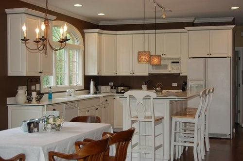
Continuation of Kitchen Update - Need help with Finishing Touch
norasnews
15 years ago


Sort by:Oldest
Comments (19)
Related Stories
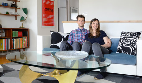
HOUZZ TOURSMy Houzz: Online Finds Help Outfit This Couple’s First Home
East Vancouver homeowners turn to Craigslist to update their 1960s bungalow
Full Story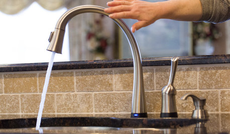
KITCHEN SINKSJust a Touch: Faucets Without the Fuss
Faucets that turn on with a tap of the finger, forearm or hand are great for messy hands or full arms
Full Story
KITCHEN DESIGNKey Measurements to Help You Design Your Kitchen
Get the ideal kitchen setup by understanding spatial relationships, building dimensions and work zones
Full Story
KITCHEN DESIGN10 Upgrades for a Touch of Kitchen Elegance
Give your kitchen a more refined look by changing just a detail or two
Full Story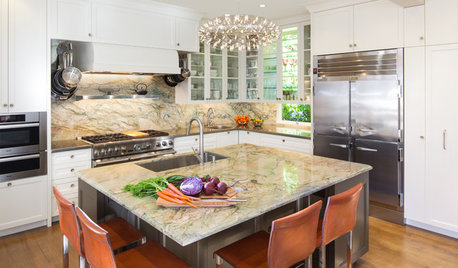
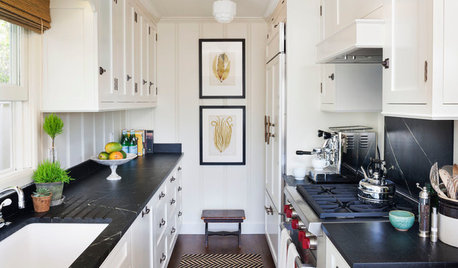
KITCHEN DESIGNKitchen of the Week: Elegant Updates for a Serious Cook
High-end appliances and finishes, and a more open layout, give a home chef in California everything she needs
Full Story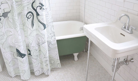
BATHROOM MAKEOVERSRoom of the Day: See the Bathroom That Helped a House Sell in a Day
Sophisticated but sensitive bathroom upgrades help a century-old house move fast on the market
Full Story
KITCHEN DESIGN3 Steps to Choosing Kitchen Finishes Wisely
Lost your way in the field of options for countertop and cabinet finishes? This advice will put your kitchen renovation back on track
Full Story
SELLING YOUR HOUSE5 Savvy Fixes to Help Your Home Sell
Get the maximum return on your spruce-up dollars by putting your money in the areas buyers care most about
Full Story
SELLING YOUR HOUSE10 Low-Cost Tweaks to Help Your Home Sell
Put these inexpensive but invaluable fixes on your to-do list before you put your home on the market
Full Story


oceanna
mlraff53
Related Professionals
Van Wert Interior Designers & Decorators · Denver Furniture & Accessories · Fort Wayne Furniture & Accessories · Kearny Furniture & Accessories · Potomac Furniture & Accessories · Ventura Furniture & Accessories · Duluth Furniture & Accessories · Short Hills Furniture & Accessories · North Bellmore Furniture & Accessories · Baldwin Park Lighting · Jefferson Valley-Yorktown Lighting · Venice Lighting · Riverside Window Treatments · Stoneham Window Treatments · Sun Lakes Window Treatmentsbrutuses
teacats
yayagal
loribee
norasnewsOriginal Author
pahance
User
marys1000
norasnewsOriginal Author
decorpas
norasnewsOriginal Author
gk5040
norasnewsOriginal Author
oceanna
norasnewsOriginal Author
alex9179
pahance