


Color Crisis-Of-Imagination
mayagayam
9 years ago
Sort by:Oldest
Comments (8)
Related Stories
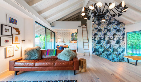
ROOM OF THE DAYRoom of the Day: More Fun for a Los Angeles Living Room
Bright furnishings and a newly open floor plan give a 1964 living room suffering from an identity crisis a new look
Full Story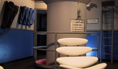
FUN HOUZZTaking Cover in a Former Nuclear Missile Silo
A Cold War relic is now a modern home, thanks to an Australian architect with a flair for the unusual
Full Story
EARTH DAYHow to Design a Garden for Native Bees
Create a garden that not only looks beautiful but also nurtures native bees — and helps other wildlife in the process
Full Story
WINTER GARDENING6 Reasons I’m Not Looking Forward to Spring
Not kicking up your heels anticipating rushes of spring color and garden catalogs? You’re not alone
Full Story
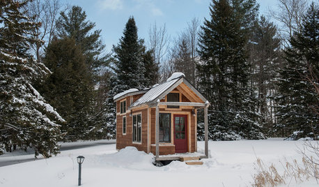
TINY HOUSESHouzz Tour: A Custom-Made Tiny House for Skiing and Hiking
Ethan Waldman quit his job, left his large house and spent $42,000 to build a 200-square-foot home that costs him $100 a month to live in
Full Story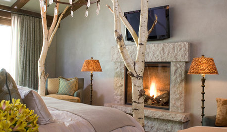
RUSTIC STYLEBank on Branches for Beautiful Furniture
Twigs bundled together or strikingly solo make for elegantly organic furnishings — even as DIY projects
Full Story
LIFEHow to Keep Your Pets Safe During the Holidays
To avoid an unwanted trip to the vet, be aware of these holiday-related hazards for dogs and cats
Full Story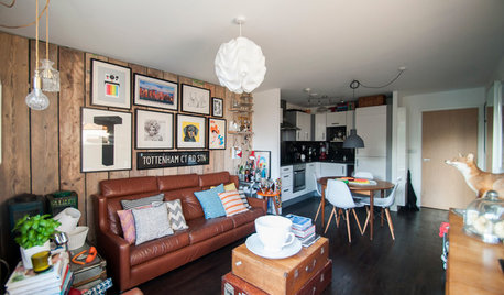
DECORATING STYLESIs Your Home Ready for a 1970s Revival?
Seventies chic is a trend that’s been brewing for some time, but this year it could hit big — with a few modern tweaks
Full Story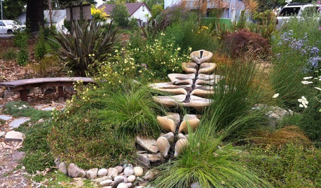
LANDSCAPE DESIGNNew Ways to Design With Water
Go beyond 3-tiered fountains and faux waterfalls to discover water's architectural possibilities
Full StorySponsored
More Discussions


justgotabme
Annie Deighnaugh
Related Professionals
Jacinto City Interior Designers & Decorators · Charlotte Furniture & Accessories · Owensboro Furniture & Accessories · St. Louis Furniture & Accessories · Topeka Furniture & Accessories · Dumont Furniture & Accessories · Fountainebleau Furniture & Accessories · Genova Furniture & Accessories · Beech Grove Lighting · Florida City Lighting · Pearland Lighting · Red Bank Lighting · Fremont Window Treatments · Gadsden Window Treatments · Hanover Park Window TreatmentsmayagayamOriginal Author
voila
justgotabme
Annie Deighnaugh
voila
mayagayamOriginal Author