


Update: Picture above Fireplace - Before and After PICS
jan_in_wisconsin
12 years ago


Sort by:Oldest
Comments (29)
Related Stories
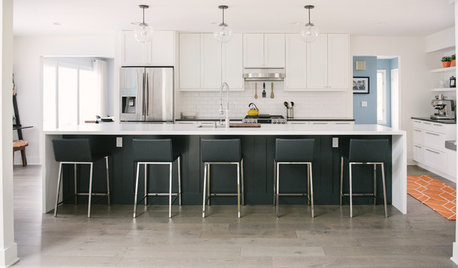
WHITE KITCHENSBefore and After: Modern Update Blasts a '70s Kitchen Out of the Past
A massive island and a neutral color palette turn a retro kitchen into a modern space full of function and storage
Full Story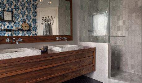
BEFORE AND AFTERSBefore and After: 19 Dramatic Bathroom Makeovers
See what's possible with these examples of bathroom remodels that wow
Full Story
FRONT YARD IDEASBefore and After: Front Lawn to Prairie Garden
How they did it: Homeowners create a plan, stick to it and keep the neighbors (and wildlife) in mind
Full Story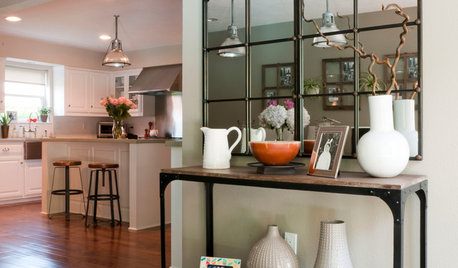
HOUZZ TOURSMy Houzz: Elegant DIY Updates for a 1970s Dallas Home
Patiently mastering remodeling skills project by project, a couple transforms their interiors from outdated to truly special
Full StoryBEFORE AND AFTERSGray Cabinets Update a Texas Kitchen
Julie Shannon spent 3 years planning her kitchen update, choosing a gray palette and finding the materials for a transitional style
Full Story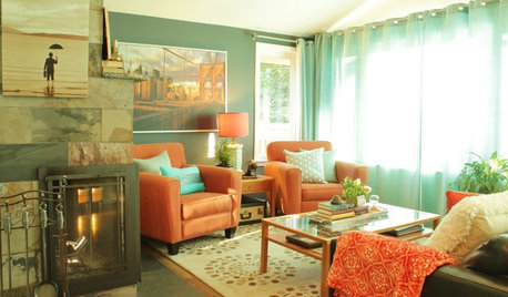
MY HOUZZMy Houzz: A Seattle Bungalow Goes From Flip to Happily-Ever-After Home
Once intended for a quick sale, this 1930s house now bears witness to its remodelers’ love and marriage
Full Story
TRIMHow to Fix a Mirror-Above-the-Mantel Dilemma
Got an unmovable mirror over your fireplace? Use trim to turn it into a feature that will turn heads
Full Story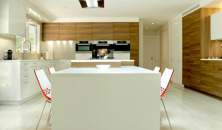
CONTEMPORARY HOMESMy Houzz: Modern Update to a 1960s Ranch in New Jersey
Outdated home decor is replaced with modern European-inspired elements, all while keeping true to the family’s rich culture
Full Story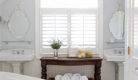
BEFORE AND AFTERS8 Bathroom Updates Have Ideas for Every Style
All white, classic vintage and brightly eclectic are just some of the new looks sported by the transformed bathrooms you'll find here
Full Story
MY HOUZZMy Houzz: Airy Update With Midcentury Appeal for a California Home
See how this graphic design couple added indoor-outdoor flow to their 950-square-foot artist loft-inspired home
Full Story


Arapaho-Rd
natal
Related Professionals
Clinton Township Interior Designers & Decorators · Midland Furniture & Accessories · Newton Furniture & Accessories · Carlsbad Furniture & Accessories · Fallbrook Furniture & Accessories · Kansas City Furniture & Accessories · Tamalpais-Homestead Valley Furniture & Accessories · Gainesville Custom Artists · Los Gatos Custom Artists · Pico Rivera Custom Artists · Englewood Lighting · Jefferson Valley-Yorktown Lighting · Orcutt Lighting · Sacramento Lighting · Spring Lightingnancybee_2010
Bumblebeez SC Zone 7
teacats
jlc712
les917
Valerie Noronha
juddgirl2
msrose
loribee
barb5
jan_in_wisconsinOriginal Author
busybee3
nicole__
deeinohio
jan_in_wisconsinOriginal Author
oceanna
busybee3
jan_in_wisconsinOriginal Author
jan_in_wisconsinOriginal Author
natal
les917
natal
dianalo
jan_in_wisconsinOriginal Author
jan_in_wisconsinOriginal Author
busybee3
OllieJane