


What color walls for this avocado bathroom?
equest17
14 years ago


Featured Answer
Sort by:Oldest
Comments (22)

OKMoreh
14 years agolast modified: 9 years agoUser
14 years agolast modified: 9 years agoRelated Professionals
Nashville Interior Designers & Decorators · Sweetwater Interior Designers & Decorators · Lorton Furniture & Accessories · Medford Furniture & Accessories · St. Louis Furniture & Accessories · Davidson Furniture & Accessories · Discovery Bay Furniture & Accessories · Fountainebleau Furniture & Accessories · Arlington Custom Artists · Arcadia Lighting · Englewood Lighting · Laguna Beach Lighting · Lancaster Lighting · Del City Window Treatments · Winter Garden Window Treatments
awm03
14 years agolast modified: 9 years ago
ingrid_vc so. CA zone 9
14 years agolast modified: 9 years agoequest17
14 years agolast modified: 9 years agoabundantblessings
14 years agolast modified: 9 years agoOKMoreh
14 years agolast modified: 9 years agorilie
14 years agolast modified: 9 years ago
redbazel
14 years agolast modified: 9 years agoles917
14 years agolast modified: 9 years agoequest17
14 years agolast modified: 9 years agonanny2a
14 years agolast modified: 9 years agotimber.j
14 years agolast modified: 9 years agoelle3
14 years agolast modified: 9 years ago
msrose
14 years agolast modified: 9 years agonel5on
14 years agolast modified: 9 years agoUser
14 years agolast modified: 9 years agocooperbailey
14 years agolast modified: 9 years agomclarke
14 years agolast modified: 9 years agojejvtr
14 years agolast modified: 9 years agokell1
3 years ago
Related Stories
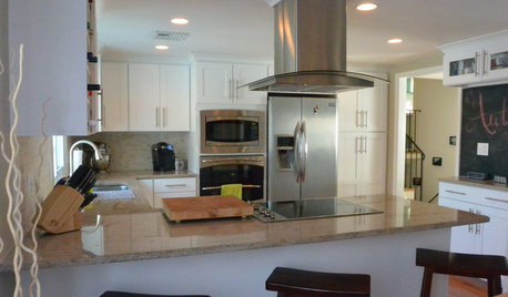
BEFORE AND AFTERSA ‘Brady Bunch’ Kitchen Overhaul for Less Than $25,000
Homeowners say goodbye to avocado-colored appliances and orange-brown cabinets and hello to a bright new way of cooking
Full Story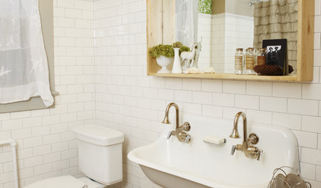
BATHROOM DESIGNSmall-Bathroom Secret: Free Up Space With a Wall-Mounted Sink
Make a tiny bath or powder room feel more spacious by swapping a clunky vanity for a pared-down basin off the floor
Full Story
BATHROOM DESIGNShould You Get a Recessed or Wall-Mounted Medicine Cabinet?
Here’s what you need to know to pick the right bathroom medicine cabinet and get it installed
Full Story
BATHROOM DESIGNBathrooms Awash in Black and White Tile
Classic, affordable and widely available, this tile combination can veer modern, traditional or eclectic on a bathroom floor
Full Story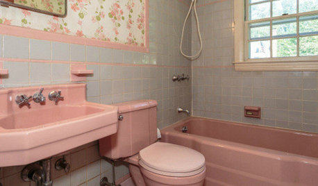
BATHROOM COLOR8 Ways to Spruce Up an Older Bathroom (Without Remodeling)
Mint tiles got you feeling blue? Don’t demolish — distract the eye by updating small details
Full Story
BATHROOM DESIGNTake Your Bathroom Walls Into Another Realm
Being practical spaces, bathrooms sometimes can be bland. Here are imaginative wall treatments that add personality
Full Story
BATHROOM DESIGNThe Glass Bathroom Wall: Love It or Lose It?
There's no question that a glass wall makes a bathroom feel more open. Are they private enough for you?
Full Story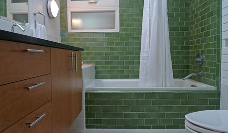
BATHROOM DESIGNBathroom Surfaces: Ceramic Tile Pros and Cons
Learn the facts on this popular material for bathroom walls and floors, including costs and maintenance needs, before you commit
Full Story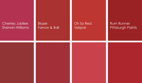
COLORBathed in Color: When to Use Red in the Bath
Rev up your space and flatter all skin tones with bold, beautiful red on bathroom walls, floors and fixtures
Full Story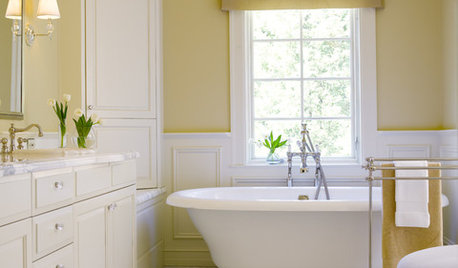
COLORBathed in Color: Favorite Yellows and Golds for the Bath
Get a golden glow for your bathroom with these expert paint picks and ideas for yellow walls
Full Story


equest17Original Author