


Benjamin Moore's "Pale Oak" undertones??
I really like this paint color, but I am worried I might see a little pink/purple undertone in it. Has anyone used this color? Do you see any undertones in it at all? Thanks so much!
Comments (53)

peaches12345
10 years agoGrays are so tricky with pink/purple undertones. At my oldest son's wedding the Mother of the Bride had on a beautiful gray chiffon formal dress. We walked outside and her previously dyed to match gray heels were now purple! Luckily it was an indoor church wedding and the shoes were again perfectly matched to the gray dress.
mcgillicuddy
10 years agoWe just painted our LR/DR Pale Oak, and I don't see any pink/purple/lavender undertones. It's possible, though, that it could look different in your home, depending on the colors and tones present. I painted large swatches of sample colors on several different walls, and Pale Oak was one of only two colors (the other was Classic Gray) that didn't change dramatically from one wall to the next. It also looked good with our 1920's-era medium oak floors.
The trim paint seemed to have the most impact on the color. I initially intended to keep the existing trim color, but after I painted the walls, the trim looked dingy and yellow, and the walls looked a bit dingy, too, and more gray than I expected. I repainted the trim using a very bright white with a blue undertone (Chantilly Lace) that somehow brought out more of the warmth in Pale Oak, which is what I wanted. It really made a dramatic difference.
I had also considered using White Dove, a white with a bit of gray, for less contrast, but I'm glad I went with the Chantilly Lace.
I love the Pale Oak more and more every day. It's a barely there color during the day, and darkens ever so slightly at night to the color of a pale beach pebble. I never see any pink.
The only way to know is to test the color in the area you plan to use it, and on several different walls. Then live with it for a few days. I was glad that we had a few cloudy days when I was testing colors, because it helped me rule out a few that were too dreary when the sun was absent.
Related Professionals
Caledonia Interior Designers & Decorators · Birmingham Interior Designers & Decorators · Mount Laurel Interior Designers & Decorators · Mesa Furniture & Accessories · San Francisco Furniture & Accessories · Skokie Furniture & Accessories · Tampa Furniture & Accessories · Walnut Creek Furniture & Accessories · Crofton Furniture & Accessories · Fountain Furniture & Accessories · Glenview Furniture & Accessories · Sugar Hill Furniture & Accessories · Cahokia Lighting · Santa Barbara Lighting · Tampa Lighting PRO
PROLori A. Sawaya
8 years agoPale Oak's color notation says it's from the yellow hue family: 2.48Y Hue / 8.47 Value / 0.72 Chroma
That 2.48 Y means it's very close to the yellow-red (orange) hue family, just on the verge of entering the yellow hue family. See color wheel.
This explains why some may see pinkish - it's really peachiness. On second glance, there's a good chance those who sense pinkish would concede that it is indeed peach, not pink. Now that I mention it.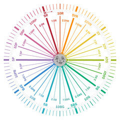
Purpleness or blueness - anything from the other side of the color wheel is completely off base. Like, they're not looking at the same Pale Oak, or the Pale Oak they're looking at was mixed incorrectly.
sprtphntc7a
8 years agohate to hijack, but lori, can u do BM Cape hatteras sand on the color wheel. we just used this color in a BR and it looks a little purple., did not look like that on the sample. we were going for a greige leaning toward gray on the darker side., i think we missed the mark... :( did ceiling in lacey pearl (BM)
although i will say it looks like this with the ceiling light on., when its off its does look better., but i think the color should be darker. overall.....
TIA
- PRO
Lori A. Sawaya
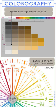
8 years agoThe color notation for Cape Hatteras Sand is 8.68 YR hue / 7.25 Value / 0.87 Chroma.
From a paint chip perspective I would not expect any sign of purple-ish. But anything can happen once a color is in a room and subjected to its light source.
As helpful as color notations are, it's wise to remember that you can not color by numbers alone.
sprtphntc7a
8 years agothanks a bunch Lori., we decided to re-paint since she couldn't stand the color., it really looked light purple in spots !!?? we went with BM chelsea gray and its much better, dark but better., we think the color change was from our neighbor's bright yellow house and brown roof which gives off a lot of reflection into her window. IDK?? we were going to go with "shenadoah taupe" 2 shades darker on strip but was afraid we were going to get some pink/purple., now we just have gray and lighter gray with the reflections....
i have to say, her room - should say "their room" since she shares with her DS- is just so "weird", every wall has different reflections, i think its b/c the room is north facing., their brother's room is next to their's same front window but he has a south side window and his room colors are "true"... that was a tough project!!
thanks again!! if i can ask, where do find that info u provided??

dixiesmiths
6 years agoWe used a Behr sample match of Pale Oak and it does seem to have a lavender undertone- especially at night. However, when painted on a white envelope, Pale Oak is a soft beige with absolutely no lavender undertone? Very disappointed it looks lavender on my walls! The wall color I painted over is a yellow cream shade. Any thoughts on the Behr match? Or current wall shade influencing? Here is the
formula info: Behr Base: UL210: CLRNT oz. 384th/ BL: 0/4/ CL 0/6.5 / IL 0/2.5
Also, this is an 8oz sample. Need help asap if possible!!! Thanks
dixiesmiths
6 years agoThank you for your prompt reply! Oddly, no matter where, or to which lighting the envelope travels, Pale Oak (Behr match) looks like soft beige, as well as the two other paint samples beside it - Sand Drift +21% and also Classic Gray 1548 (Behr Match). But only on paper, both white and black, regardless of lighting. I'm dumbfounded, they are squarely in the beige range, too similar to differentiate.
Sampled on the wall, entirely different color(s)! So, my paper samples and my wall samples are sharing the same light, but different as night and day. This room faces East, with 2 east facing windows. Wonder if this is the problem?
The current interior wall is a very yellow(ed) cream, would it be affecting the sample swaths going over it? I'm using the Behr Ultra. I am baffled. I thought I chose a light fresh gray (looks faint blueish), a creamy light breige (looking lavender) and a clean off-white cream (combo of the other two -blurple). In the morning I will try the sample board outside in indirect light as you suggested. I will also look into getting a color muse, and possibly have the samples checked out. Appreciate your clear information and explanations.

janny3
6 years agolast modified: 6 years agoI just decided against Pale Oak for the very reason that I can see pink in it, as beautiful as it is. We are not changing our décor and there is a lot of blue grey (as well as a bluer shade of red) in the room. The trim was just painted Simply White, softer and just a tad yellower than a white like Chantilly Lace. So today I finally told the painter to get Alaskan Husky and hope I didn't make a mistake! I am an artist yet I at times have trouble seeing undertones. Lori A. Sawaya above has excellent advice. It is all about the light. I am trying to teach that to my husband who doesn't understand how his changing a light bulb messes up my color scheme! I also would be wary of color matching when it is better in the long run to get the paint from Ben Moore if it is their hue you have chosen.
Barb
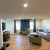
5 years agoFunny, after 8 different paint samples on the wall, it is OC20 Pale Oak and another darker shade OC28 Collingwood, that I do not see any undertones. Just plain light & medium grey. Finally! I’ve tried HGTV (Lowe’s) colors and see pink, lavender, blue and green undertones. So I got fed up and took my Ben Moore fan deck to sherwin Williams and they made my colors. They told me that bc the colors I chose are made with umber and not black, there shouldn’t be any of those undertones. He was right, I am pleased. Here is a pic, the darker grey is OC28 Collingwood, I am using it for an accent wall. Kinda hard to see with all the shadows on a cloudy day. But to me, they look nice next to white and a Formica countertop I’m using to make over a 900 sqft house for my Dad.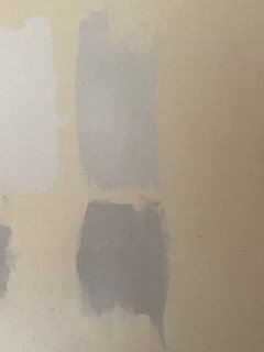
- PRO
Lori A. Sawaya
5 years agolast modified: 5 years agoThey told me that bc the colors I chose are made with umber and not black, there shouldn’t be any of those undertones.
:) No, it has nothing to do with individual colorants in the can.
We could easily find a laundry list of paint colors that ARE made with umber and DO appear pink, green, lavender in certain qualities of light according to certain people.
For every person who says Pale Oak and Collingwood "have no undertones" you will find one who says they do.
It's all about the light.
In a balanced quality of light Pale Oak and Collingwood are going to look like nice, neutral, "just soft beigy grays".
Also, the existing wall color makes no difference whatsoever and your pictures are the perfect example.
Many will say you have to look at paint colors on a white background and that's terrible advice. White skews your perception of color as much, if not more, than any
other color.A white background or border will fool you into thinking the color is not as bright or intense as it actually is. https://goo.gl/X6n6qp
Do not believe what you read out there on blogosphere. There is plenty of scientific documentation that basically states a white background is the worst thing you can use for evaluating color.
michelleborde
5 years agohome reborn - " the doors in this recent IKEA kitchen project of mine were painted Pale Oak (albeit at 10% saturation): " - I think that is the solution! Your cabinets look terrific. I was thinking of doing 50% saturation for wall color but maybe less is something I should try. thanks for sharing.

Gina Richards
5 years agoHi Lori! If you dont mind one more question about Pale Oak, I would love your advice on this. Recently used this color in the Aura formulation in a windowless basement bathroom. Mostly I love it, though in certain lights, one wall does look a bit lavender. I was hesitant to use it in the adjoining bedroom, which has a couple of smallish windows, but I diligently put samples of it up all over on the new drywall (my bad) and it looked TERRIFIC: a beautiful pale beigey gray. So off I went to get a can of Ben in Pale Oak. Well...it looks good in some lighting situations and not others...definitely lavender sometimes, but a rectangle of pink on the wall when the bedroom door is open to the lighted family room. I've already had a can of Advance mixed for the trim in 1/2 Pale Oak and 1/2 Simply White, and honestly I think I'm going to live with however it turns out because I'm unwilling to buy more paint.
The windows will be draped because they are high and small (and also for privacy.)
So. Here is my question: you have mentioned several times a "balance quality of light" . Any chance you can expand on that? I'm planning a couple of can lights, a center flush mount and a table lamp. The bedroom is small and I can fit only a full size bed with one nightstand. Thank you for any "illumination" you can provide!!- PRO
Lori A. Sawaya
5 years agoHere is my question: you have mentioned several times a "balance quality of light"
Paint color formulas are created using color data values called CIE L*a*b*.
L is lightness.
a is a scale of redness and greeness
b is a scale of blueness and yellowness
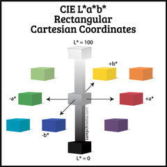
In other words, CIE Lab values define a color in terms of lightness, redness-greeness and blueness-yellowness.
We can use that definition of a color to do all sorts of things.
Like, make a paint color recipe using a specific paint base with a specified degree of whiteness and assortment of colorants.
Or, a recipe for dyestuff to color textiles. Or plastics. Or tile.
This list goes on and on. Every industry across the globe that produces product in a range of colors uses CIE Lab values to make their stuff different colors.
The only reason it works is because everyone is using standards.
One of the key standards is the illuminant - the color of light used to illuminate samples so they can be measured.
Everybody uses the same, controlled color of light. For paint it's called D65.
A D65 illuminant mimics indirect daylight at noon. For example, if you take color chips outside don't stand in the sun, stand in the shade.
Indirect daylight at noon measures as a balanced quality of light. Meaning it's the most balanced across the visible spectrum. In this graphic you can see D65 compared to other illuminants.
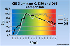
D50 is commonly used too - mostly in graphics for measuring ink.
Illuminant C is okay too but D65 replaced it in standards many years ago.
The graphic illustrates for you what 3 "balanced qualities of light" literally look like in terms of the visible spectrum.
- PRO
Lori A. Sawaya
5 years agolast modified: 5 years agoSo, that's the definition of "balanced quality of light".
How it applies to the built environment is every room has its own inherent quality of light. Comprised of natural and artificial light sources.
Homes designed since the late 70's started to take lighting plans in to consideration. People started to think strategically about where the windows and doors (called fenestration) should go and how many there should be.
As a result, a lot of homes have decent lighting plans. A nice selection of windows and doors - nice in terms of size and geographic position.
But some do not.
Many are really lucky because their house has a nice mix of windows and doors and as a result they get a nice mix of natural light streaming in during the day from fenestration...
......they have a balanced quality of light to work with.
Which means paint colors are more likely to render true to their *home* CIELab definitions which were ascertained using a D65 illuminant.
Other people have a more challenging lighting situation; it's not as balanced.
Paint colors in their spaces do not render true to their *home* CIElab definitions.
Instead, the colors shift under the unbalanced lighting.
Pale Oak is a great example.
In a balanced quality of light it will look like a warm, neutral, no hue discernible "greige".
Unbalanced quality of light and it shifts and looks purple - some call it a plum brown
Which is why some people will insist Pale Oak is the perfect "greige" with no "undertones" while at the same time others will insist that Pale Oak looks violet, lavender, purple, plum brown, etc.
Both are correct.
Difference is the light source.
The light is boss and ultimately decides the ultimate definition of a color. - PRO
Lori A. Sawaya
5 years agoBalanced inherent quality of light is obviously easier to work with.
Because we have CIELab values (or definitions) we have have a *home base*, a consistent jumping off point to work from.
Which means we can intelligently develop color strategies from an informed perspective for rooms that do not have a balanced quality of light.
Perfect example is how you are adding layers of different lighting in your basement bedroom.
Hope that helps explain "balanced quality of light". 
Melissa Yarbrough
5 years agoI painted my kitchen, living room and hallway pale oak with white dove trim. I don't see peach, pink or purple undertones in any light. It is a beautiful warm greige color. It is very neutral; like a very pale gray with a bit of brown in it.
User
5 years agolast modified: 5 years agoI am looking at Pale Oak for our home. It is my front-runner but it does seem a bit more beige in certain lights than I want. I bought a sample and painted a posterboard and have been moving it around my home (even thought it is for a new build). I'm also looking at white to go with it for trim and cabinets and am losing my mind! We like BM's Chantilly Lace but am worried it is too cool.
I wouldn't hesitate with the Pale Oak, but part of the home will be carpeted and I'm worried about it matching that (a light gray-beige). The other color I like is Agreeable gray but that one is just too dark for me.
dixiesmiths
5 years agoOnce dry, it was/is perfect. It is a soft grayish whitish tone on a very overcast day.....like a beautiful cashmere sweater. On a very sunny day, for a brief span of an hour or so, I can barely see the yellow undertone...just a hint. I am so glad I chose this color because it is very versatile.
Changing out a couch, carpet, lamps, pillows, etc would be no problem. It is soothing and quite able to showcase antiques that stay, as well as all the impulsive or seasonal fun purchases dragged home. I love it...a great chameleon that works with lots of decorating options.

Rachael Thompson
5 years agoMelissa Yarbrough can you post pics? Is your space sunny or shady? Lots of windows or not too many?
Gina Richards
4 years agoAs a follow-up: I painted my small basement bedroom walls and ceiling with the flat finish Pale Oak. I put a boatload of gray-and-gold patterned, ceiling to floor drapes which camoflage the high small windows. I had five super flat LED can lights installed and there's a lamp on the nightstand. (The cans shed a LOT of light-- I could do surgery at midnight if I choose. They're on a dimmer if I don't want all that.) There is absolutely no hint of lavender anywhere anymore. Lori was right. Thanks Lori!
sjeschke
4 years agoI've been moving a poster board around with Pale Oak on my top floor. My living/dining/foyer gets loads of daylight. Sometimes it looks soft gray, sometimes soft beige and sometimes almost white. So far I'm loving the subtle changes. I don't see any pink or violet but I think what Lori says is really true. Every color is so dependent on the light you have to work with. I tried Pale Oak in our bedroom and it looked too beige to me. We usually do not need to turn on a light in the top floor until the late evening in the summer. I'll see how it looks tonight with the lighting but the daytime effect is lovely.

Cassie Bayack
3 years agohas anyone darkened Pale Oak? it looks too washed out in our home in daytime.
steviepridenow
3 years agoI recently painted a house with bossy old saltillo tile floors that have wide gray grout in halls, bathrooms, kitchen. Pale Oak was the only color that didn't turn pink or clash in any of the rooms. The paint actually seemed to neutralize that floor and make it more tolerable. Some rooms are lacking in natural light, others flooded with South sun. I don't see pink undertones in any of them. The paint stays a light, warm neutral greige even with a copper leather sofa!
It is not gray or beige or yellow. Just perfect. I use led lights, mostly 2700K.
I did use White Dove trim as other whites turned either too yellow or blue.
No carpet. The rooms without tile have medium brown wood floors.
I put paint samples on 8x11 or larger canvas boards or watercolor paper and moved them around perpendicular to my floors (not flat horizontal) to find the right color. Worked well. All the science of color - which can be helpful - is no substitute for that.
- PRO
Lori A. Sawaya
3 years agoAll the science of color - which can be helpful - is no substitute for that.
No one said or implied that it was.
Color notations that define and describe color appearance - color science - is an efficient framework to use to help you determine which colors you should invest in testing in your space.
Whether you're painting your own samples or purchasing them, the process costs money - it is an investment of both time and money.
On average, clients who hire me have spent $150 on paint samples and supplies and fail to find the right color on their own.
Color science reduces that cost and waste of product and supplies significantly.
Painting samples and moving them around the room isn't helpful if it's the wrong color. dixiesmiths
3 years agoThe pink/purple UNDERTONE VANISHED ENTIRELY, after a number of days to fully dry. It is a beautiful greige, that is soft and cozy, but fresh! Love it.

Jill S
3 years agoFollowing! Just had our main living space painted Pale Oak, and now I'm wondering if I should've just done Alabaster white. It seems a tiny bit pink, BUT these pictures were taken at 5 pm on a gloomy day, room window are facing east. I was encouraged to hear that the paint seems to dry a little less pink ... also I do think our flooring choice will certainly help. Thoughts while I'm not too late to redirect the painters, a lot less costly now versus later :)
Cassie Bayack
3 years agoI painted our great room in Pale Oak and it did not work. I was looking for a light color, with warmth and gray. It looked lavender n some areas, so I know what you mean about seeing pink. So, I repainted. My husband was not happy but I told him I've met lots of people online that repaint all the time.
I hear Pale Oak is a difficult color. I should have listened to Kylie at E-Interiors, who warns about Pale Oak. I think it looks better on the internet. We have windows on West, and North.Jill S
3 years agoFor some reason my photos will not post, and my Google search of this issue told me this is common. Sorry. Still following the topic! :)
 PRO
PROHeather Bryce Designs
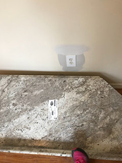
3 years agoBM Pale Oak is beautiful as a cabinet color - now what should I paint the walls and trim? Pale Oak was the only “white” or neutral that looked ok with the existing stone in the master bathroom and kitchen. Now I want to change the wall color. What should I choose? White? Or a tan of some kind?
No greys, please
HU-702621304
3 years agoHow about a toned down orange with a muted deep undertone ? It might really bring attention to the cabinets......
HU-702621304
3 years agoCassie Bayak, I thought Pale Oak had a lavender undertone.... I was wrong. The position of the room and lighting lent a deceptive cast...for a number of days...UNTIL IT WAS COMPLETELY DRY...then, it becomes that amazing color that blends with just about anything...rich, smooth, subtle
HU-702621304
3 years agolast modified: 3 years agoJill, go for it and patiently let it dry,,,this means more than 24! Once dry it holds a place of subtlety, letting your furnishings and special pieces come forward, If you have hardwood or rugs, they will also be highlighted as a grounding piece. Click on my 2 pics submitted (above under dixiesmiths) to see an accurate rendering of the color according to eastern facing room. Click pic to view in full. This color matches just about anything!
HU-702621304
3 years agoI repeat: NO PINK, NO PURPLE UNDERTONE AFTER A FEW DAYS TO COMPLETELY DRY...ESPECIALLY IF YOU ADDED AN EXTRA COAT OR SO TO TRY TO GET RID OF THE UNDERTONE. IT IS SIMPLY A CAST THAT IS DECEPTIVE REGARDING THE FINISHED ABSOLUTE NEUTRAL.
Jill S
3 years ago@HU-702621304 okay thank you!!! I do think that the flooring will help, and I DID notice that after a few days of drying, the pink/purple ness was soooo much less. Also, the film protector on the new windows is changing the natural light. upstairs they removed those from the windows and pale oak looks stunning! Thank you! Once I figure out why my android phone won't let me post pictures (lol) I'll try to post some pictures? Anyone else experience technical problems on Houzz?
HU-702621304
3 years agoMy living room was initially lavender....I freaked... and added an extra coat.... I freaked again and just tried my best to paint the greige or breige into those walls. I gave up in disbelief...MY.ROOM.IS.NOW.PINKISH.PURPLE. Fortunately, the problem vanished with four completely dry walls. The color so neutral I can redo this room with absolutely any design or fabric or carpet or special item and it adapts to mix and match with every color imaginable. Love it. The room I chose has challenging light shifts, but Pale Oak meets every shift in light with reliable neutrality. You will be able to be very creative with all added elements in a room painted this shade!

Brenda Hagel
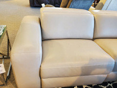
2 years agoI'm glad I found this thread. I'm going a little nuts on what paint color to pick and Pale Oak on a small chip seems like a possibility. We're getting this sectional (not the whole thing, a few pieces to make a sofa) and it's really thrown me for a loop. I thought I was going to be painting a gray wall, but ,y large samples in the showroom looked really bad next to this. So was hoping for thoughts on Pale Oak and I found some :) (btw, our kitchen cabinets are white dove and our walls are Stonington Gray - def way too blue with this sofa. If Pale Oak works will paint the kitchen that too.

Brenda Hagel
2 years agolast modified: 2 years agoThis is another angle, and it lightens to a greige. Such a chameleon sofa haha (the cushions from the previous pic are chairs that will be in the living room too)

userLA57
2 years ago@Lori A. Sawaya - what Kelvin of LED lights did you specify for @Gina Richards and Pale Oak, please?
I switched old fluorescent bulbs over the cabinets for LED tubes, but I may need a better option for lighting there.

Candice McCarthy
2 years agolast modified: 2 years agoI just wantvto add, i think brand really matters here. We had insisted on using Benjamin Moore’s Aura line in our dining room in their washable matte finish. Our painter showed up with a color matched can of Sherwin Williams. It was pink on the walls! I made them purchase the BM Aura (because i paid for the upgrade) and hoped that with BM thet the color would match the sample I picked and indeed it did! No pink undertones. just a beautul shade of greige.


Lori A. Sawaya