


Color Question
melody-s
11 years ago
Related Stories
SELLING YOUR HOUSE15 Questions to Ask When Interviewing a Real Estate Agent
Here’s what you should find out before selecting an agent to sell your home
Full Story
WORKING WITH PROS12 Questions Your Interior Designer Should Ask You
The best decorators aren’t dictators — and they’re not mind readers either. To understand your tastes, they need this essential info
Full Story
WORKING WITH PROS10 Questions to Ask Potential Contractors
Ensure the right fit by interviewing general contractors about topics that go beyond the basics
Full Story
MOST POPULAR8 Questions to Ask Yourself Before Meeting With Your Designer
Thinking in advance about how you use your space will get your first design consultation off to its best start
Full Story
REMODELING GUIDES13 Essential Questions to Ask Yourself Before Tackling a Renovation
No one knows you better than yourself, so to get the remodel you truly want, consider these questions first
Full Story
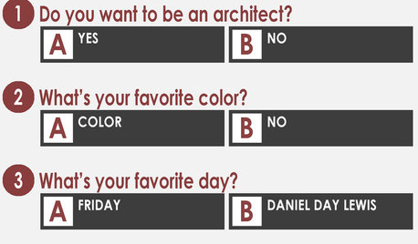
COFFEE WITH AN ARCHITECTA Quiz for Architects in Question
Should you trade in your T-square for a barista tray? Answer a few simple questions to find out
Full Story
Design Dilemmas: 5 Questions for Design Stars
Share Your Design Know-How on the Houzz Questions Board
Full Story
Easy Green: 6 Must-Answer Questions Before You Buy
Thinking about buying ecofriendly furniture? For a truly environmentally conscious home, ask yourself these questions first
Full Story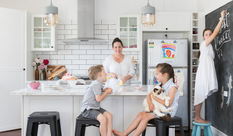
FEEL-GOOD HOMEThe Question That Can Make You Love Your Home More
Change your relationship with your house for the better by focusing on the answer to something designers often ask
Full StoryMore Discussions


juliekcmo
yayagal
Related Professionals
Liberty Township Interior Designers & Decorators · Augusta Furniture & Accessories · Camarillo Furniture & Accessories · Memphis Furniture & Accessories · Rome Furniture & Accessories · Wilmington Furniture & Accessories · Eau Claire Furniture & Accessories · Northridge Furniture & Accessories · Richfield Furniture & Accessories · Kingsburg Furniture & Accessories · Englewood Lighting · Tukwila Lighting · Patchogue Window Treatments · Seattle Window Treatments · Brownsville Window TreatmentsAnnie Deighnaugh
melody-sOriginal Author
ttodd
Annie Deighnaugh
indygo
sable_ca
avesmor
Annie Deighnaugh
melody-sOriginal Author
bronwynsmom