


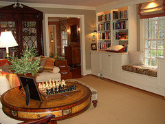
Revere Pewter walls....what color ceiling
homeagain
11 years ago
Featured Answer
Sort by:Oldest
Comments (10)

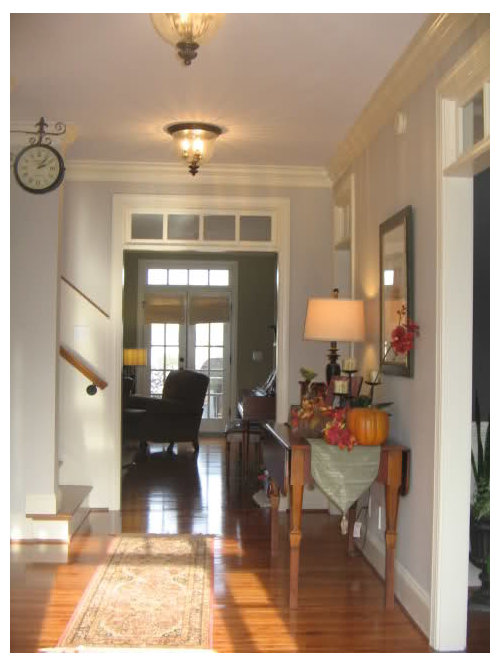
bronwynsmom
11 years agobabs711
11 years agoRelated Professionals
Fort Smith Interior Designers & Decorators · Dallas Furniture & Accessories · Greer Furniture & Accessories · Phoenix Furniture & Accessories · Racine Furniture & Accessories · Naples Furniture & Accessories · North Hollywood Furniture & Accessories · Kingsburg Furniture & Accessories · Immokalee Custom Artists · Bellevue Lighting · Antioch Window Treatments · Huntington Beach Window Treatments · Palm Beach Gardens Window Treatments · Patchogue Window Treatments · Rockford Window Treatmentsnamarie
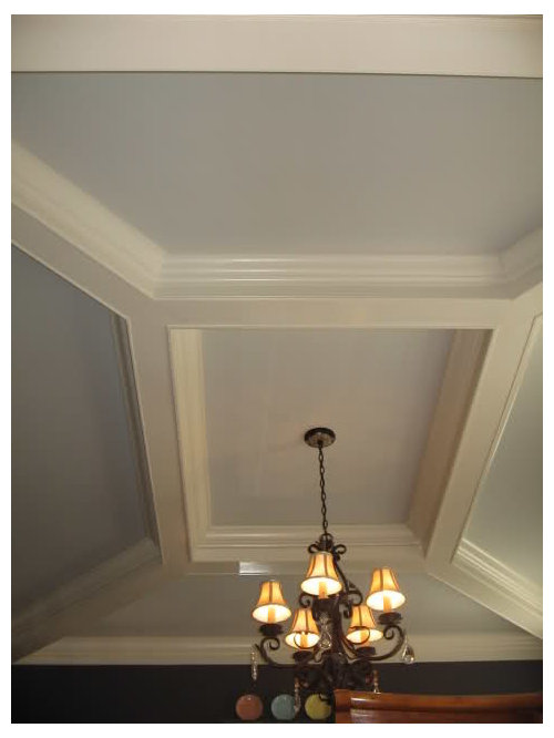
11 years agohomeagain
11 years agobronwynsmom
11 years ago
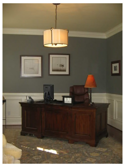
denali2007
11 years agogigi7
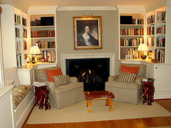
11 years agobronwynsmom
11 years agogigi7
11 years ago

Related Stories
DECORATING GUIDES11 Tricks to Make a Ceiling Look Higher
More visual height is no stretch when you pick the right furniture, paint and lighting
Full Story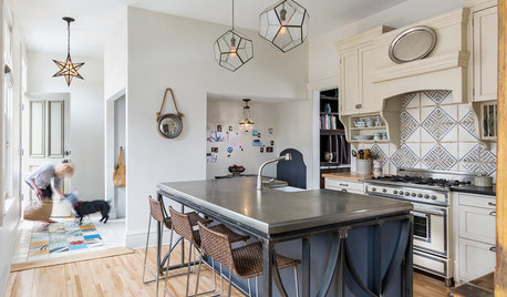
KITCHEN DESIGNKitchen of the Week: Sophisticated Farmhouse Style in Minnesota
A workhorse island with iron detailing and a pewter countertop is just one of the highlights of this creative space
Full Story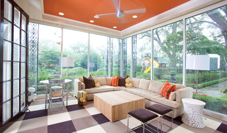
MOST POPULARHeads-Up Hues: 10 Bold Ceiling Colors
Visually raise or lower a ceiling, or just add an eyeful of interest, with paint from splashy to soothing
Full Story
COLOR12 Tried-and-True Paint Colors for Your Walls
Discover one pro designer's time-tested favorite paint colors for kitchens, baths, bedrooms and more
Full Story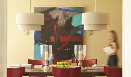
NEUTRAL COLORSHow to Bring Beige Walls to Life
Go for sprightly instead of snoozy by pairing beige walls with higher-octane hues
Full Story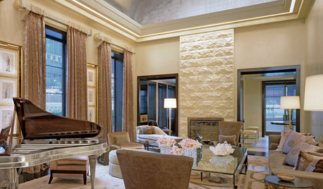
WHITEWhat to Know Before You Paint Your Walls White
A coat of white paint can do wonders in one room and wreak havoc in another. Here are tips for using the popular hue
Full Story
ROOM OF THE DAYRoom of the Day: A Great Room Pays Homage to Ordinary Architecture
This Texas renovation embraces a stick frame home's simple structure and its place in the community
Full Story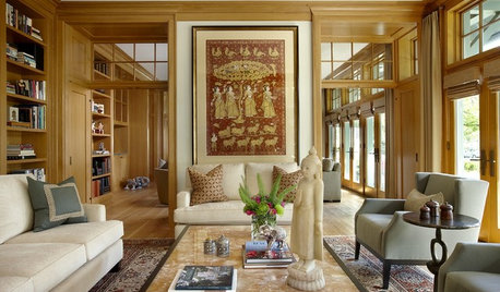
COLOR11 Terrific Paint Color Matches for Wood Details
Pair your wood trim and cabinets with the right shade of wall paint to bring out the beauty in both
Full Story
MOST POPULARRethinking Beige in a World Gone Gray
Gray, the ‘it’ neutral of recent years, has left beige in the shade. But is it time to revisit this easy-on-the-eyes wall color?
Full StoryMore Discussions


LuAnn_in_PA