


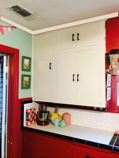
Do you have cream-colored kitchen cabinets?
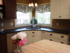
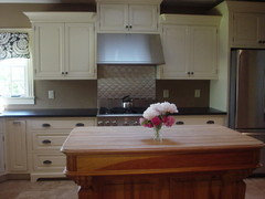
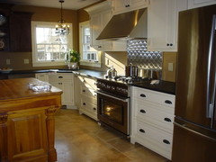
SunnyCottage
10 years ago

Featured Answer
Sort by:Oldest
Comments (112)

Oakley
9 years ago
christine40
9 years agoRelated Professionals
Aspen Hill Interior Designers & Decorators · Suisun City Interior Designers & Decorators · Westbury Interior Designers & Decorators · Huntersville Furniture & Accessories · Rock Hill Furniture & Accessories · Portage Furniture & Accessories · Beverly Hills Furniture & Accessories · Fair Lawn Furniture & Accessories · Richfield Furniture & Accessories · Glendale Lighting · Berkley Window Treatments · Ferndale Window Treatments · Mount Pleasant Window Treatments · San Jose Window Treatments · Stony Brook Window TreatmentsSunnyCottage
9 years agoSunnyCottage
9 years agoSunnyCottage
9 years agoUser
9 years agovwhippiechick
9 years ago
amykath
9 years agoSunnyCottage
9 years ago
ghostlyvision
9 years agoUser
9 years agobusybee3
9 years agoonedogedie
9 years agobusybee3
9 years agoonedogedie
9 years agoSunnyCottage
9 years agomadeyna
9 years ago
jlj48
9 years agoghostlyvision
9 years agobonnieann925
9 years agoSunnyCottage
9 years agomadeyna
9 years agoSunnyCottage
9 years agonosoccermom
9 years agoSunnyCottage
9 years agomadeyna
9 years agoSunnyCottage
9 years agomadeyna
9 years agoonedogedie
9 years agoBoopadaboo
9 years agoSunnyCottage
9 years agoSunnyCottage
9 years agoSunnyCottage
9 years agoBoopadaboo
9 years agoMiz_M
9 years agoghostlyvision
9 years agoSunnyCottage
9 years ago
Bunny
9 years agomadeyna
9 years agoSunnyCottage
9 years ago
maddielee
9 years agoSunnyCottage
9 years agoteacats
9 years agoloribee
9 years agochristine40
9 years agoSunnyCottage
9 years agoonedogedie
9 years agoonedogedie
9 years agochristine40
9 years ago


Related Stories
MOST POPULAR8 Great Kitchen Cabinet Color Palettes
Make your kitchen uniquely yours with painted cabinetry. Here's how (and what) to paint them
Full Story
KITCHEN DESIGNCabinet Colors for Dark Appliances
See how to make your black kitchen appliances blend in and look great
Full Story
KITCHEN CABINETSKeeping Cabinet Color on the Down Low
Give just base cabinets a colorful coat for a kitchen sporting character and a spacious look
Full Story
KITCHEN DESIGN8 Stunning Stain Colors for Kitchen Cabinets
Transform raw wood for custom-looking cabinetry with a stain that fills your need for color but lets the grain show through
Full Story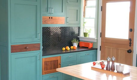
KITCHEN CABINETSKitchen Cabinet Color: Should You Paint or Stain?
Learn about durability, looks, cost and more for wooden cabinet finishes to make the right choice for your kitchen
Full Story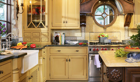
KITCHEN DESIGNExpert Panel: Kitchen Color
Bright kitchen or sedate? Colorful or muted? Get expert insight from pro designers on choosing the right color look for your cooking space
Full Story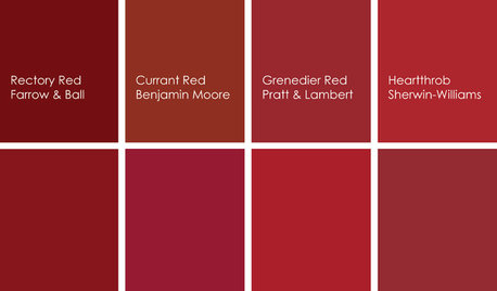
KITCHEN DESIGNCooking With Color: When to Use Red in the Kitchen
Candy Apple Red, Red Licorice and more for your kitchen walls, cabinets or island? The color choices are as delicious as they sound
Full Story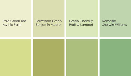
KITCHEN DESIGNCooking With Color: When to Use Green in the Kitchen
Consider a taste of Romaine or Pale Green Tea to make your kitchen walls or cabinets the freshest ones around
Full Story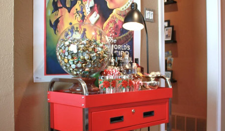
STORAGEStorage Surprise: Turn Colorful Tool Cabinets Into Fun Furniture
Reimagine your handy chests as nightstands, bar carts and kitchen storage for a bright interior alternative
Full Story
KITCHEN DESIGNCooking With Color: When to Use White in the Kitchen
Make sure your snowy walls, cabinets and counters don't feel cold while you're riding white's popularity peak
Full Story


MagdalenaLee