


And then there's the Kips Bay Show House...
nosoccermom
9 years ago
Related Stories
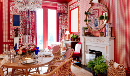
EVENTSColors and Patterns Wow at the 2015 Kips Bay Decorator Show House
Go on a virtual tour as 22 designers put on a beautiful interior fashion show in NYC’s Arthur Sachs mansion
Full Story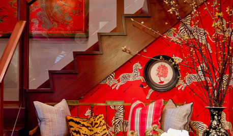
DECORATING GUIDESTwo Apartments Enthrall at 2012 Kips Bay Show House
Top New York designers transform two 6,000-square-foot apartments into incredible color-packed treats for the eyes
Full Story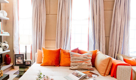
DESIGNER SHOWCASESSee the Daring Designs at the 2013 Kip's Bay Decorator Show House
New York designers show their latest creations in a fashion show for the home
Full Story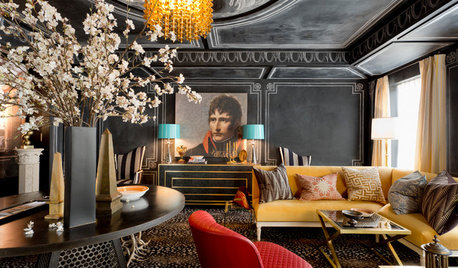
DESIGNER SHOWCASESGlamour and Colors Rule at 2016 Kips Bay Decorator Show House
See how 21 designers from around the U.S. outfitted a 1940 townhouse with vivid wall treatments and edgy furnishings
Full Story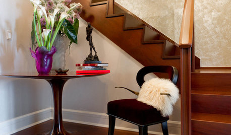
DECORATING GUIDESRooms Delight at 2012 Kips Bay Decorator Show House
Bewitching colors and high-end touches wowed in Apartment 2102 of this year's showcase on Manhattan's Upper West Side
Full Story
EVENTSDesign Calendar: May 10–May 31, 2012
London's calling with a garden party, New Yorkers can marvel at the Kips Bay show house and Californians get an inventive treat
Full Story
HOUSEKEEPING10 Problems Your House May Be Trying to Show You
Ignore some of these signs and you may end up with major issues. We tell you which are normal and which are cause for concern
Full Story
ARCHITECTUREHouses Exposed: Show Your Structure for Great Design
Why take part in the typical cover-up when your home’s bones can be beautiful?
Full Story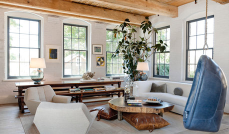
DESIGNER SHOWCASESLuxurious Looks From the 2014 Hamptons Show House
Talk a walk through a collection of imaginative rooms by top designers working for a good cause
Full Story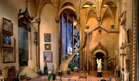
FUN HOUZZMad for Miniatures? Show Us Your Dollhouse
It seems just about everyone loves to see a smartly outfitted miniature house. Check out these amazing examples, then show us your own!
Full StoryMore Discussions
Annie Deighnaugh
tibbrix
Related Professionals
Denver Furniture & Accessories · Peachtree City Furniture & Accessories · Roswell Furniture & Accessories · Fountainebleau Furniture & Accessories · Nixa Furniture & Accessories · San Juan Capistrano Furniture & Accessories · Kendall Furniture & Accessories · Chapel Hill Custom Artists · Boston Window Treatments · Fraser Window Treatments · Gadsden Window Treatments · Greensboro Window Treatments · Rockford Window Treatments · San Jose Window Treatments · Stoneham Window TreatmentsnosoccermomOriginal Author
mtnrdredux_gw
Annie Deighnaugh
joaniepoanie
nosoccermomOriginal Author
Fun2BHere
aputernut
hhireno
mitchdesj
nosoccermomOriginal Author
deegw
nosoccermomOriginal Author
Gooster