


Funcolors, LRV question
Hi and thanks for all your help. I have pretty much decided on my colors but have a question regarding LRV. As I understand it LRV is the light reflected and thus absorbed by a color? I am debating using SW Accessible Beige in my kitchen, which is presently RH Butter (BM close match to Golden Straw or Precious Ivory). The LRV on AB is 58 and the other two are much higher around 68. Does the LRV indicate that the kitchen will look darker since less light is being reflected? Does that mean that I should go to Pale Oak, which has a higher LRV? But if I do, the color is so much lighter. BM Gray Wisp has a LRV around 55 as compared to Quiet Moments, which is higher. Does having a greyed down color decrease the LRV and basically how does knowing LRV influence how to pick a color? BTW, the guy at SW said that LRV is the finish on the paint (matte, semi gloss, etc). I think that's incorrect. Thanks
Comments (14)

chloenkitty
9 years agoHoly cow! This just shows you that you learn something new everyday! I am building a house and will be picking paint colors soon. I know enough to put some painted pieces of large board on the wall and look at in different lights to see how it looks in the room, but I never heard of this! My head is spinning the way it is without all these choices and reading that just put my OCD and ADD into overdrive lol. All this technical stuff! Have fun :)
Related Professionals
Fort Smith Interior Designers & Decorators · Lake Elsinore Interior Designers & Decorators · Charlotte Furniture & Accessories · Hastings Furniture & Accessories · Carlsbad Furniture & Accessories · Fort Carson Furniture & Accessories · Urbandale Furniture & Accessories · Ridgewood Furniture & Accessories · Englewood Lighting · Green Bay Lighting · Orcutt Lighting · Shorewood Lighting · Venice Lighting · Richardson Window Treatments · San Rafael Window Treatments PRO
PROLori A. Sawaya
9 years agoBTW, the guy at SW said that LRV is the finish on the paint (matte, semi gloss, etc). I think that's incorrect.
That is incorrect. I have never, ever in all these years found a single person in a paint store or the paint industry per se who knew about LRV.
The LRV on AB is 58 and the other two are much higher around 68. Does the LRV indicate that the kitchen will look darker since less light is being reflected?
All the colors are in the yellow hue family. A ten point difference will be noticeable but probably not huge.
Does having a greyed down color decrease the LRV and basically how does knowing LRV influence how to pick a color?
Greyed down is about vivid and dull and is different from LRV which is about light and dark. They are two separate 'parts' of color. However, they are closely related.
When you grey down a color, the LRV is affected too and the color does get darker.Because greyed down and LRV are so closely related, they are often referred to as nuance. This is a key factor in how the NCS Color System works and NCS is a good resource to learn more about nuance.
Professional color consultants and lighting designers use the LRV number to figure out contrast ratios. For example, there are LRV guidelines from The Americans with Disabilities Act and The American National Standards Institute.
Homeowners can use the information too. Sometimes LRV is a specification that's meant for homeowners to follow. For example, you will find a LRV specification on the label of most exterior paints. You will find LRV specification on garage doors, entry doors, roofing and windows, etc.
As far as choosing paint colors, LRV comes in handy as a benchmark. Noticing that you like colors from the yellow hue family within a LRV range of 50 to 60, for example, is a helpful target that can help you zero in on the right color faster.
Homeowners can take it a step farther and use LRV to calculate contrast ratios like the pros. A good example is exterior body and trim color. Choosing both colors from one strip of chips is pretty common. From the curb it can be hard to tell that two different colors were used. A good guideline would be a contrast ratio somewhere between 30% and 70%-ish for exterior body color and trim color.
Up close, the contrast between two colors is easier to see. Farther away from the curb and lines of contrast are harder to see. Calculated contrast ratios using LRV can help determine if two colors contrast enough.
scanmike
Original Author9 years agoThanks Funcolors,
Your explanation made things clearer, but I had to admit I still have much to learn about paint and color. When you compare BM Grey Wisp, Tranquility and Affinity Tranquility, the first two have a LRV of 54 and Quiet Moments, which looks so similar has an LRV or 60. The only difference I can see in these is that Quiet Moments seems a bit brighter, less gray perhaps? Do full spectrum colors in general have higher LRV?- PRO
Lori A. Sawaya
9 years agoThe only difference I can see in these is that Quiet Moments seems a bit brighter, less gray perhaps?
Less gray would indeed equate to brighter because grayness and LRV are inextricably tied. Change one and the other is affected.
Brighter is the correct term to use, btw. Because LRV is about luminance. Which is different from illuminace. If you Google for more info about LRV, lighting design world will sometimes call it luminance reflectance value instead of light reflectance value. Both terms speak to the same 'part' of color which is what we've been talking about, LRV. Technically, colorimetrically LRV is called CIE Y.
Sounds way more complicated than it actually is. LRV is really just about light or dark. So, it's not complicated but it is important because light and dark is what contrast is about. And contrast, in all facets of design and visual ergonomics, is crucial.
Do full spectrum colors in general have higher LRV?
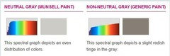
Nope. Full spectrum colors are about a balanced mix of reflected wavelengths. It can actually be measured. When you measure reflected wavelengths of a color it's called a color's spectral reflectance curve. A good analogy is to call it a color's fingerprint see the example below. (source http://goo.gl/FaFB5Z)
Defining full spectrum color has always been a gray area (no pun intended). Questions abound. Do you want to define full spectrum color by what goes in the can or do you want to define it by what it reflects when it's dry - its fingerprint. Or maybe even both?
Going forward my opinion is full spectrum is going to be about balance. How that balance is qualified and quantified is the ultimate question.
With regard to LRV, however, none of that matters. Because LRV is LRV. Doesn't matter how much light is present, doesn't matter what went in the can. The fingerprint doesn't matter. Only thing that matters is how much light (or luminance) the color reflects and how much it absorbs, how light or how dark. That's all LRV is. Simple but powerful.
scanmike
Original Author9 years agoThanks Funcolors. I am getting a better grasp of this.
Since you know so much about paint, do you know how to paint a kitchen with with cherry wood cabinets if you want to tone down the orangish tone in the cabinets?. I have read that the color should have red in the color and others have said to stay away from color (beige or greige) with red undertones and stay neutral. What is your opinion? I know greens work well with cherry but the only greenI would consider is BM grey cashmere to go with the rest of the colors in the other rooms. Considering BM Pale Oak, Balboa Mist or SW Accessible Beige Thanks.
ttodd
9 years agoOne of the reasons that I always thought that my black ceiling worked was because I looked for a black w/ very low LRV. Had I chosen a black w/ higher LRV I think that the ceiling would have been 'noticeable'. Instead it just fades away and it's not the first thing that people notice.
scanmike
Original Author9 years agoFrom what Funcolors said that makes sense about your black ceiling.
- PRO
Lori A. Sawaya
9 years ago@TheFoxesPad sounds kind of crazy that the LRV of colors of black could be relevant. After all, it's black. But different colors of black mean different LRVs.
do you know how to paint a kitchen with with cherry wood cabinets if you want to tone down the orangish tone in the cabinets?
Fight fire with fire. Too pink, add more pink. Too green, add more green. Too orange, add more orange, etc. In other words keep in all in the same hue family.
Context and contrast get tossed around a lot but I'm not sure it's ever really understood. Instances like this, too orangish, is the perfect example of what it means.
The reason you feel like you want to tone down the orangish tone is because there's something making it too orangish. There's some level of contrast in the current context that's making the cabinets visually too orangish.
Shift the contrast, adjust the context, the color will respond and its appearance will change. That is the law of color contrasts. We never experience color in isolation. Johannes Itten's Seven Laws of Color Contrast are a worthwhile Google event.
I have read that the color should have red in the color and others have said to stay away from color (beige or greige) with red undertones and stay neutral.
I don't do the undertone thing they way the mass interwebs consciousness is doing it these days. I think it's confusing as hell. Beige, greige, red undertones, every hue in the spectrum is considered "neutral", etc.??? Have to admit it's a total mystery to me how people are finding any logic or reason in what appears -to me- to be a chaotic hot mess of confused color misinformation. Sorting out this one sentence and aligning it with my Color Point of View would take a while. And I think all you're wanting is an opinion. . . which is next.
I know greens work well with cherry but the only green I would consider is BM grey cashmere to go with the rest of the colors in the other rooms. Considering BM Pale Oak, Balboa Mist or SW Accessible Beige Thanks.
Greens work well with cherry and mahogany type wood tones because it's classically complementary. A choice of green would be reconciling with what the cherry is - it is orange-red. The reason why this is a good choice is green will enhance all that the cherry has to offer and compliment it in the best way possible.
I like Pale Oak and Accessible Beige and would buy samples. They are a much calmer, no-lo contrast option vs. a green.
scanmike
Original Author9 years agoFuncolors, I once read your explanation of how you see color vs. the mass explanation of undertones. I think I have been so indoctrinated to think that way that I had a hard time understanding your explanation at that time.I apologize for not grasping it and I have to try and locate that explanation and re-read it. I may grasp it more now. Thanks for the explanation of fighting fire with fire. The present yellow (RH Butter) probably leans more to the orange side and not a green yellow so it worked but also made the room too warm I guess. I tried Pale Oak and the pink in it clashes with the touch of yellow greige that I now see in the backspash. The pink is now making the yellow in the greige noticable. Accessible Beige might be best. Agreeable Grey isn't bad but it's hard to picture a soft grey with all the yellow. Thanks
- PRO
Lori A. Sawaya
9 years agoIf a grey and yellow isn't adding up in your head now, it's probably not a plan worth pursuing. Hopefully A. Beige will work.
No need to apologize. As I've said before, my color point of view is informed by old dead guys and classic color systems that have been around - and used by various industries - for decades. Color theory is a beautiful thing. The best color theory quote ever:
"In popular usage, a theory is just a vague and fuzzy sort of fact. But to a scientist a theory is a conceptual framework that explains existing facts and predicts new ones.â (source: http://goo.gl/SZfsj)
I am a color freak and I know it. There are others like me but not many. And that's okay. :)
If you're interested in my point of view about undertones, what they are and how they fit into a structured framework of color order, here's a list of blog posts that might help.

Annie Deighnaugh
9 years agoInteresting discussion....that's why I like my cherry cabs much better now that they are surrounded by the rusty tones!
I'm was an economist, and the old joke was, an economist is someone who, when he sees something working in practice wonders if he can get it to work in theory. So it makes sense to me!
scanmike
Original Author9 years agoThanks Funcolors.
I think Accessible Beige will be the one. The greys , even Agreeable Grey turns bluish in certain light. I guess that's the north light coming in. I look forward to reading your links.


scanmikeOriginal Author