


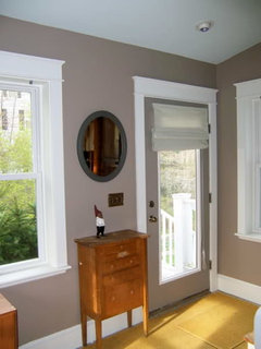
sag harbor gray paint (benjamin moore)
nesting12
15 years ago
Featured Answer
Sort by:Oldest
Comments (19)

nesting12
15 years agoRelated Professionals
Mount Vernon Interior Designers & Decorators · Crestview Interior Designers & Decorators · Washington Interior Designers & Decorators · Austin Furniture & Accessories · Des Moines Furniture & Accessories · Fort Carson Furniture & Accessories · Sugar Hill Furniture & Accessories · Deer Park Lighting · Englewood Lighting · Fort Washington Lighting · York Lighting · Antioch Window Treatments · Berkeley Window Treatments · Campbell Window Treatments · Rockford Window Treatmentsalisande
15 years agopositano
15 years agomldao
15 years agonesting12
15 years ago
redbazel
15 years agomldao
15 years agonesting12
15 years agolittle_red8
14 years agopattyk_64
14 years agonesting12
14 years agomegsy
14 years agoredbazel
14 years agolindseylulu
14 years agonesting12
14 years ago
Circus Peanut
14 years agorhodora
14 years ago
Loretta Kingsmore
2 years ago

Related Stories
HOUZZ TOURSMy Houzz: Harbor Views Enrich a Newfoundland Townhouse
Bigger windows in this brownstone bring in ocean sights, but more features for entertaining are just as much a draw
Full Story
MOST POPULAR50 Shades of Gray
Gray is hotter than ever, thanks to a hit novel full of risks and dark secrets. Tell us: Which paint shade possesses you?
Full Story
GRAYChoosing Paint: How To Pick the Right Gray
Which Version of Today's 'It' Neutral Is For You?
Full Story
COLORBenjamin Moore Floats Breath of Fresh Air as Its Color of 2014
Touted as a new neutral, this baby blue can stand on its own or support bolder colors. Here's how to use it
Full Story
EXTERIOR COLORExterior Color of the Week: 7 Ways With Warm Gray
See why this hue can be the perfect neutral for any house
Full Story
DINING ROOMSColor Feast: When to Use Gray in the Dining Room
The right shade of gray pairs nicely with whites and woods to serve up elegance and sophistication
Full Story
GRAYColor Guide: How to Work With Light Gray
The hottest new neutral can be cool or warm, formal or casual, and feminine or masculine. Talk about versatile
Full Story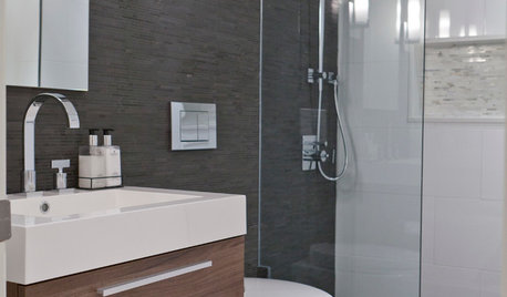
COLORBathed in Color: When to Use Gray in the Bath
Go for elegance and sophistication without going overboard on coolness, using these gray bathroom paint picks and inspirational photos
Full Story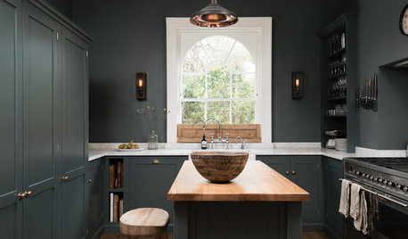
KITCHEN OF THE WEEKDark Gray Sophistication in a Shaker-Style Kitchen
Rich paint used throughout this compact London space helps create a kitchen that’s contemporary and inviting
Full Story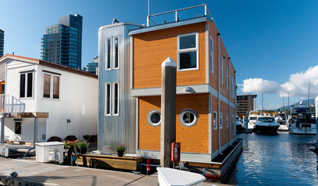
HOUZZ TOURSHouzz Tour: Modern Houseboat in Vancouver, B.C.
Get small-space design ideas from a modern dream home afloat on the harbor
Full Story


positano