Shop Products
Houzz Logo Print
scanmike_gw

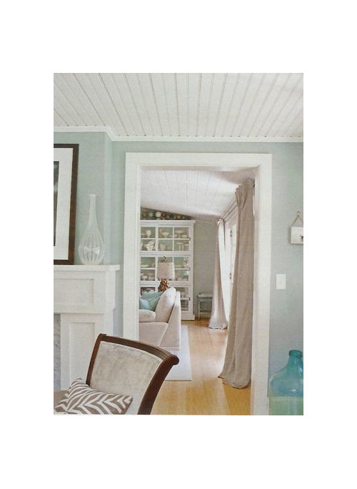
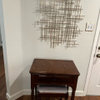
Can anyone guess these colors?

scanmike
10 years ago

This is in addition to my other post regarding Accessible Beige and Smokey Taupe. I love this look below. Can anyone suggest colors that would give this effect? I pretty much know the blue, but the background color?
Thanks,
Denise

.

This post was edited by scanmike on Sun, Apr 27, 14 at 7:46

Comments (24)

  • tibbrix
    10 years ago

    scanmike, my bedroom (although I'm about to repaint it in SW Languid Blue).

    Color now is BM Quiet Moments. Trim and ceiling are BM White Dove.

    This post was edited by Tibbrix on Sat, Apr 26, 14 at 20:43

  • tibbrix
    10 years ago

    Quiet Moments:

  • lazydaisynot
    10 years ago

    The room in the foreground could be Restoration Hardware's Silver Sage, a color that changes quite a bit depending on lighting.

  • Sueb20
    10 years ago

    Or Healing Aloe.

  • Sueb20
    10 years ago

    Or Pale Smoke?

  • bestyears
    10 years ago

    Maybe Ben Moore's November Rain?

  • scanmike
    Original Author
    10 years ago

    Thanks everyone. I pretty much know what blue works for me and it's Silver Sage, Quiet Moments or Grey Cashmere (lighter). But what is the background color, or a color similar tothe drapes?

  • User
    10 years ago

    I am far from a color expert but to my eyes, the color in the front room in Scanmike's photos looks more like- healing aloe--or pale smoke--- or sea salt of the photos posted above.
    I think the other guesses had too much blue green.
    again, this is to my untrained eyes on my monitor.

  • tibbrix
    10 years ago

    Healing Aloe is the one I was thinking of but couldn't think of the name. I knew it wasn't Quiet Moments.

    What do you mean by "background color"?

    FYI: Quiet moments is more green than blue.

  • nosoccermom
    9 years ago

    OK, so here are some other photos of the same pictures.

    "Clean & Classy

    Light blue, brown, and beige create a sophisticated palette. In this living room, the white trim and ceiling combine with light wood floors to keep it feeling airy."

    I think the other room is in the same paint color, even though it looks a bit grayer (maybe add a little white). The drapes are maybe something like
    BM Muslin??

    The BM colors, especially the whites/creams look nothing IRL on my monitor.

  • msrose
    9 years ago

    Did you decide Accessible Beige wasn't right?

    Accessible Beige

    Tapestry Beige

    Bennington Gray

  • alex9179
    9 years ago

    The color by the bookcase looks like BM Ozark Shadows, which I have in my entry and living room. I fell victim to the name, since I grew up in the Ozarks, but it DOES work with my stuff. It has the same pigments as BM Revere Pewter, which might work depending on your light.

    As demonstrated by nosoccermom, the colors in photos never looks like it does IRL. It's a true guessing game to come up with a color that LOOKS like a color in a photo.

  • mlweaving_Marji
    9 years ago

    I too am very confused by what you mean by "background color".
    I'd put money on both rooms being painted the same color and it's the light that's making them look a bit different.
    Add to that computer differences, and upload differences, what you're seeing and what I'm seeing might be way different things.

    In one of the versions nosoccermom posted above the curtains look like unbleached muslin, in the next they look like unbleached linen. A linen is distinctly more grey than a cotton muslin.

  • scanmike
    Original Author
    9 years ago

    I know that colors on the monitor can't be trusted. It's just the feel of the room that I like. The blue with taupe and greige colors. Very soothing. I am a bit stuck on the greige color. Tapestry is too green (my house throws alot of green light). It's looking like Accessible Gray might be the winner. I just wish it was a tad deeper. I guess I can have them increase the concentration. I never did that though. Smokey Taupe has a slight pinkish hue, but only when you look at it against the others. NOt sure how it would read in the whole room. I have large 24 x 24 boards up all over my house. My family thinks I am nuts. I have been debating this for a year now, which is good for me, since I usually impulsively pick the wrong colors. I want to try to get it right this time, knowing what I do about undertones now. I do love the color Thunder and in one room it has a taupe hue to it, but in the sun room (more light) it's more true grey. Lovely color, but not sure how grey would look with cappuccino in the hallway. I never see grey and browns together (in my head)

  • bestyears
    9 years ago

    Look at Ben Moore Pashmina -though it may be too intense.

  • tibbrix
    9 years ago

    The color one chip down on the strip from Accessible Beige is SW Balanced Beigeâ¦7037. Maybe that will be the depth you want.

  • dawn_t
    9 years ago

    Not sure if this helps, but I have a blue/gray accent wall (BM Piedmont Gray) in the living room with greige entrance & dining room walls (BM Ranchwood). The other 3 living room walls are BM Revere Pewter...

    Quite a mix, I know, but I find the colors soothing :)

  • Sueb20
    9 years ago

    In our beach house bedroom, we have a combination of Edgecomb Gray and Healing Aloe, which seems similar to the look you're after.

  • zen4d
    9 years ago

    Found the same room on another site and I believe it's the same color.

    Nevertheless, if you are looking for a nice taupe that would go with your aqua inspired color, you might like F&B Elephant's Breath.

    Here is a link that might be useful: Light Turquoise in LR

  • Annie Deighnaugh
    9 years ago

    For the beige, I'd look at Ben Moore Upper West Side

  • scanmike
    Original Author
    9 years ago

    When I look at Edgecomb Grey swatch, it looks like Accessible Beige to me. Makes sense that I like
    Edgecomb Grey also. I will check out upper west side along with one other on the Williamsburg Collection. Balanced Beige looks much more beige to me, if that makes sense. It's deeper yes, but looks less greige. Everyone is split between Accessible Beige and Smokey Taupe. My daughter is still rooting for Silver Sage. At least I am narrowing it down. I thought about Pashima but it's just a bit too dark and someone posted that it can go green, which I don't want. How does it work when you lighten a color by a percentage?. Does it look like the same color, only lighter? Just thinking about BM Stone Hearth vs. BM Smokey Taupe. Elephants Breath is supposed to have a lilac hue to it. I have Farrow and Ball Stoney Ground in a bedroom and it's similar to what I am thinking of, just minus the green cast it gives off. Looks alot like Grant Beige, which is why I didn't sample that. Plus I don't want to pay $100 a gallon again.

  • zen4d
    9 years ago

    Don't know if this helps but for what it's worth: I have BM Pashmina in a LR and F&B Elephant's Breath in a bathroom. Elephant's Breath is a shade lighter than the Pashmina.

  • bestyears
    9 years ago

    I've only lightened a color once, and I was never really happy with it. I had the same color in an adjoining room, but wanted a bit less intensity in the foyer. It always seemed watered down to me. Others have had better experiences I think.