


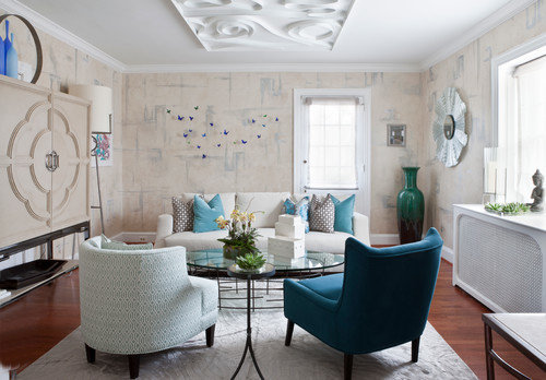
For good measure: DC Show House
nosoccermom
9 years ago

Related Stories
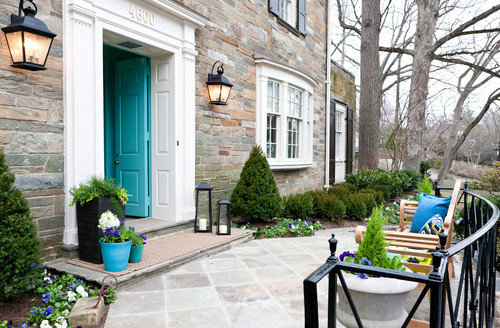
EVENTSDesigners Get Creative in a D.C. Show House
With a historic home as a canvas and a worthy cause as an incentive, designers pulled out all the stops for the 2014 project
Full Story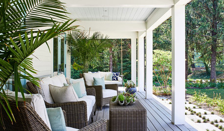
STANDARD MEASUREMENTSThe Right Dimensions for Your Porch
Depth, width, proportion and detailing all contribute to the comfort and functionality of this transitional space
Full Story
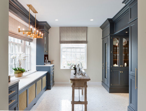
KITCHEN DESIGNKey Measurements to Help You Design Your Kitchen
Get the ideal kitchen setup by understanding spatial relationships, building dimensions and work zones
Full Story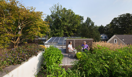
GREEN BUILDINGHouzz Tour: An Innovative Home Shows What It’s Made Of
Homeowners design their Washington, D.C., residence with sustainability in mind and to accommodate them as they get older
Full Story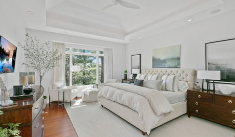
REMODELING GUIDESKey Measurements for a Dream Bedroom
Learn the dimensions that will help your bed, nightstands and other furnishings fit neatly and comfortably in the space
Full Story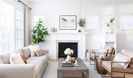
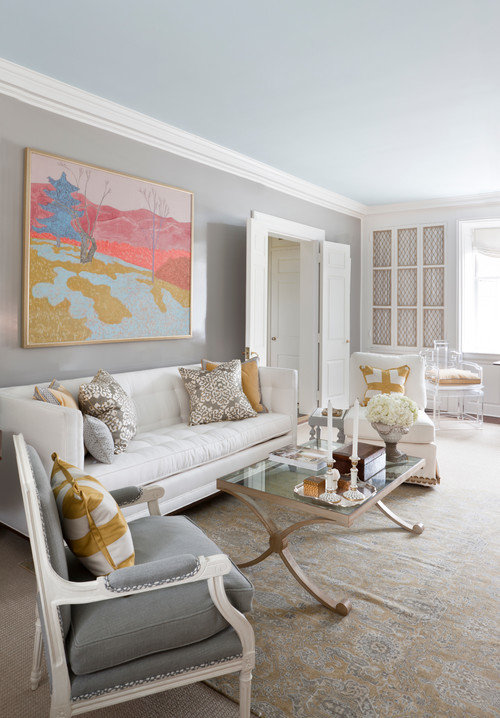
LIVING ROOMSKey Measurements for Your Living Room
Learn the basic dimensions that will allow good circulation, flow and balance as you fit in all the furnishings you want
Full Story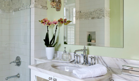
BATHROOM MAKEOVERS21st-Century Amenities for an Old-Time Show House Bath
Updated but appropriate features help an old-fashioned bath in the 2014 DC Design House align with modern tastes
Full Story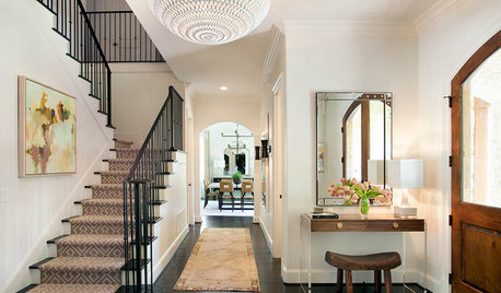
STANDARD MEASUREMENTSKey Measurements: Hallway Design Fundamentals
Whether narrow or wide, hallways can be enhanced with built-ins, artwork and distinctive lighting fixtures
Full Story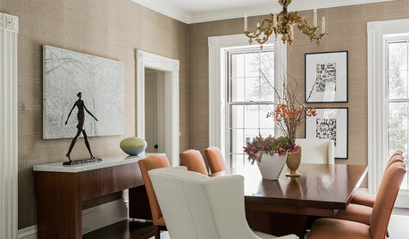
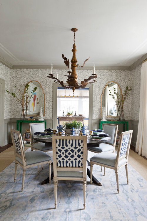
STANDARD MEASUREMENTSKey Measurements for Planning the Perfect Dining Room
Consider style, function and furniture to create a dining space that will let you entertain with ease
Full Story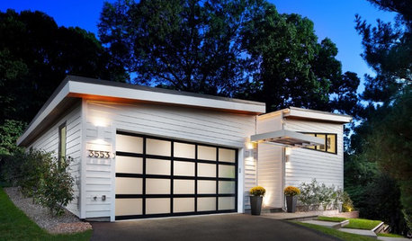
GARAGESKey Measurements for the Perfect Garage
Get the dimensions that will let you fit one or more cars in your garage, plus storage and other needs
Full StoryMore Discussions


tibbrix
bpath
Related Professionals
Bridgeport Furniture & Accessories · Columbia Furniture & Accessories · Denver Furniture & Accessories · Shakopee Furniture & Accessories · Eau Claire Furniture & Accessories · Clark Furniture & Accessories · Eureka Furniture & Accessories · Highland Park Furniture & Accessories · Millburn Furniture & Accessories · Moraga Furniture & Accessories · Rogers Furniture & Accessories · North Bellmore Furniture & Accessories · Arcadia Lighting · Walker Lighting · El Mirage Window Treatmentspatricianat
ineffablespace
Gooster
mtnrdredux_gw
Annie Deighnaugh
nosoccermomOriginal Author
mtnrdredux_gw
nancybee_2010
nancybee_2010
outsideplaying_gw
peony4
Gooster
nosoccermomOriginal Author