


Paint shade for large north facing room
shadey
9 years ago
Featured Answer
Comments (20)

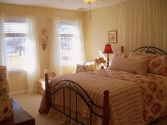
tibbrix
9 years agotibbrix
9 years agoRelated Professionals
Hagerstown Interior Designers & Decorators · Mount Laurel Interior Designers & Decorators · Fort Wayne Furniture & Accessories · Franklin Furniture & Accessories · Potomac Furniture & Accessories · Rock Hill Furniture & Accessories · Atlantic Beach Furniture & Accessories · Culver City Furniture & Accessories · Fair Lawn Furniture & Accessories · North Bellmore Furniture & Accessories · Ridgewood Furniture & Accessories · Lawrence Lighting · Monrovia Lighting · Scottdale Lighting · Seattle Window Treatmentstibbrix
9 years ago
patricianat
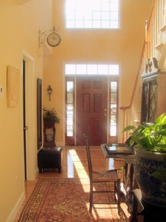
9 years agotibbrix
9 years agocrl_
9 years agopatricianat
9 years ago
Sueb20
9 years agolegomom23
9 years agodakota01
9 years agoloribee
9 years agodakota01
9 years agopeony4
9 years ago PRO
PROLori A. Sawaya
9 years agopeony4
9 years agopatricianat
9 years agocarolmka
9 years agoloribee
9 years agonosoccermom
9 years ago

Related Stories
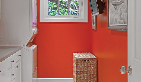
MORE ROOMS8 Colors for North-Facing Rooms
Have a room with little sunlight? One of these vibrant, saturated paint colors will warm it up
Full Story
DECORATING GUIDESThe Faces Have It: Large Portraits Go Over Big
Oversize visages of celebrities and mere mortals make for double-take drama in interiors
Full Story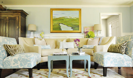
MORE ROOMS8 Colors for South-Facing Rooms
Choose one of these soft, cool colors to tone down the sun shining in
Full Story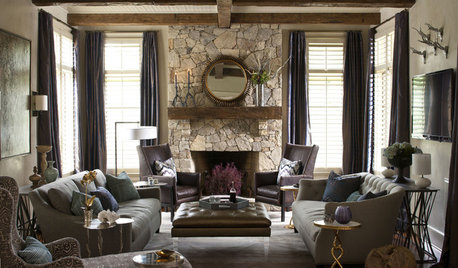
LIVING ROOMSRoom of the Day: Balancing Rustic and Glam in North Carolina
He wanted rough hewn; she wanted more polished — and a kid and dogs needed considering. See how their family room came together beautifully
Full Story
WINDOWSTreatments for Large or Oddly Shaped Windows
Get the sun filtering and privacy you need even with those awkward windows, using panels, shutters, shades and more
Full Story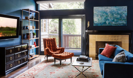
TRANSITIONAL STYLERoom of the Day: Dramatic Redesign Brings Intimacy to a Large Room
The daunting size of the living room once repelled this young family, but thanks to a new design, it’s now their favorite room in the house
Full Story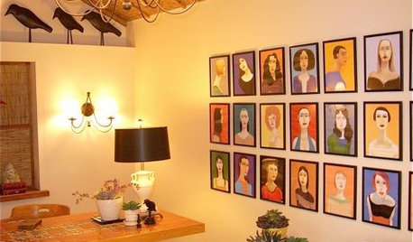
DECORATING GUIDESExpert Talk: Portraits Take Rooms Beyond Face Value
Adding depth and intrigue, portraits also sit well with these pro designers for putting a personal stamp on interior designs
Full Story
MOST POPULAR50 Shades of Gray
Gray is hotter than ever, thanks to a hit novel full of risks and dark secrets. Tell us: Which paint shade possesses you?
Full Story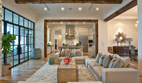
LIVING ROOMSLay Out Your Living Room: Floor Plan Ideas for Rooms Small to Large
Take the guesswork — and backbreaking experimenting — out of furniture arranging with these living room layout concepts
Full Story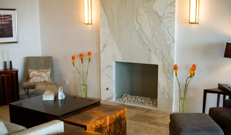
FIREPLACES12 Hot Ideas for Fireplace Facing
From traditional brick to industrial steel, there’s a fireplace cladding here to light up your design
Full Story

Lori A. Sawaya