


Living Room Paint Color Help/Advice Needed
travelingrory
10 years ago

Sort by:Oldest
Comments (22)
Related Stories

KITCHEN DESIGNDesign Dilemma: My Kitchen Needs Help!
See how you can update a kitchen with new countertops, light fixtures, paint and hardware
Full Story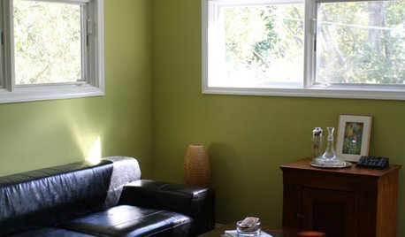


LIFEDecluttering — How to Get the Help You Need
Don't worry if you can't shed stuff and organize alone; help is at your disposal
Full Story
ORGANIZINGGet the Organizing Help You Need (Finally!)
Imagine having your closet whipped into shape by someone else. That’s the power of working with a pro
Full Story
COLORPaint-Picking Help and Secrets From a Color Expert
Advice for wall and trim colors, what to always do before committing and the one paint feature you should completely ignore
Full Story
HOUSEKEEPINGWhen You Need Real Housekeeping Help
Which is scarier, Lifetime's 'Devious Maids' show or that area behind the toilet? If the toilet wins, you'll need these tips
Full Story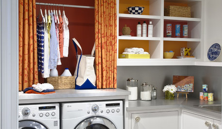
REMODELING GUIDESContractor Tips: Advice for Laundry Room Design
Thinking ahead when installing or moving a washer and dryer can prevent frustration and damage down the road
Full Story
TASTEMAKERSBook to Know: Design Advice in Greg Natale’s ‘The Tailored Interior’
The interior designer shares the 9 steps he uses to create cohesive, pleasing rooms
Full Story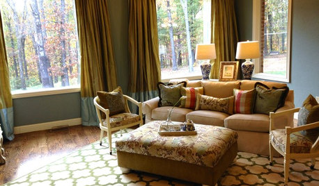
LIVING ROOMSA Living Room Miracle With $1,000 and a Little Help From Houzzers
Frustrated with competing focal points, Kimberlee Dray took her dilemma to the people and got her problem solved
Full StorySponsored
Franklin County's Preferred Architectural Firm | Best of Houzz Winner
More Discussions


tibbrix
travelingroryOriginal Author
Related Professionals
Chicago Furniture & Accessories · Denver Furniture & Accessories · Duluth Furniture & Accessories · Hastings Furniture & Accessories · Memphis Furniture & Accessories · Milwaukee Furniture & Accessories · Simpsonville Furniture & Accessories · Walnut Creek Furniture & Accessories · Duluth Furniture & Accessories · Fountain Furniture & Accessories · Kansas City Furniture & Accessories · Van Nuys Furniture & Accessories · Scottdale Lighting · Huntington Beach Window Treatments · Stoneham Window Treatmentsnosoccermom
tibbrix
travelingroryOriginal Author
tibbrix
travelingroryOriginal Author
tibbrix
travelingroryOriginal Author
tibbrix
travelingroryOriginal Author
tibbrix
travelingroryOriginal Author
tibbrix
travelingroryOriginal Author
travelingroryOriginal Author
nosoccermom
tfitz1006
travelingroryOriginal Author
Sueb20
tibbrix
Sueb20