


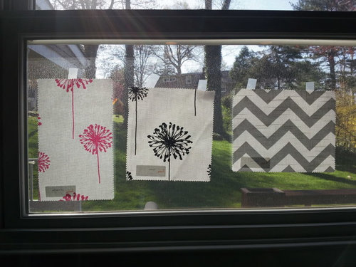
Help Me Pick Kitchen/Family Room Window Treatments
malhgold
12 years ago


Sort by:Oldest
Comments (21)
Related Stories

COLORPaint-Picking Help and Secrets From a Color Expert
Advice for wall and trim colors, what to always do before committing and the one paint feature you should completely ignore
Full Story
COLORPick-a-Paint Help: How to Create a Whole-House Color Palette
Don't be daunted. With these strategies, building a cohesive palette for your entire home is less difficult than it seems
Full Story
PRODUCT PICKSGuest Picks: Help Your Home Blossom With Floral Decor
Sprinkle hints of spring around your rooms with fabrics, wall coverings and more that recall nature's charms
Full Story
ARCHITECTUREHouse-Hunting Help: If You Could Pick Your Home Style ...
Love an open layout? Steer clear of Victorians. Hate stairs? Sidle up to a ranch. Whatever home you're looking for, this guide can help
Full Story
COLORColor Palette Extravaganza: Room-by-Room Help for Your Paint Picks
Take the guesswork out of choosing paint colors with these conveniently collected links to well-considered interior palettes
Full Story
Guest Picks: Give Your Home a Helping of Spring Greens
Celebrate garden growth with this collection of housewares and gardening gear in the shades of budding plants
Full Story
COLORPick-a-Paint Help: How to Quit Procrastinating on Color Choice
If you're up to your ears in paint chips but no further to pinning down a hue, our new 3-part series is for you
Full Story
UNIVERSAL DESIGNMy Houzz: Universal Design Helps an 8-Year-Old Feel at Home
An innovative sensory room, wide doors and hallways, and other thoughtful design moves make this Canadian home work for the whole family
Full Story
SELLING YOUR HOUSE10 Tricks to Help Your Bathroom Sell Your House
As with the kitchen, the bathroom is always a high priority for home buyers. Here’s how to showcase your bathroom so it looks its best
Full Story
KITCHEN DESIGNKey Measurements to Help You Design Your Kitchen
Get the ideal kitchen setup by understanding spatial relationships, building dimensions and work zones
Full StorySponsored
More Discussions


Annie Deighnaugh
dakota01
Related Professionals
Bridgeport Furniture & Accessories · Indianapolis Furniture & Accessories · Potomac Furniture & Accessories · Queens Furniture & Accessories · Santa Barbara Furniture & Accessories · St. Louis Furniture & Accessories · San Elizario Furniture & Accessories · Pleasant Grove Furniture & Accessories · Richfield Furniture & Accessories · Sahuarita Furniture & Accessories · Indian Creek Furniture & Accessories · Chapel Hill Custom Artists · Pembroke Custom Artists · Red Bank Lighting · Placerville Window Treatmentsanele_gw
les917
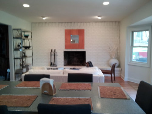
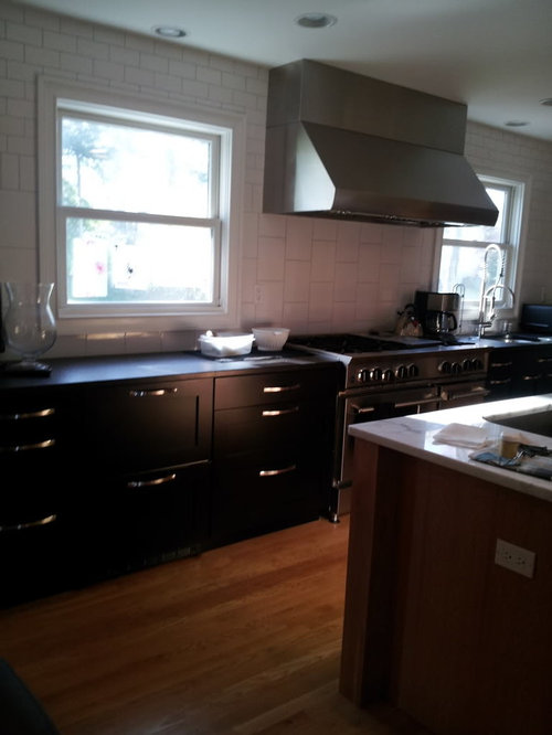
malhgoldOriginal Author
vintagewine
hlove
beekeeperswife
User
loribee
malhgoldOriginal Author
arlosmom
gr8daygw
malhgoldOriginal Author
breezygirl
User
Alittleapple
gobruno
palimpsest
bronwynsmom
Pipdog