


Fill in the Color! Exterior Patio Edition
gyr_falcon
10 years ago

Featured Answer
Comments (22)

teacats
10 years ago
gyr_falcon
10 years agoRelated Professionals
Jacinto City Interior Designers & Decorators · Chicago Furniture & Accessories · Mesa Furniture & Accessories · Minneapolis Furniture & Accessories · Atlantic Beach Furniture & Accessories · Highland Park Furniture & Accessories · Tamalpais-Homestead Valley Furniture & Accessories · Laguna Niguel Lighting · Miami Springs Lighting · Oak Lawn Lighting · Red Bank Lighting · La Vista Window Treatments · Rochester Hills Window Treatments · Rockledge Window Treatments · Brownsville Window Treatments
tibbrix
10 years agotibbrix
10 years agotibbrix
10 years agogyr_falcon
10 years agotibbrix
10 years ago
outsideplaying_gw
10 years agotibbrix
10 years agogyr_falcon
10 years agotibbrix
10 years agogyr_falcon
10 years agomadeyna
10 years agooutsideplaying_gw
10 years agochispa
10 years agogyr_falcon
10 years agogyr_falcon
10 years agogyr_falcon
10 years agogyr_falcon
10 years agochispa
10 years agogyr_falcon
10 years ago


Related Stories

FARMHOUSESLight-Filled Artist’s Studio in the Pennsylvania Countryside
An architect creates a soaring space for a still-life painter that references the area’s history and her passion for horses
Full Story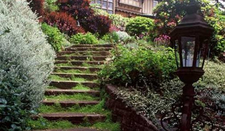
ARCHITECTUREModern or Contemporary Architecture? The Interiors Edition
See how one expert distinguishes between two popular camps of interior architecture. Do you agree with his choices?
Full Story
HOUZZ TOURSMy Houzz: Eye Candy Colors Fill an 1800s New Orleans Victorian
Take your fill of teal and pink patent leather, shots of chartreuse and vibrant artwork spanning the rainbow
Full Story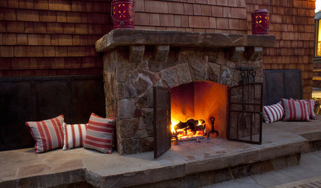
GARDENING AND LANDSCAPINGExtend Your Living Space With an Outdoor Fireplace
Increase square footage and enjoyment of your home with an exterior fireplace for a patio or backyard
Full Story
LANDSCAPE DESIGNProblem Solving With the Pros: Rustic Simplicity in a Country Garden
Editing thoughtfully and adding some magic result in a timeless weekend retreat
Full Story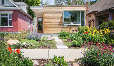
HOUZZ TOURSMy Houzz: A Modern Home Meets Its Neighbors Halfway
Its exterior proportions fit the next-door Victorians, but this Salt Lake City home has its own distinctly modern personality
Full Story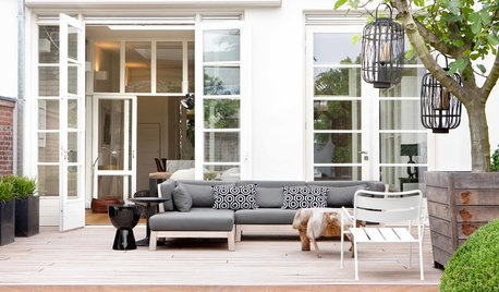
GARDENING AND LANDSCAPINGUnwind in a Boutique-Hotel Lounge — on Your Patio
Bring vacation-style comfort to your patio with cushy all-weather furnishings and accessories worthy of a posh getaway
Full StoryHOUZZ TOURSHouzz Tour: Contemporary Nest in Fun Vancouver Neighborhood
First-time homeowner turns her compact apartment into a peaceful, light-filled home
Full Story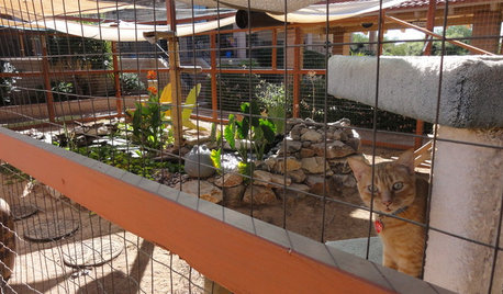
PETSSee a Deluxe 'Catio' Built for Feline Fun
Sixteen lucky cats get the run of a protected outdoor patio with ramps, steps and even a koi pond
Full StoryMore Discussions


tibbrix