


brightening a room without much natural light
Bunny
15 years ago
Sort by:Oldest
Comments (22)
Related Stories
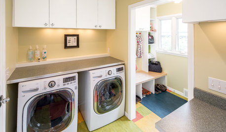
MOST POPULARA Colorful Place to Whiten Whites and Brighten Brights
This modern Minnesota laundry-mudroom gets a smarter layout and a more lively design
Full Story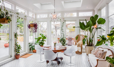
HOUZZ TOURSHouzz Tour: A New Conservatory Brightens a Converted Carriage House
A year in Barcelona and fond memories of London spur a new sunny addition and a whole-house refresh
Full Story
DECORATING GUIDESLighten Up — or Brighten Up — With Yellow
You can use this versatile color to create a buttery backdrop, add a zesty accent or make a bold design statement
Full Story
PRODUCT PICKSGuest Picks: Decor to Brighten a Wintry Day
Warm neutrals and a touch of glimmer make these linens, furnishings and accessories bright spots during cold times
Full Story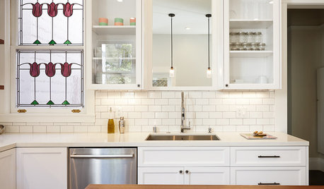
KITCHEN DESIGNKitchen of the Week: A Dark Kitchen Brightens Up
A cooking space honors the past while embracing the present
Full Story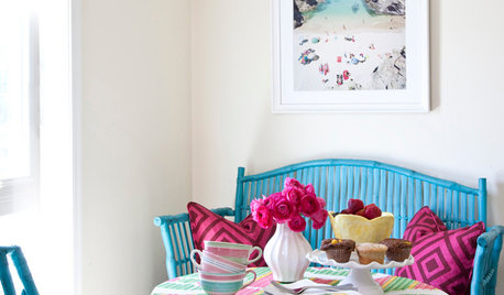
COLORSteep Your Rental in Color — Without Painting the Walls
Let your favorite hues loose without skirting your lease, with these room-by-room ideas for apartments and other rented homes
Full Story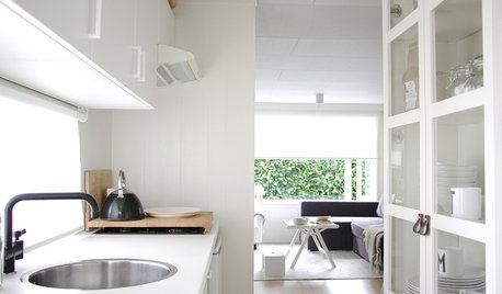
HOUZZ TOURSMy Houzz: White Interiors Brighten a Dutch Cottage
Snowy finishes and minimal accessories give a compact 2-bedroom home for a family of 5 a more open feel
Full Story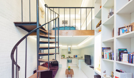
REMODELING GUIDESAsk an Architect: How Can I Carve Out a New Room Without Adding On?
When it comes to creating extra room, a mezzanine or loft level can be your best friend
Full Story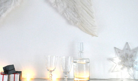
DECORATING GUIDES17 Ways to Brighten a Holiday Home, Scandinavian Style
No one does inspired natural decorating better than the Scandinavians, and that includes adorning the home for the holidays
Full Story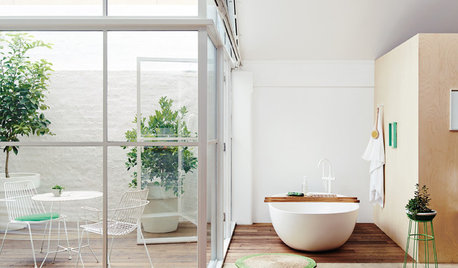
BATHROOM DESIGNWindows That Expose Your Bathroom to Light Without Exposing You
Enjoy the best of both worlds with window tricks that give you privacy along with the views and natural light
Full Story
brutuses
Jeannine
Related Professionals
Appleton Interior Designers & Decorators · Fountain Hills Interior Designers & Decorators · Tahoe City Interior Designers & Decorators · Milwaukee Furniture & Accessories · Ventura Furniture & Accessories · Carson City Furniture & Accessories · Eau Claire Furniture & Accessories · Fair Lawn Furniture & Accessories · Fillmore Furniture & Accessories · Northridge Furniture & Accessories · Pinehurst Furniture & Accessories · Diamond Bar Lighting · Tampa Lighting · Colorado Springs Window Treatments · Del City Window Treatmentspumpkin_spice
brutuses
BunnyOriginal Author
luckygal
threedgrad
graywings123
stinky-gardener
bronwynsmom
vavavoom
stinky-gardener
bronwynsmom
BunnyOriginal Author
brutuses
BunnyOriginal Author
brutuses
patricianat
stinky-gardener
brutuses
BunnyOriginal Author
patricianat