


Bungalow exterior colors
maddybeagle
11 years ago

Sort by:Oldest
Comments (32)
Related Stories
HOUZZ TOURSMy Houzz: Color and Heirlooms Combine in a Welcoming Bungalow
Inherited furniture mixes with bright hues in a 1921 Dallas home that embraces the neighborhood and modern life
Full Story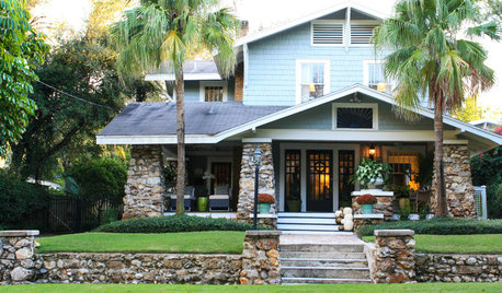
HOUZZ TOURSMy Houzz: Coastal Elegance for a 1917 Bungalow
Sea glass and beachy colors join the family silver and traditional seating in a 4-bedroom Florida home
Full Story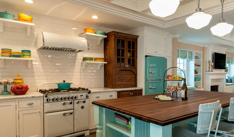
COASTAL STYLEKitchen of the Week: Vintage Beach Bungalow Style
A coastal color palette, retro details and modern amenities make life easy and cheerful in this 1940s home
Full Story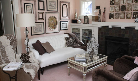
HOUZZ TOURSMy Houzz: 1921 Portland Bungalow Gone Glam
Vintage cabinets, pastel colors and creative flair outfit a cozy jewelry and mixed-media artist’s home
Full Story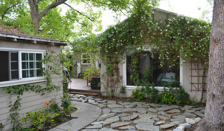
HOUZZ TOURSMy Houzz: Budget-Minded Comfort for a 1940s Hollywood Bungalow
Plush furnishings, warm colors and a cottage garden give a first-time owner a house worth coming home to
Full Story
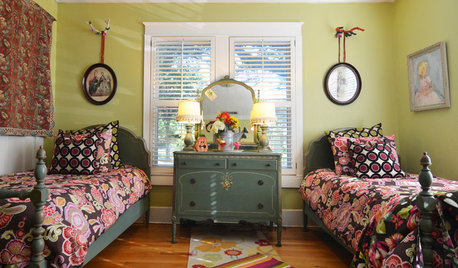
HOUZZ TOURSMy Houzz: Collected Style in a Nashville Bungalow
First-time owners bring a fresh take on DIY, color and creative composition to their 2-bedroom home
Full Story
HOUZZ TOURSMy Houzz: Colorado Bungalow, Creatively Redone
Plenty of color and art, plus a sense of adventurousness, wind through the contemporary renovation of this Denver family's 1908 home
Full Story
EXTERIORSHelp! What Color Should I Paint My House Exterior?
Real homeowners get real help in choosing paint palettes. Bonus: 3 tips for everyone on picking exterior colors
Full Story
EXTERIOR COLOR18 Home Exteriors Gone Wild With Color
Technicolor dreams play out beautifully with these exterior paint jobs, showing that color confidence has its rewards
Full Story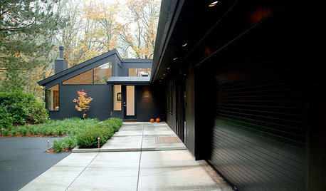
EXTERIOR COLOROn Trend: Bold and Black Exterior House Color
All-black and coal-gray exteriors make a nonconformist statement on homes of any style and size
Full StoryMore Discussions


arlosmom
maddybeagleOriginal Author
Related Professionals
Fort Smith Interior Designers & Decorators · Lake Elsinore Interior Designers & Decorators · Rosaryville Interior Designers & Decorators · Minneapolis Furniture & Accessories · Nashville Furniture & Accessories · Queens Furniture & Accessories · Fountain Furniture & Accessories · Palmetto Bay Furniture & Accessories · Melbourne Custom Artists · Springville Custom Artists · Los Angeles Window Treatments · Mount Sinai Window Treatments · North Tustin Window Treatments · Palm Beach Gardens Window Treatments · Seattle Window Treatmentsmadeyna
maddybeagleOriginal Author
jab65
maddybeagleOriginal Author
equest17
madeyna
maddybeagleOriginal Author
jmc01
maddybeagleOriginal Author
polly929
maddybeagleOriginal Author
madeyna
maddybeagleOriginal Author
maddybeagleOriginal Author
maddybeagleOriginal Author
arlosmom
maddybeagleOriginal Author
Holly- Kay
madeyna
maddybeagleOriginal Author
msjay2u
hosenemesis
maddybeagleOriginal Author
madeyna
maddybeagleOriginal Author
madeyna
Vertise
powermuffin
maddybeagleOriginal Author
maddybeagleOriginal Author