


Need a Green Paint Suggestion
rgusrafs
14 years ago
Sort by:Oldest
Comments (14)
Related Stories
LANDSCAPE DESIGN6 Suggestions for Harmonious Hardscaping
Help a sidewalk, driveway or path flow with your garden design, for a cohesive and pleasing look
Full Story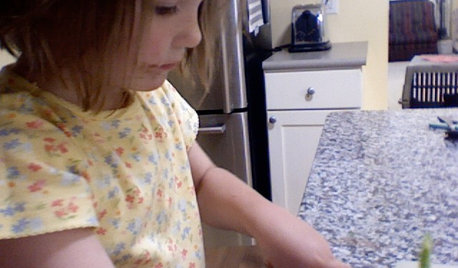
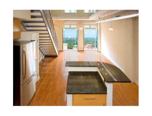
LIFEInviting Kids Into the Kitchen: Suggestions for Nurturing Cooks
Imagine a day when your child whips up dinner instead of complaining about it. You can make it happen with this wisdom
Full Story
HOUZZ TOURSHouzz Tour: Nature Suggests a Toronto Home’s Palette
Birch forests and rocks inspire the colors and materials of a Canadian designer’s townhouse space
Full Story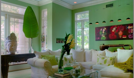
DECORATING GUIDESHow To Pick the Right Green Paint
Use Nature's Neutral to Energize, Soothe, and Surprise the Eye
Full Story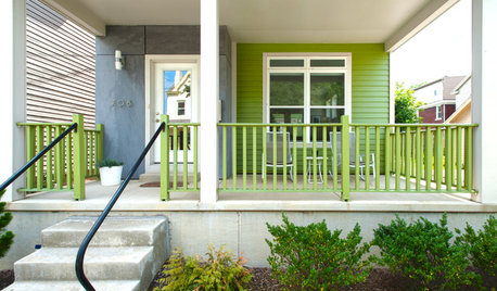
EXTERIOR COLORThe Joyful Exterior: Perk Up Curb Appeal With a Splash of Green
You may not want to douse your whole house with it, but green can work wonders as an exterior accent color
Full Story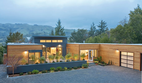
GREEN BUILDINGEfficient Architecture Suggests a New Future for Design
Homes that pay attention to efficient construction, square footage and finishes are paving the way for fresh aesthetic potential
Full Story
DECORATING GUIDESPaint Color Ideas: 8 Uplifting Ways With Yellow and Green
Dial up the cheer with yellow and green paint combinations sure to cast off winter doldrums
Full Story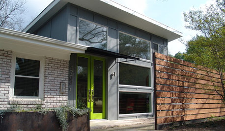
FRONT DOOR COLORSFront and Center Color: When to Paint Your Door Green
Fresh, fun and a pleasant surprise on a front door, green in subtle to strong shades brings energy to home exteriors
Full Story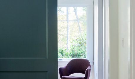
COLORMore Top Paint Picks for 2014: New Greens, Blues and Neutrals
Valspar’s new colors aim to lift spirits and express creativity. Here’s how to use 9 of them in lively ways
Full Story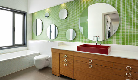
COLORBathed in Color: When to Use Green in the Bath
Splash some spring-conjuring green paint, tiles or accessories around your bathroom for natural appeal
Full Story


my3babypeaches
jamaraz
Related Professionals
Caledonia Interior Designers & Decorators · Washington Interior Designers & Decorators · Dallas Furniture & Accessories · Milwaukee Furniture & Accessories · Redmond Furniture & Accessories · Santa Barbara Furniture & Accessories · Woodstock Furniture & Accessories · Sudbury Furniture & Accessories · Arcadia Lighting · Walnut Creek Lighting · Whittier Lighting · Chicago Window Treatments · Gadsden Window Treatments · Phoenix Window Treatments · Rockford Window Treatmentsmegsy
altagirl
rgusrafsOriginal Author
htnspz
paint_chips
loribee
rgusrafsOriginal Author
scanmike
traditionalgirl1
rgusrafsOriginal Author
rgusrafsOriginal Author
scanmike