


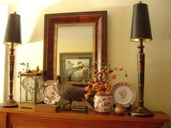
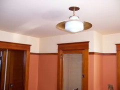
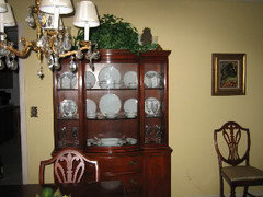
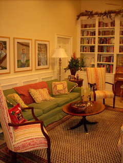
Perfect Muted Yellow
newhomeowner_2008
15 years ago
Featured Answer
Sort by:Oldest
Comments (34)

amysrq
15 years agocharleney
15 years agoRelated Professionals
Linton Hall Interior Designers & Decorators · Wanaque Interior Designers & Decorators · Washington Interior Designers & Decorators · Marietta Furniture & Accessories · Newnan Furniture & Accessories · San Diego Furniture & Accessories · Hampton Bays Furniture & Accessories · Miami Beach Furniture & Accessories · Sudbury Furniture & Accessories · Mill Valley Custom Artists · Aurora Lighting · Walnut Creek Lighting · Wells Branch Lighting · Stanton Window Treatments · Stony Brook Window Treatmentsnewhomeowner_2008
15 years agottodd
15 years agoamysrq
15 years agopumpkin_spice
15 years agonewhomeowner_2008
15 years agobuddyrose
15 years agoavaclark
15 years agohondagirl
15 years agottodd
15 years agopirula
15 years agobrutuses
15 years ago
My3dogs ME zone 5A
15 years ago
Circus Peanut
15 years agoartlover13060
15 years agocherigw
15 years agoartlover13060
15 years agobrutuses
15 years ago
Janice
15 years ago
Bunny
15 years agoMy3dogs ME zone 5A
15 years agoBunny
15 years agoUser
15 years ago
angeldog
15 years agoacomom
15 years agoangeldog
15 years agojuliann74
14 years agonewdawn1895
14 years agocarolj79
14 years agolaurenk88_pa
14 years ago
Oakley
14 years agonewhomeowner_2008
14 years ago


Related Stories
COLORWhy Blue and Yellow Can Be Perfect Bedfellows
This color combo evokes clear skies and golden beaches and can bring cheer to even the gloomiest days
Full Story
DECORATING GUIDESPaint Color Ideas: 8 Uplifting Ways With Yellow and Green
Dial up the cheer with yellow and green paint combinations sure to cast off winter doldrums
Full Story
ORANGEColor Guide: How to Use Yellow Ocher
Earthy and warm, this ancient color evokes the sands of time as well as speaks to modern decorating sensibilities
Full Story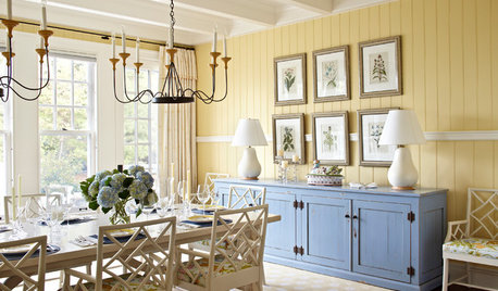
COLORHow to Pick the Perfect Accent Color
Not sure what colors go together in a room? Here are suggested combinations for different moods and effects
Full Story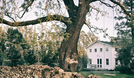
HOUZZ TOURSHouzz Tour: Picture-Perfect Simplicity
It’s like camping out in a catalog sometimes at this classic farmhouse — Pottery Barn and other retailers love it for photo shoots
Full Story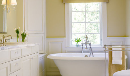
COLORBathed in Color: Favorite Yellows and Golds for the Bath
Get a golden glow for your bathroom with these expert paint picks and ideas for yellow walls
Full Story
COLORPick a Perfect Color Palette
Whether you're color challenged or just uninspired, two sites offer a rainbow of options to help you choose just the right hues
Full Story
COLORDreaming in Color: 8 Eye-Opening Yellow Bedrooms
Start your day energized and cheerful with bedroom hues that sing of sunshine or golden fields
Full Story
YELLOWMustard Yellow Offers a Fresh Taste for Rooms
New shades and tones have sown the seeds of a mustard-yellow revival, and rooms everywhere are reaping the benefit
Full Story
COLORBest Ways to Use the Soft Yellow Color of 2014
You may fall for PPG Pittsburgh Paints’ Turning Oakleaf if you like your hues warm, mellow and cheery
Full StoryMore Discussions


threedgrad