


A conversation about color, and how to see and use it.
bronwynsmom
15 years ago
Related Stories
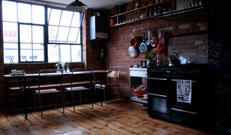
HOUZZ TOURSHouzz Tour: Warehouse Conversion in East London Sees Full Potential
Functional spaces, an open floor plan and optimized storage units transform this warehouse into an efficient small home
Full Story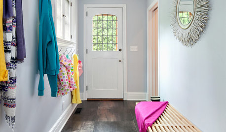
MUDROOMSHouzz Call: We Want to See Your Hardworking Mudroom
The modern mudroom houses everything from wet boots to workstations. Proud of your space? Inspire us with your photos and tips
Full Story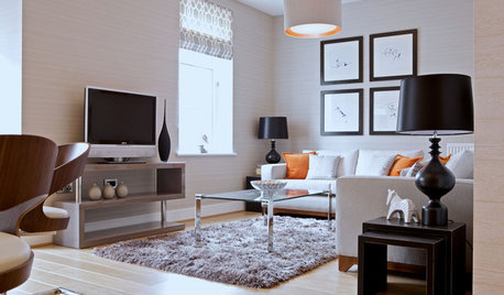
See How TVs Are Passing the Designer Test
Better-looking televisions and electronics come out of the armoire, into the room's design
Full Story
REMODELING GUIDESWhat to Know About Budgeting for Your Home Remodel
Plan early and be realistic to pull off a home construction project smoothly
Full Story
GREEN DECORATING8 Questions to Help You See Through Green Hype
With the ecofriendly bandwagon picking up some dubious passengers, here's how to tell truly green products and services from the imposters
Full Story
KIDS’ SPACESSee an Arizona Nursery That’ll Never Get Old
Age appropriate but not childish, this baby boy’s room will grow with him without a redesign
Full Story
MOST POPULARShe’s Baaack! See a Savvy DIYer’s Dramatic $400 Bathroom Makeover
You’ve already seen her dramatic laundry room makeover. Now check out super budget remodeler Ronda Batchelor’s stunning bathroom update
Full Story
INSIDE HOUZZHouzz Survey: See the Latest Benchmarks on Remodeling Costs and More
The annual Houzz & Home survey reveals what you can expect to pay for a renovation project and how long it may take
Full Story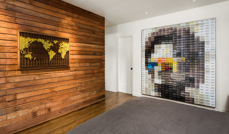
HOUZZ TOURSHouzz TV: See How Reclaimed Wood Warms a Home With a James Brown Wall
L.A. homeowners craft their interiors with salvaged wood and build a tribute to the Godfather of Soul with cassette tapes
Full Story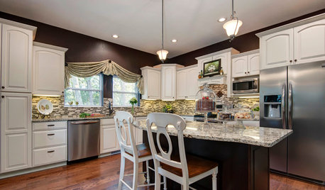
INSIDE HOUZZSee the Results: The Houzz/Lowe’s Dream Kitchen Sweepstakes
An interior designer and products from Lowe’s help this homeowner fulfill a kitchen dream
Full StorySponsored
Leading Interior Designers in Columbus, Ohio & Ponte Vedra, Florida
More Discussions


parma42
happytobehome
Related Professionals
Fernway Interior Designers & Decorators · Annandale Furniture & Accessories · Beaufort Furniture & Accessories · Owensboro Furniture & Accessories · Alpharetta Furniture & Accessories · Asheville Furniture & Accessories · Tamalpais-Homestead Valley Furniture & Accessories · Aurora Lighting · Florida City Lighting · Lancaster Lighting · Miami Lighting · Wasco Lighting · Huntington Beach Window Treatments · San Jose Window Treatments · The Woodlands Window Treatmentsparma42
Lori A. Sawaya
lindac
caramia
arleneb
Lori A. Sawaya
dainaadele
bronwynsmomOriginal Author
justmeinsd
amysrq
caramia
bronwynsmomOriginal Author
Ideefixe
caramia
luckygal
parma42
lucillle
mistybear11
dainaadele
Lori A. Sawaya
mahatmacat1
parma42