


Color suggestions: Exterior Paint for Beachfront Home
14 years ago

Sort by:Oldest
Comments (32)
Related Stories
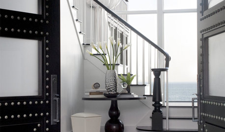
HOUZZ TOURSHouzz Tour: Glossy, Black-and-White Beachfront Style
Step inside a coastal New England home with a chic and tailored urban twist
Full Story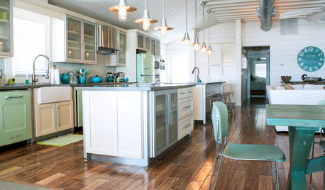
HOUZZ TOURSMy Houzz: A Breezy Beachfront Getaway for 8
Gutting and redesigning turn a dilapidated Florida triplex into a comfortable weekend retreat for a big family
Full Story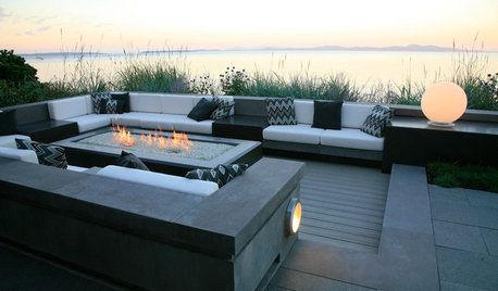
GARDENING AND LANDSCAPINGBeachfront Garden Stands Up to the Elements
A sophisticated outdoor entertaining space relies on tough plants and resilient materials to bring indoor living outside
Full Story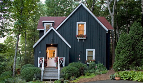
GREAT HOME PROJECTSHow to Get Your Home’s Exterior Painted
Learn how to hire and work with a painting contractor to get the best results
Full Story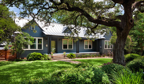
CURB APPEALHow to Touch Up Your Home’s Exterior Paint
Protect your siding from weather damage without exposing yourself to mismatched paint by learning the right way to do touch-ups
Full Story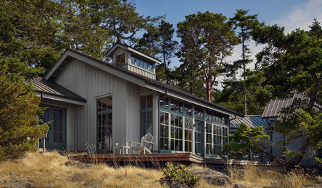
EXTERIOR COLORWhen to Paint Your Home Gray
This perfectly neutral and highly versatile color can create subtle distinctions among exterior architectural elements or stand on its own
Full Story
EXTERIOR COLORWhen to Paint Your Home Yellow
Be a cheer leader with this color that captures the sun and radiates a warm welcome
Full Story
GREAT HOME PROJECTSReady to Repaint Your Home’s Exterior? Get Project Details Here
Boost curb appeal and prevent underlying damage by patching and repainting your home’s outer layer
Full Story
CURB APPEALWhen to Paint Your House Brown
Nature loves brown, from rich soil to sunlit sand, and so do home exteriors with a traditional or Craftsman bent
Full Story
EXTERIORS8 Homes With Exterior Paint Colors Done Right
Get ideas for an exterior palette from these homes that run the gamut from Mediterranean to modern
Full StorySponsored
Your Custom Bath Designers & Remodelers in Columbus I 10X Best Houzz
More Discussions

CaroleOH
nhb22
Related Professionals
Clinton Township Interior Designers & Decorators · Linton Hall Interior Designers & Decorators · Rosaryville Interior Designers & Decorators · Boston Furniture & Accessories · Jupiter Furniture & Accessories · Silver Spring Furniture & Accessories · Springdale Furniture & Accessories · Surprise Furniture & Accessories · Owasso Furniture & Accessories · Temple Terrace Furniture & Accessories · Green Bay Lighting · Pearland Lighting · Tukwila Lighting · Huntington Beach Window Treatments · St. Louis Window Treatmentscooperbailey
willowdecor
My3dogs ME zone 5A
moonshadow
moonshadow
moneypitzelaOriginal Author
summiebee
moonshadow
LaylaPalmer_aol_com
summiebee
moonshadow
summiebee
moneypitzelaOriginal Author
moonshadow
summiebee
loribee
bluestarrgallery
moonshadow
moneypitzelaOriginal Author
powermuffin
moonshadow
Sueb20
moneypitzelaOriginal Author
moneypitzelaOriginal Author
User
msrose
graywings123
cooperbailey
declansmom
kjmama