


exterior paint color help
kam76
10 years ago

Sort by:Oldest
Comments (25)
Related Stories

EXTERIORSHelp! What Color Should I Paint My House Exterior?
Real homeowners get real help in choosing paint palettes. Bonus: 3 tips for everyone on picking exterior colors
Full Story
ENTRYWAYSHelp! What Color Should I Paint My Front Door?
We come to the rescue of three Houzzers, offering color palette options for the front door, trim and siding
Full Story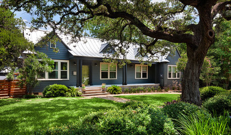
CURB APPEALHow to Touch Up Your Home’s Exterior Paint
Protect your siding from weather damage without exposing yourself to mismatched paint by learning the right way to do touch-ups
Full Story
EXTERIORSHow To Get Your Exterior Paint Color Right
Your House Color Should Fit You, Your Architecture and Where You Live
Full Story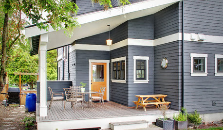
EXTERIORS5 Easy Tips for Choosing Your Exterior Paint Palette
Make your home the talk of the neighborhood — in a good way — with an exterior paint scheme that pops
Full Story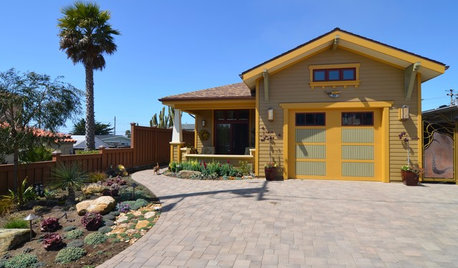
COLOR PALETTESChoosing Color: See This Home Try On 5 Exterior Paint Palettes
Dark and dramatic, or soft and neutral. See how paint color alone can change the look of a home
Full Story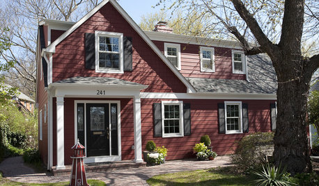
EXTERIORS8 Homes With Exterior Paint Colors Done Right
Get ideas for an exterior palette from these homes that run the gamut from Mediterranean to modern
Full Story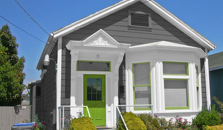
MOST POPULARChoosing Color: See 1 Cute Home in 3 Exterior Paint Palettes
Here’s proof that a little bit of fun color can add a whole lot of flair to your house
Full Story
COLORPick-a-Paint Help: How to Quit Procrastinating on Color Choice
If you're up to your ears in paint chips but no further to pinning down a hue, our new 3-part series is for you
Full Story
COLORColor Palette Extravaganza: Room-by-Room Help for Your Paint Picks
Take the guesswork out of choosing paint colors with these conveniently collected links to well-considered interior palettes
Full StorySponsored
Central Ohio's Trusted Home Remodeler Specializing in Kitchens & Baths
More Discussions


kam76Original Author
patricianat
Related Professionals
Gloucester City Interior Designers & Decorators · Van Wert Interior Designers & Decorators · Lake Zurich Furniture & Accessories · Mansfield Furniture & Accessories · Racine Furniture & Accessories · Rockville Furniture & Accessories · Clark Furniture & Accessories · Discovery Bay Furniture & Accessories · Encinitas Furniture & Accessories · Greenwood Village Furniture & Accessories · Urbandale Furniture & Accessories · Salem Custom Artists · South Miami Lighting · Sayreville Window Treatments · St. Louis Window Treatmentskam76Original Author
tibbrix
tibbrix
Lori A. Sawaya
kam76Original Author
kam76Original Author
Lori A. Sawaya
kam76Original Author
tannatonk23_fl_z9a
Lori A. Sawaya
joaniepoanie
kam76Original Author
kam76Original Author
tannatonk23_fl_z9a
tannatonk23_fl_z9a
patricianat
Lori A. Sawaya
kam76Original Author
kam76Original Author
kam76Original Author
kam76Original Author
kam76Original Author
kam76Original Author