


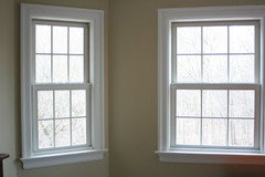
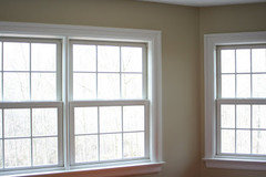
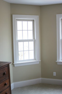
SW Ramie - or other non-'brown' neutrals
jockewing
15 years ago
Featured Answer
Sort by:Oldest
Comments (12)

mom2reese
15 years agoRelated Professionals
Nashville Interior Designers & Decorators · Van Wert Interior Designers & Decorators · Columbia Furniture & Accessories · Rome Furniture & Accessories · Washington Furniture & Accessories · Clark Furniture & Accessories · Davidson Furniture & Accessories · Irmo Furniture & Accessories · La Mirada Furniture & Accessories · New Hope Furniture & Accessories · San Francisco Lighting · South Bend Lighting · Mount Pleasant Window Treatments · West Des Moines Window Treatments · La Jolla Window Treatmentsjockewing
15 years agomom2reese
15 years agocrashboombang
15 years agobestyears
15 years agojockewing
15 years ago
susanlynn2012
15 years agoparma42
15 years agojockewing
15 years agoparma42
15 years agopositano
15 years ago
Related Stories

MOST POPULARWhat’s Your Neutral: Beige or Gray?
A designer shares 10 tips for using the neutral shade that works best for you
Full Story
GRAYGoing Greige: Tips for Choosing This All-Around Neutral
Here are some ways to highlight and complement your home with this elegant hybrid of gray and beige
Full Story
COLORBest Ways to Use the Neutral Green Color of 2015
Benjamin Moore’s Color of the Year is soft and natural
Full Story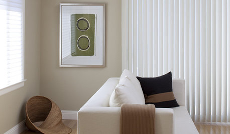
BROWNBeige to Almost Black: How to Pick the Right Brown
Warm your home with paint the color of lattes, espresso and chocolate
Full Story
DECORATING GUIDESNo Neutral Ground? Why the Color Camps Are So Opinionated
Can't we all just get along when it comes to color versus neutrals?
Full Story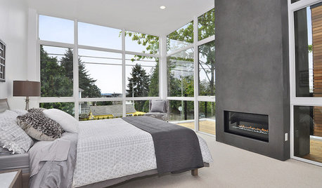
NEUTRAL COLORS8 Great Color Palettes: Surprising Bedroom Neutrals
Peaceful plum, relaxing black and many shades of gray show an unpredictably neutral nature in the bedroom
Full Story
COLOR4 New Neutrals for the New Year
So you're not resolved to go crazy with color in 2013. These refreshing on-trend neutrals can still broaden your rooms' color horizons
Full Story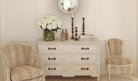
COLOR11 Ways to Spice Up Neutral Palettes
Side with texture and pattern in a neutral room for a look that commits to high sophistication and elegance
Full Story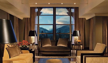
NEUTRAL COLORS10 Ways to Make Your Neutral Palette Shine
Wake up your beige and gray with a rich combination of texture, shape and pattern
Full Story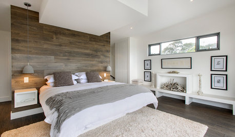
DECORATING GUIDESHow to Design a Neutral Room That Kicks Boring to the Curb
Neutrals need not be dull and lifeless. Here are some inspiring wow-factor designs — and ways to get the look
Full StoryMore Discussions


kmallen