


Complementary colors for adjacent rooms - one red other gold
purplekrayon
15 years ago
Sort by:Oldest
Comments (14)
Related Stories
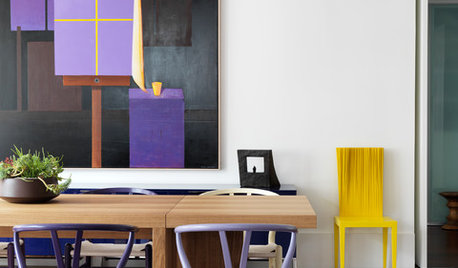
COLOROpposites Attract: Complementary Color Combos
Use the power couples of the color wheel — blue and orange, purple and yellow, red and green — to spice up any decor scheme
Full Story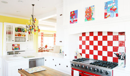
DECORATING GUIDESColor Guide: How to Work With Red
Sizzling or sedate, red is not for the timid. Here's how to use its boldness to make your rooms come alive
Full Story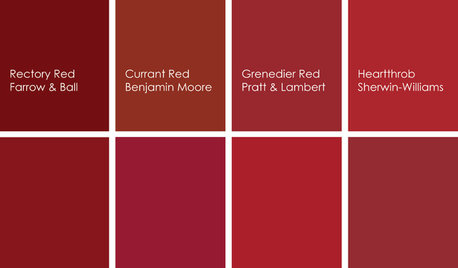
KITCHEN DESIGNCooking With Color: When to Use Red in the Kitchen
Candy Apple Red, Red Licorice and more for your kitchen walls, cabinets or island? The color choices are as delicious as they sound
Full Story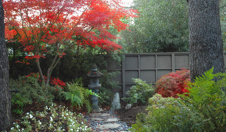
COLORNature’s Color Wisdom: Lessons on Red From the Great Outdoors
Dab some of Mother Nature’s rouge around the home for an eye-opening look
Full Story
COLORColor Feast: When to Use Red in the Dining Room
It awakens appetites and spurs conversations, but too much is like a second helping of pie. Find the perfect balance of dining room red here
Full Story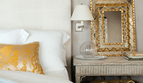
COLORRestful Bedroom Designs Strike Gold
Don’t be afraid to use this high-octane metallic to create a soft and sunny glow in the bedroom
Full Story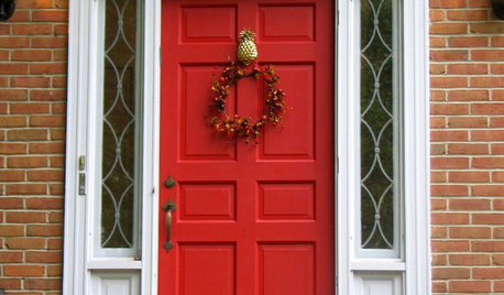
COLORThe Palette’s Power Suit: Energize With Red
Spicy or subdued, red brings undeniable vitality to rooms. See how it works with all kinds of styles
Full Story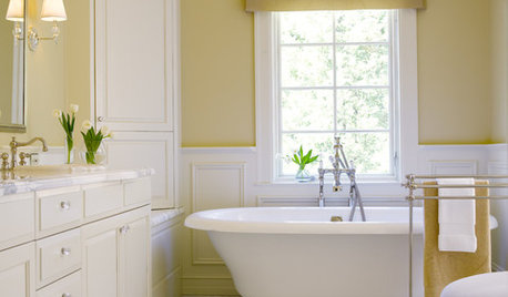
COLORBathed in Color: Favorite Yellows and Golds for the Bath
Get a golden glow for your bathroom with these expert paint picks and ideas for yellow walls
Full Story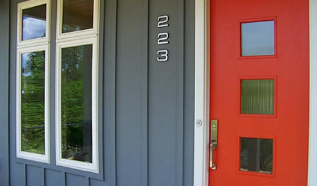
FRONT DOOR COLORSFront and Center Color: When to Paint Your Door Bright Red
Welcoming and intense, a red front door kicks up a home's entryway and is impossible to miss
Full Story
COLORColor Guide: How to Work With Gold
It's OK to be a gold digger — this timeless color adds a rich glow to walls, furnishings and home decor that anyone would covet
Full Story


beachlily z9a
amysrq
Related Professionals
Atlanta Furniture & Accessories · Carlsbad Furniture & Accessories · Dallas Furniture & Accessories · Franklin Furniture & Accessories · Phoenix Furniture & Accessories · Springdale Furniture & Accessories · Champlin Furniture & Accessories · Golden Glades Furniture & Accessories · Temple Terrace Furniture & Accessories · Decatur Custom Artists · New Bedford Custom Artists · Green Bay Lighting · Littleton Window Treatments · Riverhead Window Treatments · San Rafael Window TreatmentspurplekrayonOriginal Author
ingrid_vc so. CA zone 9
eliza_824
optionalnecessity
purplekrayonOriginal Author
purplekrayonOriginal Author
yborgal
deborahnj
artlover13060
User
optionalnecessity
optionalnecessity