


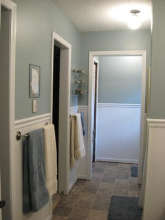
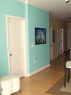
Is aqua really blue?
susan1208
15 years ago
Featured Answer
Comments (16)

threedgrad
15 years agobronwynsmom
15 years agoRelated Professionals
Charleston Furniture & Accessories · Duluth Furniture & Accessories · Fayetteville Furniture & Accessories · Redmond Furniture & Accessories · Topeka Furniture & Accessories · Wilmington Furniture & Accessories · Asheville Furniture & Accessories · Maplewood Furniture & Accessories · Pleasant Grove Furniture & Accessories · Jefferson Valley-Yorktown Lighting · Laguna Niguel Lighting · Cleveland Window Treatments · Kent Window Treatments · Littleton Window Treatments · Ridgewood Window Treatments
IdaClaire
15 years agoequest17
15 years agojockewing
15 years agoUser
15 years agosusan1208
15 years agosillymesillyne
15 years agoequest17
15 years agosusan1208
15 years agoscarlet_morgan
15 years agojockewing
15 years agosewnice50
15 years ago
mitchdesj
15 years agodebbiedoes
14 years ago


Related Stories

SHOP HOUZZShop Houzz: Get Acquainted With Tranquil Aqua Blue
Lighting, pillows, furniture and decor in aqua tones for easy, relaxing style
Full Story0
PRODUCT PICKSGuest Picks: Whip Up Kitchen Cheer With Aqua and Red
Cool blue and hot red accessories are foolproof ingredients of a jaunty kitchen with a hint of vintage
Full Story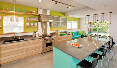
KITCHEN DESIGNKitchen of the Week: Aqua Knockout in Austin
Torn-down walls created more space, while vivid blue and green colors and clever storage gave a one-two punch to a kitchen remodel in Texas
Full Story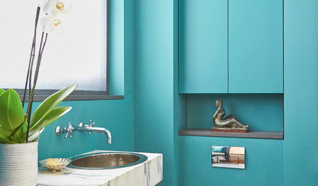
BLUE9 Beautiful Blues for Bathrooms
From soft sky to bold tropical aqua, see why this hue is making waves in bathrooms
Full Story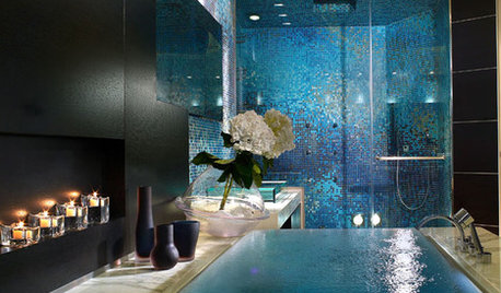
BATHROOM DESIGNDip Into a Watery Blue Bathroom
Relax and Refresh in a Soothing Bath of Blue, Turquoise or Aqua
Full Story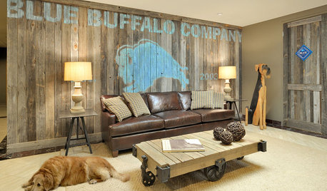
DECORATING GUIDESUnexpected Combination: Rustic Rooms and Blue
See how a cool aqua hue can give a space polish and character
Full Story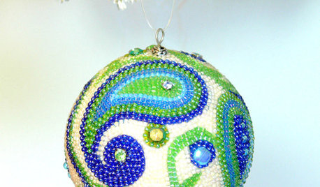
PRODUCT PICKSGuest Picks: I'll Have a Blue Christmas
With 20 decorations in shades of aqua, teal and turquoise, the holiday will be anything but glum
Full Story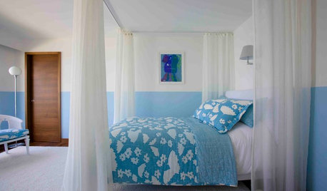
BEDROOMSDreaming in Color: 10 Beautiful Blue Bedrooms
Whether soft and sleepy or bold and splashy, see why blue can be the perfect hue in your bedroom
Full Story
COLORCatch a Splash of Ocean Blue This Summer
Dip a toe into cobalt or take on turquoise at full blast for rooms that soothe, energize and feel as breezy as the beach
Full Story
DECORATING GUIDESBlues Blaze Into Fashion for Fall 2012
Sashaying down designer runways and sported by trendy home interiors, this cool hue is looking to be way hot this fall
Full Story

caliloo