


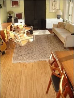
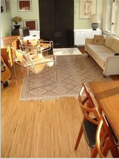
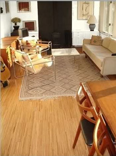
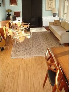
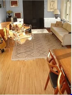
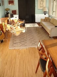
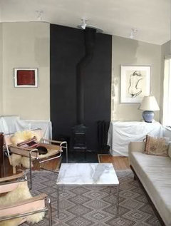
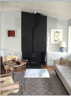
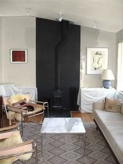
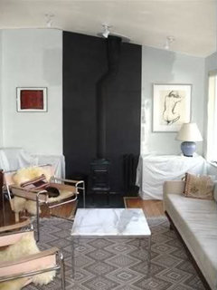
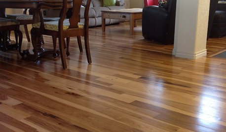
I guess it's my turn to ask for wallcolor advice. Red oak floors?
Stacey Collins
14 years ago
Featured Answer
Sort by:Oldest
Comments (25)

Stacey Collins
14 years ago
haley_comet
14 years agoRelated Professionals
Ashwaubenon Interior Designers & Decorators · Bloomingdale Interior Designers & Decorators · Ogden Interior Designers & Decorators · Ridgefield Park Interior Designers & Decorators · Camarillo Furniture & Accessories · Jacksonville Furniture & Accessories · North Bergen Furniture & Accessories · St. Louis Furniture & Accessories · Irmo Furniture & Accessories · Palmetto Bay Furniture & Accessories · Clive Furniture & Accessories · Arlington Custom Artists · Gainesville Custom Artists · Spring Lighting · The Woodlands Window Treatmentshomebodymom
14 years agoUser
14 years agoStacey Collins
14 years agoscanmike
14 years agoUser
14 years agoStacey Collins
14 years agoUser
14 years agopalimpsest
14 years agoyoungdeb
14 years agofirstmmo
14 years agoStacey Collins
14 years agoStacey Collins
14 years agoUser
14 years agokiki_redo
14 years agoscanmike
14 years agoStacey Collins
14 years ago
redbazel
14 years agojjam
14 years agofirstmmo
14 years agoloribee
14 years agoStacey Collins
14 years agolouisianapurchase
14 years ago


Related Stories
MATERIALSWhat to Ask Before Choosing a Hardwood Floor
We give you the details on cost, installation, wood varieties and more to help you pick the right hardwood flooring
Full Story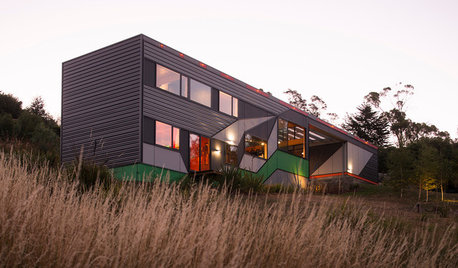
THE ART OF ARCHITECTUREThe Architects Who Asked ‘What If?’
In designing their own homes, these Australian architects turned self-imposed limits into creative discoveries
Full Story
LIFETurn Off the Video Games and Turn On Your Kid's Creativity
Going nuts planning summer activities? Kids overdosing on screen time? It may be time to foster more self-directed play
Full Story
DECORATING GUIDES10 Design Tips Learned From the Worst Advice Ever
If these Houzzers’ tales don’t bolster the courage of your design convictions, nothing will
Full Story
GREEN BUILDINGConsidering Concrete Floors? 3 Green-Minded Questions to Ask
Learn what’s in your concrete and about sustainability to make a healthy choice for your home and the earth
Full Story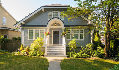
SELLING YOUR HOUSEFix It or Not? What to Know When Prepping Your Home for Sale
Find out whether a repair is worth making before you put your house on the market
Full Story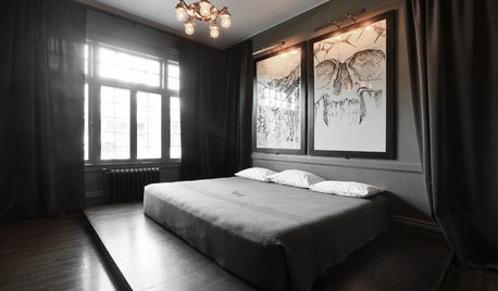
DECORATING GUIDESDecorating Advice to Steal From Your Suit
Create a look of confidence that’s tailor made to fit your style by following these 7 key tips
Full Story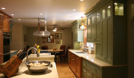
KITCHEN DESIGNSmart Investments in Kitchen Cabinetry — a Realtor's Advice
Get expert info on what cabinet features are worth the money, for both you and potential buyers of your home
Full Story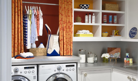
REMODELING GUIDESContractor Tips: Advice for Laundry Room Design
Thinking ahead when installing or moving a washer and dryer can prevent frustration and damage down the road
Full Story
LIFEYou Said It: ‘Some Ask Why, Others Why Not?’ and Other Houzz Quotables
Design advice, inspiration and observations that struck a chord this week
Full Story

megpie77