


Paint Opinions
RPDHockey
10 years ago

Related Stories
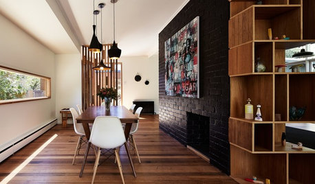
WALL TREATMENTSExpert Opinion: What’s Next for the Feature Wall?
Designers look beyond painted accent walls to wallpaper, layered artwork, paneling and more
Full Story
DECORATING GUIDESNo Neutral Ground? Why the Color Camps Are So Opinionated
Can't we all just get along when it comes to color versus neutrals?
Full Story
LIFEWhen Design Tastes Change: A Guide for Couples
Learn how to thoughtfully handle conflicting opinions about new furniture, paint colors and more when you're ready to redo
Full Story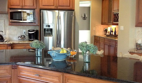
DECORATING GUIDESThe Hottest Houzz Discussion Topics of 2012
Discussions rocked and rolled this year with advice, support, budding friendships — and oh, yes, a political opinion or two
Full Story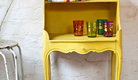
PAINTINGWhat to Know About Milk Paint and Chalk Paint — and How to Use Them
Learn the pros, cons, cost and more for these two easy-to-use paints that are great for giving furniture a vintage look
Full Story
BRICKHow to Paint Brick Like a Pro
Got a bland or beat-up brick wall? Treat it to a fresh face with paint in any color you choose
Full Story
REMODELING GUIDESInterior Brick: Paint it or Leave It?
Here's how to know if covering that brick is a sin or solution
Full Story
DECORATING GUIDESWhat You Need to Know Before Painting Brick
Sure, painted brick can be a great look. But you need to take some risks into account. Here's how to paint brick like a pro
Full Story
MOST POPULAR8 Great Kitchen Cabinet Color Palettes
Make your kitchen uniquely yours with painted cabinetry. Here's how (and what) to paint them
Full Story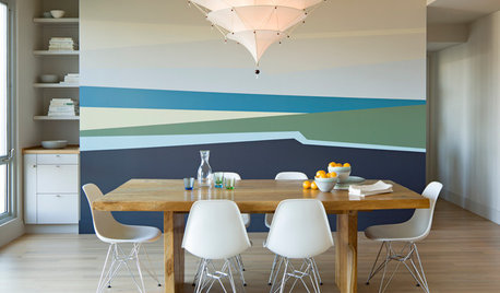
DECORATING GUIDESGet the Scoop on Finding the Best Paint for Your Money
Scoring the best deal on paint for your home may have nothing to do with advertised specials
Full Story

RPDHockeyOriginal Author
RPDHockeyOriginal Author
Related Professionals
Charleston Furniture & Accessories · Eagan Furniture & Accessories · Framingham Furniture & Accessories · Woodstock Furniture & Accessories · Encinitas Furniture & Accessories · Wakefield Furniture & Accessories · Clive Furniture & Accessories · Seal Beach Custom Artists · Southchase Custom Artists · Palm Desert Lighting · Aurora Window Treatments · Del City Window Treatments · Oak Park Window Treatments · Sayreville Window Treatments · Shiloh Window Treatmentstibbrix
tibbrix
tibbrix
RPDHockeyOriginal Author
tibbrix
tibbrix
tibbrix
tibbrix
tibbrix
kitschykitch
RPDHockeyOriginal Author
tibbrix
patricianat
Olychick
RPDHockeyOriginal Author
RPDHockeyOriginal Author
RPDHockeyOriginal Author
tibbrix
nosoccermom
Sueb20
patricianat
crl_
patricianat
patty_cakes
tibbrix
busybee3
nosoccermom
tibbrix
nosoccermom
tibbrix
tibbrix
nosoccermom
tibbrix
WendyB 5A/MA
nosoccermom
tfitz1006
patricianat
tibbrix
Holly- Kay
tibbrix
tibbrix
crl_
WendyB 5A/MA
RPDHockeyOriginal Author
RPDHockeyOriginal Author