


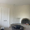
Do you match or coordinate your art?
User
10 years ago
Featured Answer
Sort by:Oldest
Comments (22)

crl_
10 years agoalex9179
10 years agoRelated Professionals
Franklin Furniture & Accessories · Greenville Furniture & Accessories · Lake Zurich Furniture & Accessories · Mesa Furniture & Accessories · Mahwah Furniture & Accessories · Hastings Custom Artists · Central Falls Custom Artists · Gainesville Custom Artists · Englewood Lighting · Lancaster Lighting · Scottdale Lighting · Wells Branch Lighting · Los Angeles Window Treatments · Mesa Window Treatments · Ridgewood Window Treatmentschispa
10 years agoUser
10 years agoineffablespace
10 years agoFun2BHere
10 years agoalex9179
10 years agojoaniepoanie
10 years agoluckygal
10 years ago
Oakley
10 years agoUser
10 years agoalex9179
10 years ago
tinam61
10 years agoUser
10 years agoMmmbeeer
10 years agoineffablespace
10 years agoUser
10 years agojerseygirl_1
10 years ago
kitschykitch
10 years agoedie_thiel
10 years agosloedjinn
10 years ago
Related Stories
DECORATING GUIDESThe Art of Mix-and-Match Style
The creative interior: Here's how to get that perfectly unpredictable look just right
Full Story
KITCHEN DESIGNCountertop and Backsplash: Making the Perfect Match
Zero in on a kitchen combo you'll love with these strategies and great countertop-backsplash mixes for inspiration
Full Story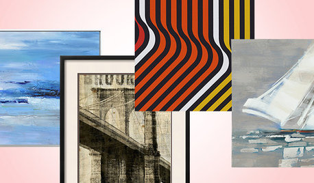
SHOP HOUZZShop Houzz: Art to Match Your Style
Creative pieces that will speak to your heart and top off your room’s style
Full Story0
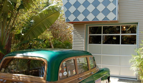
FUN HOUZZAre These Cars a Perfect Match for Their Homes?
Shift gears to the driveway or garage and see if you appreciate these pairings as much as we do — then share your own ideal match
Full Story
KITCHEN CABINETSKitchen Confidential: 7 Ways to Mix and Match Cabinet Colors
Can't decide on a specific color or stain for your kitchen cabinets? You don't have to choose just one
Full Story
FURNITURECreative Ways to Mix and Match Your Sofas and Chairs
Pull together a personalized living room look with these ideas for combining colors, prints, textures and shapes
Full Story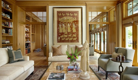
COLOR11 Terrific Paint Color Matches for Wood Details
Pair your wood trim and cabinets with the right shade of wall paint to bring out the beauty in both
Full Story
GREAT DESIGNERSCan You Match These Faces With Their Famous Designs?
Architects' portraits are less familiar than their iconic designs, but take a good look — you might see a connection
Full Story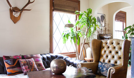
HOUZZ TOURSMy Houzz: Vintage Furnishings With Stories to Match
A photographer and a musician make their 600-square-foot Seattle apartment their home with carefully curated secondhand finds
Full StorySponsored
Industry Leading Interior Designers & Decorators in Franklin County
More Discussions


User