


Benjamin Moore Wythe Blue fail
After seeing the pictures posted on here of the living room and dining room in Wythe Blue, I painted my dining room. I painted test swatches of it, and I tested out a bunch of similar colors and decided it would work in my room, but now it's baby blue on the walls! Where do I go from here? I'm going to repaint since the room is still pulled apart from the Wythe Blue paint job. I agonized over this and drove myself crazy, pulled the trigger, and it isn't what I want. I want something a little deeper, earthier, and more gray I think, but I don't know what that is. I'm on color overload! The Wythe Blue is gorgeous, but it's just not quite what I was after for my dining room. I don't want a pale blue/gray, but this is just too powdery baby blue looking. Aacckk! So frustrating.
Comments (80)

Vertise
11 years agoHow big is your sample board? Did you do 2 coats? Also check to make sure the sample pot matches the swatch to make sure you didn't receive a bad mix. They can be quite a bit off.
honeybasil
Original Author11 years agoWhat about Benjamin Moore Pleasant Valley if I am still wanting some green in it?
I think I have realized I don't want too blue of a color or too bright of a color. I guess I'm just a muted color person. And I want it to feel somewhat neutral without being beige. And I need it to be dark enough to pop a little and make the molding and wainscoting stand out. I am leaning towards Oyster Bay or Comfort Gray unless I find something that speaks to me just a little more.
Related Professionals
Columbia Furniture & Accessories · Franklin Furniture & Accessories · Jupiter Furniture & Accessories · Tucson Furniture & Accessories · Crofton Furniture & Accessories · Fair Lawn Furniture & Accessories · Potomac Furniture & Accessories · Oak Lawn Lighting · Orcutt Lighting · Palm Springs Lighting · Sarasota Lighting · El Mirage Window Treatments · Greensboro Window Treatments · North Tustin Window Treatments · Sun Lakes Window Treatmentsbronwynsmom
11 years agoPleasant Valley is really quite green - more than a dollop, I think.
The others (Sherwin Williams, I believe?) are lovely colors, and more neutral while still leaning to blue with a hint of green. And either of them will let your cream woodwork show up just fine.
honeybasil
Original Author11 years agoThank you so much for your help. I think I'm going to go with the SW Oyster Bay since it's a little darker. I am going to try to get it mixed in BM paint though, because we painted with that for the first time with the Wythe Blue, and it was amazing! If I hate the Oyster Bay, we will just paint again (or my husband will kill me first!). Ha ha!
Now I need to paint my boys' room and don't even have a clue where to start. Accckkkkk! Seriously, picking out paint has to be the hardest thing.
bronwynsmom
11 years agoIf you like the color, and if you have access to a Sherwin Williams dealer, do consider getting it there. Different manufacturers use different chemistry and pigments, and you may get something pretty close - but after all you've done to decide, I'd hate to see you disappointed if the color has a different feeling.
honeybasil
Original Author11 years agoOkay, went back in the BM dealer today, and he suggested Beach Glass based on what I am trying to find. I'm worried that might be too light, so would Mt. Saint Anne be that but darker? Does it have any green to it?
bronwynsmom
11 years agoAre you coming home with samples when you go to the paint store? Or at least color strips?
I don't think you can make the choice without at least that much to go on. If you are down to two options, it may be time to spring for sample quarts.
(By the way, I think Beach Glass is a lovely color, and is a little fresher and lighter than Mt. St. Anne, also a pretty color, but you seem to want something that is as light and soft as it can be while still providing good contrast with your creamy trim. They are similar in hue.)
honeybasil
Original Author11 years agoOh I'm so embarrassed by all the samples and strips I have. It's getting ridiculous. I just can't seem to visualize the way it will look from the samples. The Oyster Bay looks not pretty at all on the sample, but the pictures online and what people say about it indicate otherwise, so I really have no clue.
I was originally using an inherited Oriental rug as a starting point, but I finally realized that it's ok that it's not my style and it's ok if I don't want to base my paint color on it. I can move it somewhere else. But, I am not buying a new rug right now, so I kind of just decided to start from scratch based on what I like, but obviously it's been more difficult to narrow down than what I thought.
lizzie_grow
11 years agoI think BM Beach Glass is a beautiful color. I think it is similar to some of the RH paints. It will look beautiful with your trim & be an easy color to live with. When I chose the RH Sea Green, it was like a light bulb went on in my head!! I appreciate deep saturated and even bright colors in decor, but can't seem to live with it in our home. It's not that I want blah or puny colors, but I need a little more subdued hue on a daily basis. Then I can add texture & bolder accent colors, but the house itself feels calm
Maybe you are sort of like me that way....seemed kind of like it when you were describing what you're looking for. For what it's worth (smile), I love the Beach Glass!
I myself, am dealing with a water damage issue today from leaving water running in our utility sink yesterday, while I took a phone call. Our house looks like a construction zone. Needing to cancel Easter dinner here & we're leaving for Maui next Thurs. for a week, so our house/cat sitter will be luxuriating in all of this. She loves our home & comes for a little R&R...not so sure that will be what she gets this time. Grateful to be going to Maui, but timing is not good.
Good luck with your paint choice!
honeybasil
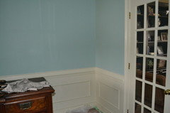
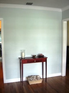
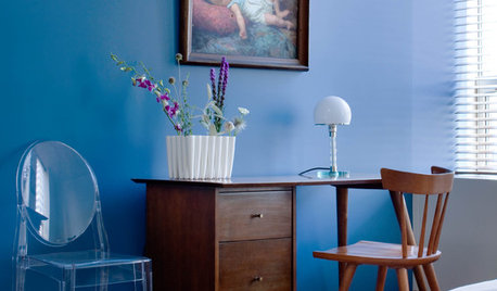
Original Author11 years agoHere is a picture of how the Wythe blue turned out on my walls. The picture makes it look more blue than it is, and this is only one coat. I know two coats would give a better idea, but I don't even want to do it because i know this is too vibrant for me. I don't mind the darkness (saturation??), but it just screams a little too much at me. It is a very hard color to photograph.
honeybasil
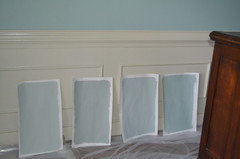
Original Author11 years agoHere are some samples I have. From the left: Gray Wisp, Oyster Bay, Beach Glass, Quietude.
I know I need to paint larger areas on the wall, but now this Wythe Blue is making it really difficult.
honeybasil
Original Author11 years agoAnd here is a link of a color that I think I love, maybe even a little darker than this for the dining room. Am I totally off base in the direction I am going?
Here is a link that might be useful: [Paint color[(https://www.houzz.com/photos/cape-cod-traditional-kitchen-traditional-kitchen-tampa-phvw-vp~327399)
KevinMP
11 years agoI almost used Beach Glass, but I wanted to go a shade darker. Mount Saint Anne definitely has a greenish tinge to it (like Beach Glass) and it's blue without being powder or baby blue. I like all three from the left, I don't like the one on the right, and I think the wall color, while nice, is too Tiffany blue.
The other color you showed in the link is completely green, so, to me, it's a totally different direction.
This post was edited by KevinMP on Thu, Mar 28, 13 at 21:17
patricianat
11 years agoPrill, I once had a lamp like the one you have on the table in your DR, which my husband broke, and I had a table like that as well, which was built by my son in his first year of architecture school. That is just uncanny. I feel like I am in the twilight zone.
honeybasil
Original Author11 years agoKevinMP, and that is why I am struggling. Maybe I am looking at the wrong colors to get what I am envisioning. I don't want green but I don't want blue. I want both. Can't I just have it all, lol???

gsciencechick
11 years agoI have tried both the Wythe Blue and Quietude samples. They are very similar but Wythe is more blue, while the Quietude is more green. Your Wythe does look a little off to me.
I actually wound up with the slightly darker color of Quietude, Halcyon Green.
Tmnca
11 years agoI like the Grey Wisp, and I also suspect you will like BM Wedgewood Gray, did you pick up a chip or sample of it? It is one of their Classic colors has some subtle green, blue and of course gray.
The Wythe Blue looks even more aqua and vivid in your room, I don't like it myself.
hlove
11 years agoBased on the photo you linked, it seems like you want a greener blue. I have Harrisburg Green in our office and absolutely love it. It may be a bit too bright for you, though, but if you click on the link and then click below the color where it says "More Shades", maybe one of the lighter ones would work?
Good luck! Choosing paint colors is so difficult!
Here is a link that might be useful: BM Harrisburg Green

cozyfarmhouse
11 years agoI used the same Sea Green from RH that Lizzie_grow mentioned in my kitchen and guest room.
It shifts from green to blue depending on the light. It's not a bright clear color, very easy to live with. In the photo you can see how the color changes with the light.{{!gwi}}
honeybasil
Original Author11 years agoOh, I love that Sea Green, but we don't have a RH. Can BM or SW mix it? Or will it not turn out the same (or close enough)?
lizzie_grow
11 years agoI wonder if you could order Sea Green online? I think maybe you can from RH website.
fripper
11 years agoI think the color you linked to might be BM Soft Fern which coordinates with the green tiles in the backsplash. Very pretty.
cozyfarmhouse
11 years agoI actually had mine color matched at Home Depot, using Behr Ultra paint in an eggshell finish. I ordered the swatch fan from RH. My paint matches the swatch exactly.
This post was edited by CozyFarmhouse on Sat, Mar 30, 13 at 12:36
jimandanne_mi
11 years agoSince you seem to be having the same problems I have, here's what I did if it might help.
I've spent months (years?) trying to come up with the right blues for my DR & MBR, and have done samples of several of the colors that have been mentioned. I've looked at them in all 4 seasons, all times of the day, all kinds of sunlight or lack thereof, and finally have made some choices. I knew nothing about color when I started, but have learned a few things, partly with the help of several people who responded to my post on this forum several months ago.
I bought a BM color fan online, and that made the choices easier. The LRV numbers in the back ended up being quite helpful after I'd tried several colors, because I finally figured out that for the amount of contrast and depth of color that I wanted, those in the mid-50s are right for the DR that gets a lot of sun, and those in the mid-60s are right for the MBR that gets very little. So if a color chip appealed to me, I'd check the LRV and proceed or not depending on the number.
I found that the colors I love on the BM chips are not anywhere near what I like on the wall. I'd initially painted (and repainted) several 1'x 2' to 4' scraps of drywall that we had with a little of the quart samples, since that gives a better representation of how they will look IRL. When I finally got closer to the colors I wanted, I went to HD and bought a couple of sheets of drywall. They let you cut them up in the store (or they will do the cutting--I cut one of them into four 1' lengths, and one into two 2' lengths, but haven't used the 2' ones yet) so that you can get them in your car.
We have 9' ceilings, so if you have 8' ceilings, you'd want to cut off a foot to make them easier to move around. I sometimes move them around daily. :o) The color at the top, middle, and bottom can be quite different, as you can tell from some of the pictures posted. Rest the ends on plastic bags, or be prepared to vacuum some.
Finally, I had so many samples, I decided to start mixing my own colors. Using 5 of my samples, I came up with a beautiful soft color that leans to blue or green or gray depending on the light. I'm going to take it to my BM place and have them zap it to tell me which BM colors my mix is closest to. They may already have a color close to mine that was in one of their fan decks that I didn't have, which would be easier than mixing what I'd need for just one room.
Anne
aggierose
11 years agoThank you for posting this thread! I had the same experience with BM Nimbus Gray. I loved it in pictures, but it looks terrible in my master bedroom. It screams baby boy nursery to me. Someone on here recommended BM Adagio. I just finished re-painting 2 walls with Adagio and I think I'm going to love it!
patty_cakes
11 years agoI'm just wondering how long it can take to choose a color before frustration sets in. I know you want it to be *right* but until the complete room is painted you really will not know. I'm actually starting to "feel your pain". LOL Are "we" any closer to making a decision? ;o)
honeybasil
Original Author11 years agoJimandanne, I can so relate, and it sounds like you have found a good system to help you. I will have to try your method out.
Aggierose, I'm so glad you have found your color! What does the Adagio look like in your space?
Patty_cakes, no decision yet. I am getting so overwhelmed and going to take a break. My kids are out on spring break, and we can't really paint until next weekend at least anyway, so I've got to just take a rest from it. I am almost to the point of being so confused I don't know what I want anymore. I'm going to enjoy my kids and revisit my paint in a few days!
Fripper, the Soft Fern is really pretty!
busybee3
11 years agoi would prefer the 'grayness' of the grey wisp or the oyster bay,,, i think the beach glass would be too pastel a color for me (and the grey wisp might look too light on your walls too, tho the gray helps to cut that pastel look) and the quietude is not too much different than what you already have... how close to what you already have do you want to be?? i think you'll be surprised with how 'less gray' the 2 choices on your left would be once they're up on your wall...
and i think those are the only 2 that will look more green depending on the time of day... i think the other 2 will seem predominantly blue most of the time...runninginplace
11 years agoChiming in on busybee's thoughts-I have most of my house painted in BM Quiet Moments which is almost identical and next to Grey Wisp on their color bar.
As busy says, these tones do NOT read gray on the wall! They are definitely a lovely blue green and at least in my house read more to the green end of the spectrum. They aren't pastel but I feel are truly a neutral in terms of being quiet, soothing and amenable to a lot of different tones you can use for furniture, drapes, bedding etc. My trim is all crisp white and this shade looks smashing with it; really makes the trim pop without being a dark contrast.
So just a voice from someone who has been extremely happy with how this gray-but-really-green/blue shade of paint looks in a real home.
If you want to see it, here is a shot of my LR just after I painted it with Quiet Moments. I cut my mix 50% because I really wanted a light and airy feeling. And I've been absolutely delighted with it in every room--now have it in my foyer, LR, DR, kitchen, hallway and master bedroom. As my kids leave the other two bedrooms are heading for Quiet Moments too :).
First LR view, you can see white trim too:
Another LR view, to show you how it looks with dark leather furniture:

And here it is in the foyer with natural light (a southern facing exposure):
Same view with a flash:
Ann
nosoccermom
11 years agoI sampled pretty much the same paints and ended up with
Yarmouth Blue. I personally would have preferred a much darker blue but was outvoted, and everybody who comes compliments me on it. Window faces west.
Check out the link below.Here is a link that might be useful: Blue-Gray
honeybasil
Original Author11 years agoBusybee, I definitely need something that leans to the gray. I've realized that now. I have what appears to be Sea Salt in my foyers (PO painted it), and I love it. I need something like it but more saturated because it's way too light for my DR. Since Oyster Bay is on the same strip,
I was hoping that would be it (which it still might be).Ann, your paint is really pretty. It looks really similar to my foyer. I get so many compliments on it.
Nosoccermom, my mom just bought a house with a Yarmouth Blue kitchen. It's really very nice. Her windows face east, so I wonder how it differs from yours.
kimberlyrkb
11 years agoI have a room painted Yarmouth Blue. It has two windows facing south and one facing east. The room doesn't get a lot of light because we're in the woods. It's a bit too baby blue looking for me, so I've been thinking of re-painting. This thread has helped in that it has given me a number of new colors to check out. Thanks.
geogirl1
11 years agoOur master bath is painted Sea Salt and one darker, Comfort gray. Our master bedroom is painted Santorini Blue and the two colors transition beautifully with each other. Santorini blue, brittany blue (lighter) and water's edge (darker) are blues with gray.
honeybasil
Original Author11 years agoI think we are going to go with Benjmin Moore Misted Green. It is a close match to the SW Oyster Bay, and my BM guy would rather me not try to match the SW color. I want to use BM paint and also support my BM store. I have painted test swatches and am going to roll a big wall of it tonight. I got busy with spring break and all the kids' activities, but we need to get the room finished now. I will be sure to post a picture when it is finished, hopefully this weekend!
jockewing
11 years agoOh my goodness, I went through months, no YEARS of frustration with the blue/green/grays. I wanted to paint my master bedroom Wythe Blue. I was dead set on it. But when I sampled, I too found it quite bright and saturated and almost a cartoonish aqua. SW Quietude looks almost exactly the same on the strip to Wythe, but it came out much much soothing and grayed down in real life. I ended up painting my master bedroom with the Quietude and absolutely loved it.
I also noticed the phenomenon mentioned here by others--when I first got finished painting, I really hated the Quietude! It looked great in little samples, but for some reason, turned extremely gray, dull, and lifeless when it was covering all of the walls. I was very distraught and couldn't believe I had just gone through all of the work for a color I still didn't like. Over the next several days, something magical happened---the walls slowly but surely came to life and the color seemed to come alive. By the next week I was astonished at how the color just looked so perfect---sometimes bluish, sometimes greenish, but always so soothing and relaxing. It wasn't bright or garish, but the color wasn't nearly as dull and lifeless as I felt it looked after just finishing it. I don't know if this is a psychological thing or an actual physical change in the paint itself (probably a bit of both).
I was quite happy with Quietude for quite some time. Then I had to have some drywall repaired in my house, including a few spots in the bedroom. I had a little bit left in the can, but I got a new can made in the same type of paint, sheen, etc., and even mixed in the paint I had left in the old can (about 15% of the can). Unfortunately, the touch up color was very noticeably different than the original Quietude (it was darker and greener). I guess because I had it mixed at a different SW store the machine was calibrated slightly differently? Anyway, I had to end up repainting the entire room, and it lost the magic of the original color.
Now the bedroom is BM Smoke, which is a similar color, but much bluer. I like it alot. It still has that slight green hint and it is sufficiently grayed to not look babyish. My master bathroom is painted Quiet Moments, and I will probably always have a room in my house this color. I absolutely love it and it looks wonderful. Surprisingly these blue greens can really serve as a neutral if it has enough gray and looks great with lots of colors. One piece of advice---in my experience these colors must have white trim. I have tried them in rooms with dark wood trim and they don't look nearly as good. Somehow it seems to sap the life out of them and really cancel out the greens. Also, when a color looks green on the chip, it will turn MUCH bluer when it is on the larger surface like the walls. Don't understand why this happens.
karen.iz
11 years agoHi Honeybasil,
I'm sorry the Wythe Blue didn't work out in your rooms... I think it was probably my LR/ DR photos you saw . I have to believe it all depends on the light you have in your particular room. It doesn't look at all baby blue in my rooms... much more of a green-blue. My living room gets sun all morning, and the dining room gets late afternoon light. The color does seem to change throughout the day, which I really like.
Looking forward to seeing your Misted Green walls!
honeybasil
Original Author11 years agoKaren.iz, it was your room which looks so beautiful, it inspired me. Unfortunately, the color didn't work as well for me. I'll keep you all posted.
vsalzmann
11 years agoJust from the pictures you posted, I am wondering if the problem isn't the cream trim. Your trim has a lot of yellow in it. Most of the blues mentioned above, especially in the sample pics, are placed next to white. Even your sample boards have a white edge. I think the undertones of the cream and the blues are fighting once it's on the wall. Have you considered moving to a less saturated cream for your trim?
honeybasil
Original Author11 years agoVsalz, I definitely think the cream trim really made the color look worse, but my whole house is the same cream trim and we just can't repaint all of that at this time. It definitely didn't work with the Wythe blue. Just finished with the Misted Green this morning and it is so much better - what I had thought the Wythe Blue would look like. I will post pix when we clean it up in a few minutes.
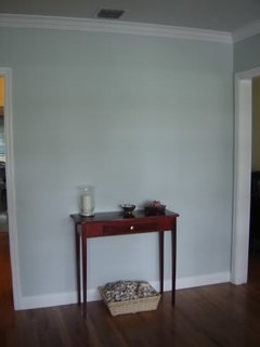
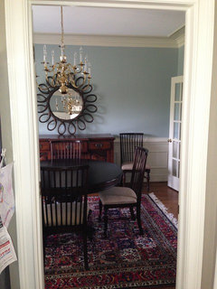
honeybasil
Original Author11 years agoHere is a view of the finished product. Ignore the chandelier as we definitely need a new one. And the mirror needs to be hung. I love the color! What kind of chandelier would you put in here??
honeybasil
Original Author11 years agoAlso, I may take the rug out and put a sisal type rug in there - haven't decided yet. And I definitely need lamps for my buffet too.
honeybasil
Original Author11 years agoOne last thing: by the end of this process I realized there were lots of different paint colors that I would have been happy with. I could have leaned in a few different directions and been okay with it. But I just had to commit to something! Now onto the next room, lol!!

enduring
11 years agoGreat color looks very nice. You're right about the choices for color, that many will work.


lazydaisynot