


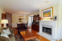
What color yellow paint is this?? UUUUHHHHH!
jfmiii
11 years ago
Featured Answer
Comments (26)

graywings123
11 years ago
sable_ca
11 years agoRelated Professionals
Jacinto City Interior Designers & Decorators · Stanford Interior Designers & Decorators · View Park-Windsor Hills Interior Designers & Decorators · Washington Interior Designers & Decorators · Whitman Interior Designers & Decorators · Miami Furniture & Accessories · Phoenix Furniture & Accessories · Duluth Furniture & Accessories · Carlsbad Furniture & Accessories · Temple Terrace Furniture & Accessories · Indian Creek Furniture & Accessories · Saratoga Custom Artists · Centreville Lighting · La Jolla Lighting · Rockford Window Treatmentsbestyears
11 years agojfmiii
11 years agoliriodendron
11 years ago
sas95
11 years agotuesday_2008
11 years ago
kswl2
11 years agoMartianMan
11 years agokswl2
11 years agonew_home1024
11 years agoashef
11 years ago
Circus Peanut
11 years agoVertise
11 years agomarcolo
11 years agoVertise
11 years ago
My3dogs ME zone 5A
11 years agomarcolo
11 years agoVertise
11 years agoMy3dogs ME zone 5A
11 years ago
aa62579
11 years agoaa62579
11 years agoaiallega
11 years agoJXBrown (Sunset 24, N San Diego County)
11 years agoamcken3
5 years ago


Related Stories
COLOR11 Ways to Add a Splash of Yellow to Your Interior
See how a dab of this sunshiny color can bring warmth and cheer to a room
Full Story
CURB APPEALFront and Center Color: When to Paint Your Door Yellow
Bring a burst of eternal sunshine to your home's entryway with an invigorating yellow front door
Full Story
DECORATING GUIDESPaint Color Ideas: 8 Uplifting Ways With Yellow and Green
Dial up the cheer with yellow and green paint combinations sure to cast off winter doldrums
Full Story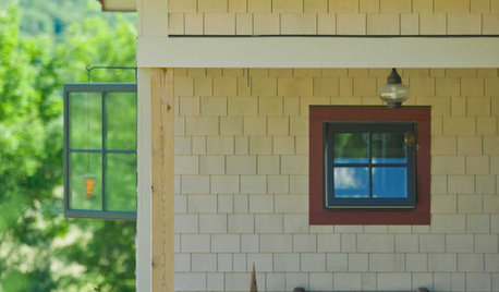
EXTERIOR COLORWhen to Paint Your Home Yellow
Be a cheer leader with this color that captures the sun and radiates a warm welcome
Full Story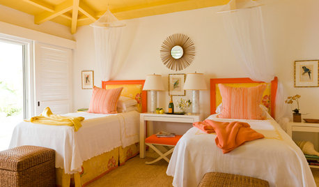
DECORATING GUIDESPaint Color Ideas: 7 Bright Ways With Yellow and Orange
Go with the glow. These sample palettes and room examples show you how to work with two of the happiest hues around
Full Story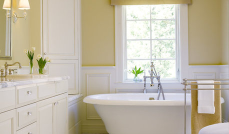
COLORBathed in Color: Favorite Yellows and Golds for the Bath
Get a golden glow for your bathroom with these expert paint picks and ideas for yellow walls
Full Story
DECORATING GUIDESHow to Pick the Right Yellow
Which of These 9 Types of Yellow is the Paint Color for You?
Full Story
COLORBest Ways to Use the Soft Yellow Color of 2014
You may fall for PPG Pittsburgh Paints’ Turning Oakleaf if you like your hues warm, mellow and cheery
Full Story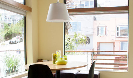
COLORColor of the Week: Spring Blossom Yellow
Tired of winter yet? Bring on spring with our featured color of the week
Full Story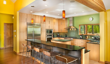
YELLOWColor of the Week: Celebrate Summer With Sunny Yellow
Bring home some of that glorious summer sunshine
Full StoryMore Discussions


grlwprls