


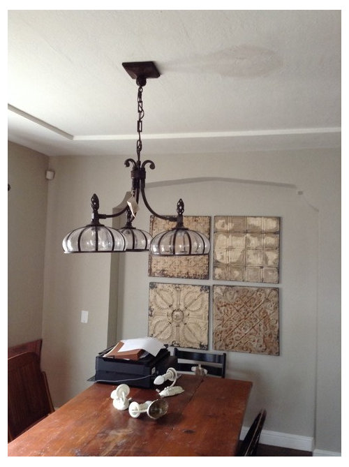
Ceiling paint, tray ceiling, wwyd?
crl_
10 years ago
Sort by:Oldest
Comments (20)
Related Stories
CEILINGSA Dozen Ways To Dress Up Your Tray Ceiling
Lighting, paint, paneling and pattern transform the view from below
Full Story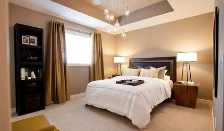
DESIGN DICTIONARYTray Ceiling
Tray ceilings provide three-dimensional contrast in an otherwise flat ceiling
Full Story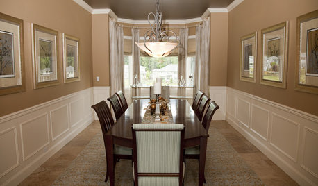
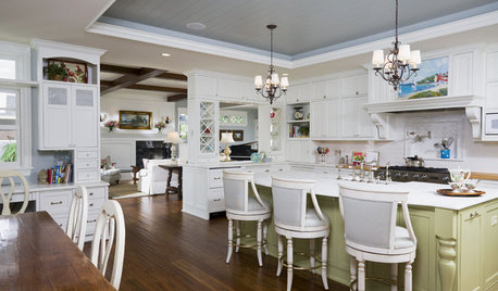
CEILINGSGreat Ideas for Painted Ceilings
Look up: Your ceiling may be crying out for some color
Full Story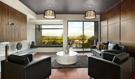
COLOR11 Reasons to Paint Your Ceiling Black
Mask flaws, trick the eye, create drama ... a black ceiling solves a host of design dilemmas while looking smashing
Full Story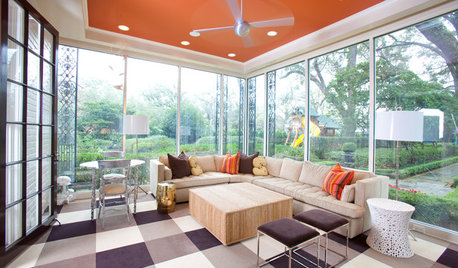
MOST POPULARHeads-Up Hues: 10 Bold Ceiling Colors
Visually raise or lower a ceiling, or just add an eyeful of interest, with paint from splashy to soothing
Full Story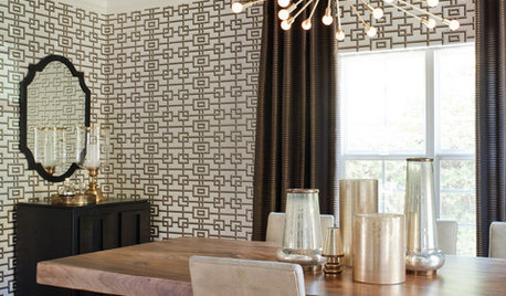
REMODELING GUIDESDecorated Ceilings Are Looking Up
Whether with a simple coat of paint or intricate molding, ceilings are getting some long-deserved attention in interior designs
Full Story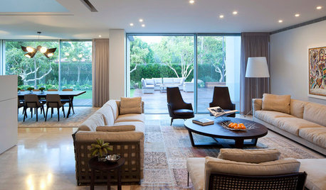
DECORATING GUIDES11 Tricks to Make a Ceiling Look Higher
More visual height is no stretch when you pick the right furniture, paint and lighting
Full Story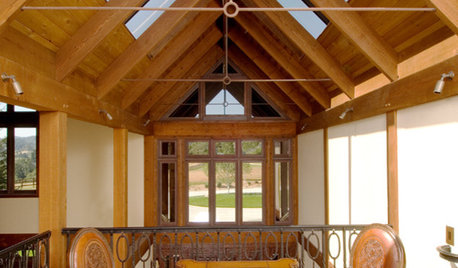
CEILINGSCeilings That Work: Designs for the Space Above
Coffer or vault your ceiling and give your whole space a lift
Full Story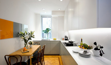
SMALL KITCHENSKitchen of the Week: Space-Saving Tricks Open Up a New York Galley
A raised ceiling, smaller appliances and white paint help bring airiness to a once-cramped Manhattan space
Full Story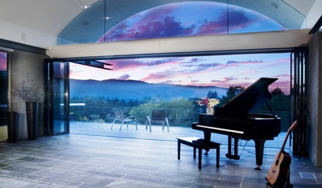
CEILINGSThe Space Above: Beautiful Barrel-Vaulted Ceilings
Create Spaciousness and Intimacy With a Ceiling Shaped Like the Sky
Full Story

graywings123
mtnrdredux_gw
Related Professionals
Birmingham Interior Designers & Decorators · Centerville Interior Designers & Decorators · Clinton Township Interior Designers & Decorators · Westbury Interior Designers & Decorators · Brooklyn Furniture & Accessories · Savannah Furniture & Accessories · Surprise Furniture & Accessories · Ventura Furniture & Accessories · Davidson Furniture & Accessories · Hoffman Estates Furniture & Accessories · New Hope Furniture & Accessories · Salem Custom Artists · Folsom Custom Artists · Florida City Lighting · Stony Brook Window Treatmentscrl_Original Author
Bunny
raee_gw zone 5b-6a Ohio
crl_Original Author
Annie Deighnaugh
crl_Original Author
crl_Original Author
mtnrdredux_gw
User
crl_Original Author
lascatx
crl_Original Author
mayaswell
ineffablespace
busybee3
User
crl_Original Author
busybee3