


(still) Working on that Darn Foyer!
grlwprls
11 years ago

Sort by:Oldest
Comments (27)
Related Stories
HOUSEKEEPINGOut, Darn Spot! Tips for Removing Carpet Stains
Know the right solutions and when to use them to prevent stains from pets, soda, chocolate, blood and more
Full Story
FUN HOUZZThe Cutest Darn Animals on Houzz
You might end up admiring these horses, goats, llamas and more until the cows come home
Full Story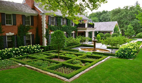
GARDENING GUIDESBoxwood: Still Shape-Shifting After 350 Years
Wild or mild, the humble boxwood still brings style and order to all kinds of gardens
Full Story
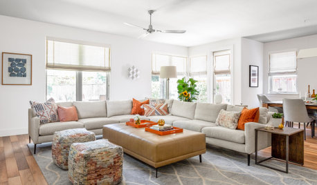
FURNITURESeating in the Round: An Old Idea That’s Still Fresh Today
Bring in romance, unexpected style or just great seating for conversations with sofas that turn their back on the straight and narrow
Full Story
CONTRACTOR TIPS10 Things to Discuss With Your Contractor Before Work Starts
Have a meeting a week before hammers and shovels fly to make sure everyone’s on the same page
Full Story
DECORATING GUIDESColor Guide: How to Work With Charcoal Gray
The most modern neutral, charcoal gray looks great in dining rooms, living rooms and even nurseries. Here's how to use it best
Full Story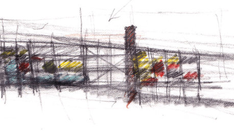
ARCHITECTUREArchitect's Toolbox: The Sketches That Spark a Home
See why in a high-tech world, pen and paper are often still essential for communicating design ideas
Full Story
MOST POPULARMeet a Lawn Alternative That Works Wonders
Carex can replace turfgrass in any spot, is low maintenance and adjusts easily. Add its good looks and you’ve got a ground cover winner
Full Story
ARCHITECTUREGet a Perfectly Built Home the First Time Around
Yes, you can have a new build you’ll love right off the bat. Consider learning about yourself a bonus
Full Story
MOST POPULARHow to Work With an Interior Designer
Interior designers do much more than make a home pretty — they turn it into a harmonious haven that's uniquely yours
Full Story


teeda
yayagal
Related Professionals
Mount Laurel Interior Designers & Decorators · Ridgefield Interior Designers & Decorators · Cedar Rapids Furniture & Accessories · Eagan Furniture & Accessories · Fort Wayne Furniture & Accessories · North Bergen Furniture & Accessories · Norwalk Furniture & Accessories · Peachtree City Furniture & Accessories · Topeka Furniture & Accessories · Culver City Furniture & Accessories · Wilmington Furniture & Accessories · Zionsville Furniture & Accessories · Iowa City Lighting · Chicago Window Treatments · North Tustin Window Treatmentsrosie
luckygal
Olychick
funkyart
grlwprlsOriginal Author
patty_cakes
grlwprlsOriginal Author
grlwprlsOriginal Author
anitamo
amykath
grlwprlsOriginal Author
My3dogs ME zone 5A
grlwprlsOriginal Author
grlwprlsOriginal Author
grlwprlsOriginal Author
nini804
threeapples
anele_gw
Arapaho-Rd
patty_cakes
User
grlwprlsOriginal Author
kellienoelle
autismmom
bronwynsmom