


Funcolors & other color friends - Color Resources Please
pschul05
11 years ago
Sort by:Oldest
Comments (10)
Related Stories
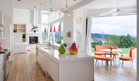
KITCHEN DESIGNYour Essential Resource for a Healthy, Ecofriendly Kitchen
Find the Houzz guides to choosing earth-friendly kitchen counters, cabinets, appliances, lighting, flooring and tile — all in one place
Full Story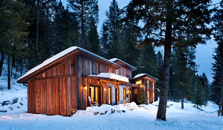
HOUZZ TOURSHouzz Tour: Resourcefulness Shows in a Rugged Montana Cabin
Reclaimed materials and a simple plan help a carpenter build his own inviting, energy-efficient home
Full Story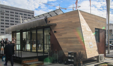
GREEN BUILDINGMeet a New Resource-Saving Prefab Design
Energy efficiency and a resourceful layout combine with ecofriendly materials in this noteworthy prototype for modular homes
Full Story
HOUZZ TOURSHouzz Tour: Creative Resourcefulness in a 1970s Ranch
Combine design dexterity and abundant creativity with patience, and what do you get? A home awash in personality and style
Full Story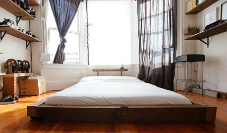
HOUZZ TOURSMy Houzz: 2 Tools + 1 Resourceful Guy = Lots of Great ‘New’ Furniture
With scrap wood and a hands-on attitude, a San Francisco renter on a tight budget furnishes his bedroom and more
Full Story
GARDENING GUIDESProtect a Precious Resource With a Rain Garden
Promote pure water and a beautiful landscape with a garden design that makes the most of the rain
Full Story
HOME OFFICESQuiet, Please! How to Cut Noise Pollution at Home
Leaf blowers, trucks or noisy neighbors driving you berserk? These sound-reduction strategies can help you hush things up
Full Story
HOUZZ TOURSMy Houzz: A Circle of Friends Turns a Dallas House Into a Home
Homeowners enlist help from friends to remodel, build an addition and decorate their home
Full Story
GARDENING GUIDESGarden-Friendly Native Alternatives to Overplanted Exotics
There are lots of gorgeous, wildlife-friendly native plants ready to make an appearance in your garden
Full Story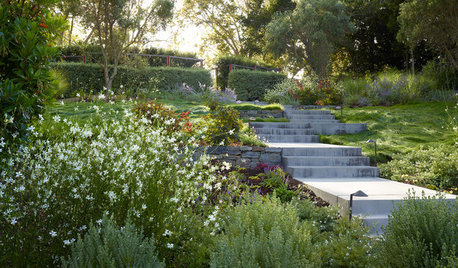
EARTH DAY5 Ideas for a More Earth-Friendly Garden
Consider increasing the size of garden beds, filtering rainwater and using plants to reduce energy use
Full StoryMore Discussions


imagineyourhomes
pschul05Original Author
Related Professionals
Belle Glade Interior Designers & Decorators · Hercules Interior Designers & Decorators · Linton Hall Interior Designers & Decorators · Mount Sinai Interior Designers & Decorators · Rosaryville Interior Designers & Decorators · Beaufort Furniture & Accessories · Dallas Furniture & Accessories · Jacksonville Furniture & Accessories · Peachtree City Furniture & Accessories · Sioux Falls Furniture & Accessories · Topeka Furniture & Accessories · Temple Terrace Furniture & Accessories · Short Hills Furniture & Accessories · Channahon Lighting · Walnut Creek Window TreatmentsLori A. Sawaya
pschul05Original Author
Vertise
Lori A. Sawaya
Vertise
pschul05Original Author
pschul05Original Author
Elraes Miller