


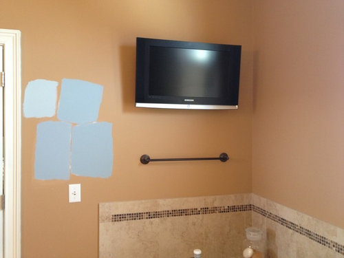
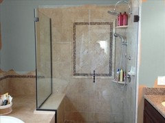
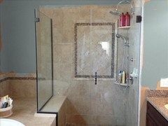
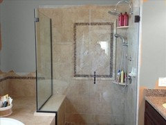
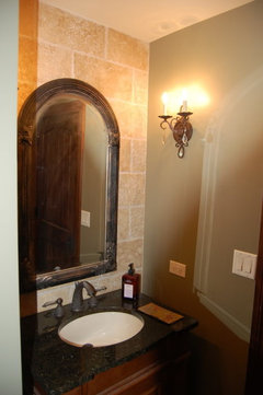
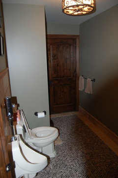
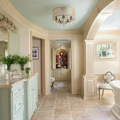
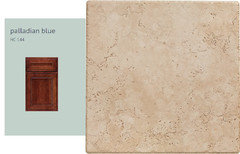
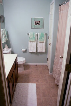
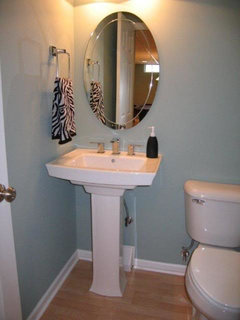
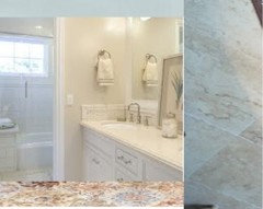
Paint- Blue Grey Master Bath with Pics
VangoghSuz
11 years ago
Featured Answer
Sort by:Oldest
Comments (68)

VangoghSuz
11 years agoallison0704
11 years agoRelated Professionals
Garden Acres Interior Designers & Decorators · Carlsbad Furniture & Accessories · Dallas Furniture & Accessories · Memphis Furniture & Accessories · Silver Spring Furniture & Accessories · Topeka Furniture & Accessories · Eureka Furniture & Accessories · Glenview Furniture & Accessories · Irmo Furniture & Accessories · Robbinsdale Furniture & Accessories · San Juan Capistrano Furniture & Accessories · Decatur Custom Artists · Green Bay Lighting · Whittier Lighting · Salt Lake City Window TreatmentsVangoghSuz
11 years agoVangoghSuz
11 years agoVangoghSuz
11 years agokellienoelle
11 years agopatricianat
11 years agoVangoghSuz
11 years agokellienoelle
11 years agoVertise
11 years agoJamie
11 years agokellienoelle
11 years agoKevinMP
11 years agoVertise
11 years agogeogirl1
11 years agohobokenkitchen
11 years agohosenemesis
11 years agolazydaisynot
11 years agopatricianat
11 years agokimberlyrkb
11 years ago
Oakley
11 years agomom2sethc
11 years agopatricianat
11 years agogeokid
11 years agoslflaherty
11 years agoVangoghSuz
11 years agogeokid
11 years agomom2sethc
11 years agobusybee3
11 years agotuesday_2008
11 years agocarolt924
11 years agoUser
11 years agopatricianat
11 years agoKevinMP
11 years agojterrilynn
11 years agonoellabelle
11 years agoJanice742
11 years agoislanddevil
11 years agodakota01
11 years agonosoccermom
11 years agoJanice742
11 years agomom2sethc
11 years agojterrilynn
11 years agojterrilynn
11 years ago
gr8daygw
11 years agoUser
11 years agogeokid
11 years agotergar
11 years agoseaswirl
11 years agoVertise
11 years ago
Related Stories
COLORBathed in Color: When to Use Gray in the Bath
Go for elegance and sophistication without going overboard on coolness, using these gray bathroom paint picks and inspirational photos
Full Story

GRAYChoosing Paint: How To Pick the Right Gray
Which Version of Today's 'It' Neutral Is For You?
Full Story
MOST POPULAR50 Shades of Gray
Gray is hotter than ever, thanks to a hit novel full of risks and dark secrets. Tell us: Which paint shade possesses you?
Full Story
COLORColor of the Week: April Sky Blue
See how to use this soft neutral hue that’s neither gray nor pure blue
Full Story
DINING ROOMSColor Feast: When to Use Gray in the Dining Room
The right shade of gray pairs nicely with whites and woods to serve up elegance and sophistication
Full Story
COLORCooking With Color: When to Use Gray in the Kitchen
Try out Trout or shake up some Martini Shaker gray for a neutral-based kitchen that whispers of sophistication
Full Story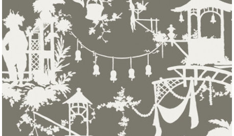
PRODUCT PICKSGuest Picks: Go Gray for Modern Elegance
Done up in chinoiserie, Greek key patterns and sculptural accessories, gray has all the sophistication with none of the somber
Full Story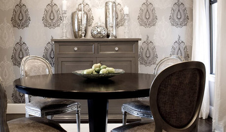
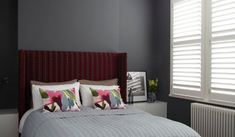
COLORDreaming in Color: 8 Gorgeous Gray Bedrooms
With this versatile hue, you can go dark and bold or slip into something more soothing
Full Story

Vertise