


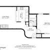
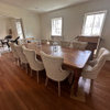
Color for great room, absolutely confused...options?
williamsem
10 years ago

Related Stories

GREEN BUILDINGLet’s Clear Up Some Confusion About Solar Panels
Different panel types do different things. If you want solar energy for your home, get the basics here first
Full Story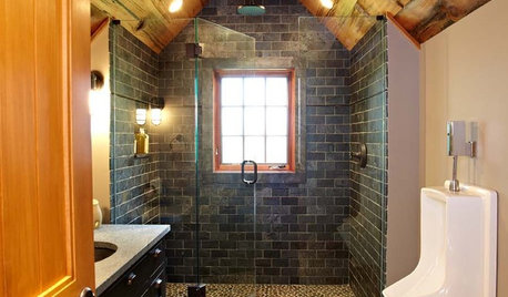
BATHROOM DESIGNWood in the Bathroom? Absolutely!
Wet places and wood can be a match made in design heaven — see great examples and get tips for sealing and installing bathroom wood here
Full Story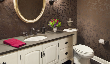
FURNITUREExpand Your Options for Powder Bath Furniture
Retrofit a Great Piece of Furniture for a Warm, One-of-a-Kind Vanity
Full StoryCONTEMPORARY HOMESHouzz Tour: Gaining Space and Options With a Flex Room
See how a new entryway bonus room increases dining and entertaining possibilities, and improves this California home’s flow
Full Story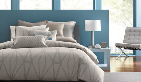
FURNITURESmart Shopper: How to Buy a Mattress
Confusing options, hair-raising prices, haggling ... Our guide can keep you from losing sleep over mattress shopping
Full Story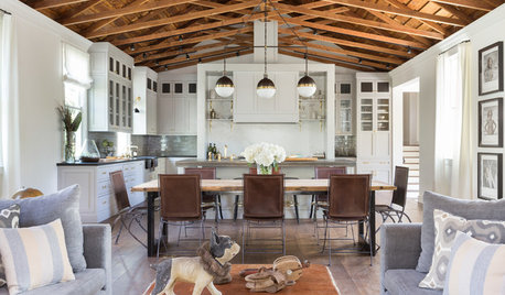
REMODELING GUIDESRoom of the Day: A Great Room in a Former Church
Handmade details, beautiful trusses and a bell make the most of this converted church’s good bones
Full Story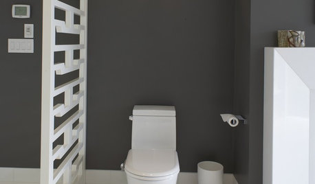
BATHROOM DESIGNHere's (Not) Looking at Loo, Kid: 12 Toilet Privacy Options
Make sharing a bathroom easier with screens, walls and double-duty barriers that offer a little more privacy for you
Full Story
KITCHEN DESIGN9 Popular Stovetop Options — Plus Tips for Choosing the Right One
Pick a stovetop that fits your lifestyle and your kitchen style with this mini guide that covers all the basics
Full Story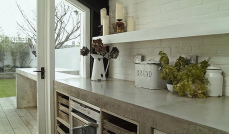
KITCHEN COUNTERTOPSKitchen Counters: Concrete, the Nearly Indestructible Option
Infinitely customizable and with an amazingly long life span, concrete countertops are an excellent option for any kitchen
Full Story
KITCHEN COUNTERTOPSKitchen Counters: Plastic Laminate Offers Options Aplenty
Whatever color or pattern your heart desires, this popular countertop material probably comes in it
Full StoryMore Discussions

cawaps
luckygal
Related Professionals
Fernway Interior Designers & Decorators · Ridgefield Park Interior Designers & Decorators · North Myrtle Beach Furniture & Accessories · Rochester Furniture & Accessories · Stuart Furniture & Accessories · Tampa Furniture & Accessories · Champlin Furniture & Accessories · Hilton Head Island Furniture & Accessories · Naples Furniture & Accessories · Temple Terrace Furniture & Accessories · Mill Valley Custom Artists · Westmont Lighting · Cleveland Window Treatments · Stoneham Window Treatments · Washington Window TreatmentswilliamsemOriginal Author
Annie Deighnaugh
crl_
Annie Deighnaugh
williamsemOriginal Author
dilly_ny
cawaps
williamsemOriginal Author
mtnrdredux_gw
cawaps
jterrilynn
amyktexas