


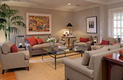
Revere Pewter - too light for this livingroom? (*Pic)
dawn_t
12 years ago
Featured Answer
Sort by:Oldest
Comments (23)

nicole74
12 years agoRelated Professionals
Mount Vernon Interior Designers & Decorators · Boise Interior Designers & Decorators · Centerville Interior Designers & Decorators · Cedar Rapids Furniture & Accessories · Memphis Furniture & Accessories · Santa Barbara Furniture & Accessories · Silver Spring Furniture & Accessories · Simpsonville Furniture & Accessories · Topeka Furniture & Accessories · Wichita Furniture & Accessories · Aliso Viejo Furniture & Accessories · Fillmore Furniture & Accessories · Hoboken Furniture & Accessories · Moraga Furniture & Accessories · South Yarmouth Window Treatments
lolauren
12 years agokimiko232
12 years agobusybee3
12 years agoles917
12 years agodawn_t
12 years agopps7
12 years agopps7
12 years agodawn_t
12 years agopps7
12 years agodawn_t
12 years agodaisychain01
12 years agocatkin
12 years agobabs711
12 years agolascatx
12 years agofauve01
12 years agodawn_t
12 years agohopmom
12 years agocatkin
12 years agocherigw
12 years agodawn_t
12 years agocherigw
12 years ago
Related Stories
COLORBeyond White: With Tints, Everybody Wins
Light colors with just a trace of pigment add a subtle ambience. Here’s how to use tints to set a mood without darkening your space
Full Story
KITCHEN OF THE WEEKKitchen of the Week: The Calm After the Storm
Ravaged by Hurricane Sandy, a suburban New York kitchen is reborn as a light-filled space with a serene, soothing palette
Full Story
MOST POPULAR50 Shades of Gray
Gray is hotter than ever, thanks to a hit novel full of risks and dark secrets. Tell us: Which paint shade possesses you?
Full Story
COLORDreaming in Color: 8 Gorgeous Gray Bedrooms
With this versatile hue, you can go dark and bold or slip into something more soothing
Full Story
WHITEWhat to Know Before You Paint Your Walls White
A coat of white paint can do wonders in one room and wreak havoc in another. Here are tips for using the popular hue
Full Story
MIDCENTURY HOMESHouzz Tour: How Can We Get Invited to This Awesome Midcentury Home?
A redwood-clad gem in California’s Marin County features a dreamy outdoor oasis with an open-door policy for the homeowners’ friends
Full Story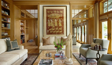
COLOR11 Terrific Paint Color Matches for Wood Details
Pair your wood trim and cabinets with the right shade of wall paint to bring out the beauty in both
Full Story
MOST POPULARRethinking Beige in a World Gone Gray
Gray, the ‘it’ neutral of recent years, has left beige in the shade. But is it time to revisit this easy-on-the-eyes wall color?
Full Story
EXTERIOR COLORExterior Color of the Week: 7 Ways With Warm Gray
See why this hue can be the perfect neutral for any house
Full Story
COLOR12 Tried-and-True Paint Colors for Your Walls
Discover one pro designer's time-tested favorite paint colors for kitchens, baths, bedrooms and more
Full StoryMore Discussions


User