


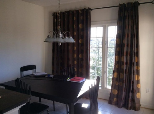
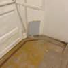
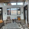
Need help with paint for dining room!
shhhh
10 years ago


Sort by:Oldest
Comments (41)
Related Stories
REMODELING GUIDESRoom of the Day: Antiques Help a Dining Room Grow Up
Artfully distressed pieces and elegant colors take a formerly child-focused space into sophisticated territory
Full Story
SMALL HOMESRoom of the Day: Living-Dining Room Redo Helps a Client Begin to Heal
After a tragic loss, a woman sets out on the road to recovery by improving her condo
Full Story
COLORPaint-Picking Help and Secrets From a Color Expert
Advice for wall and trim colors, what to always do before committing and the one paint feature you should completely ignore
Full Story
COLORPick-a-Paint Help: How to Create a Whole-House Color Palette
Don't be daunted. With these strategies, building a cohesive palette for your entire home is less difficult than it seems
Full Story
COLORPick-a-Paint Help: How to Quit Procrastinating on Color Choice
If you're up to your ears in paint chips but no further to pinning down a hue, our new 3-part series is for you
Full Story
HOUZZ TOURSMy Houzz: Saturated Colors Help a 1920s Fixer-Upper Flourish
Bright paint and cheerful patterns give this Spanish-style Los Angeles home a thriving new personality
Full Story
LIVING ROOMSA Living Room Miracle With $1,000 and a Little Help From Houzzers
Frustrated with competing focal points, Kimberlee Dray took her dilemma to the people and got her problem solved
Full Story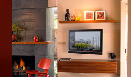
DECORATING GUIDESDecorate With Intention: Helping Your TV Blend In
Somewhere between hiding the tube in a cabinet and letting it rule the room are these 11 creative solutions
Full Story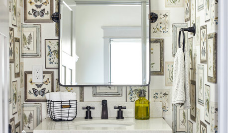
BATHROOM DESIGNKey Measurements to Help You Design a Powder Room
Clearances, codes and coordination are critical in small spaces such as a powder room. Here’s what you should know
Full Story
SMALL SPACESDownsizing Help: Think ‘Double Duty’ for Small Spaces
Put your rooms and furnishings to work in multiple ways to get the most out of your downsized spaces
Full StorySponsored
Your Custom Bath Designers & Remodelers in Columbus I 10X Best Houzz
More Discussions
joaniepoanie
patricianat
Related Professionals
Ridgefield Interior Designers & Decorators · Columbia Furniture & Accessories · San Francisco Furniture & Accessories · Topeka Furniture & Accessories · Fort Carson Furniture & Accessories · Genova Furniture & Accessories · Highland Park Furniture & Accessories · Ashburn Custom Artists · Romeoville Lighting · South Miami Lighting · Edmond Window Treatments · North Tustin Window Treatments · St. Louis Window Treatments · West Des Moines Window Treatments · Inwood Window Treatmentsdenali2007
denali2007
erinsean
tibbrix
anele_gw
anele_gw
tibbrix
chispa
shhhhOriginal Author
anele_gw
shhhhOriginal Author
Rory (Zone 6b)
arkansas girl
anele_gw
tibbrix
nosoccermom
tibbrix
anele_gw
kitschykitch
busybee3
patricianat
ppbenn
shhhhOriginal Author
tibbrix
shhhhOriginal Author
tibbrix
tibbrix
nosoccermom
Mayaa
shhhhOriginal Author
tibbrix
busybee3
anele_gw
patricianat
shhhhOriginal Author
busybee3
User
meghnjosh
shhhhOriginal Author